If you’re an aspiring data scientist, chances are you’ve come across ggplot2, a powerful data visualization package in R. However, with its wide range of options and functionalities, it can be overwhelming to memorize all the different commands and syntax. Fortunately, ggplot2 has a handy cheat sheet that summarizes all the basic elements and syntax, making it easier for you to create beautiful visualizations.
The ggplot2 cheat sheet covers all the key components of the package, including data layers, scales, aesthetics, and geometries. It’s a comprehensive guide that can help you quickly create complex visualizations without having to remember all the details of the package’s syntax.
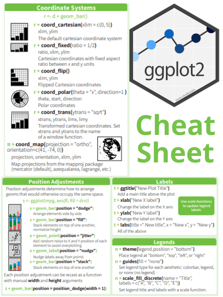
Here are some of the key elements you’ll find on the ggplot2 cheat sheet:
- Data layers: The data layer is the foundation of any ggplot2 visualization. It’s where you specify the dataset you want to use and the variables you want to visualize. The cheat sheet provides examples of how to create data layers using the
dataandaesfunctions. - Scales: Scales help you map data values to visual properties like color and size. The cheat sheet includes examples of how to create different scales using the
scale_functions, such asscale_color_manualandscale_fill_gradient. - Aesthetics: Aesthetics are the visual properties that are mapped to data values. The cheat sheet provides examples of how to specify aesthetics using the
aesfunction, such asaes(x = ..., y = ..., color = ...). It also includes examples of how to customize aesthetics using thethemefunction. - Geometries: Geometries are the visual elements that represent data points. The cheat sheet includes examples of how to create different geometries using the
geom_functions, such asgeom_pointandgeom_bar.
The ggplot2 cheat sheet is an invaluable resource for anyone learning or using the package. It provides a quick reference guide for all the key elements and syntax, making it easier to create beautiful visualizations in R. Additionally, the cheat sheet is regularly updated, so you can be sure you’re always using the latest version of ggplot2.
If you’re looking to improve your data visualization skills using ggplot2, the cheat sheet is a must-have resource. With its clear and concise explanations of all the package’s key elements, it’s a valuable tool for both beginners and advanced users alike. So don’t hesitate to download and print it out, and keep it handy as you explore the many possibilities of ggplot2!
Read more: Master Data Visualization Using ggplot2