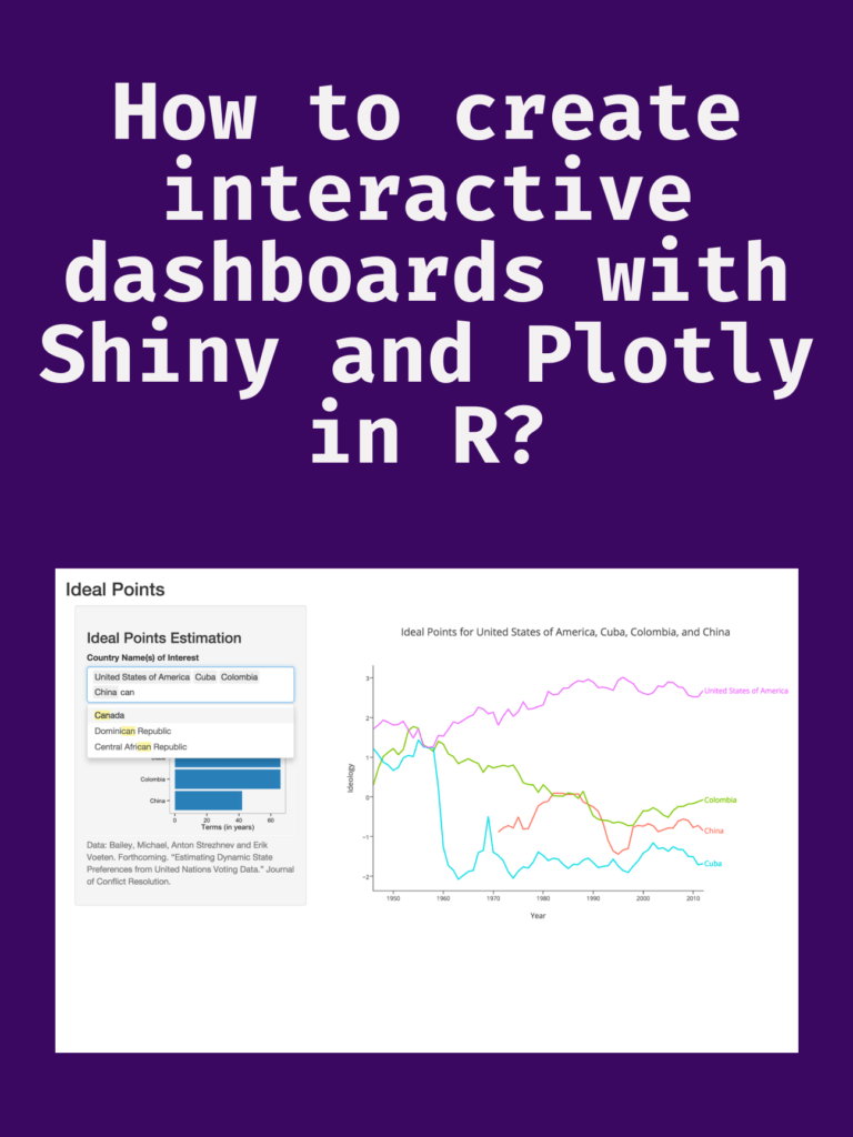
How to create interactive dashboards with Shiny and Plotly in R? Creating interactive dashboards is an important task in data analysis and visualization. Dashboards provide a way to visualize data and communicate insights to stakeholders. In this article, we will explore how to create interactive dashboards using Shiny and Plotly in R.
Shiny is a web application framework for R that allows users to create interactive web applications using R. Plotly is a powerful data visualization library that can create interactive visualizations for the web. Together, Shiny and Plotly provide a powerful toolset for creating interactive dashboards.

Setup
Before we start creating our dashboard, we need to install the necessary packages. We will be using the following packages:
install.packages("shiny")
install.packages("plotly")
Once we have installed these packages, we can start building our dashboard.
Building the dashboard
To start building our dashboard, we need to create a new Shiny application. We can do this by running the following command in R:
library(shiny)
shinyApp(ui = ui, server = server)
This will create a new Shiny application with a default user interface (UI) and server function (server).
Adding UI components
Next, we need to add UI components to our dashboard. These components will define the layout and appearance of our dashboard. We will be using the fluidPage function from Shiny to create a responsive UI. The fluidPage function will automatically adjust the layout of the dashboard based on the size of the user’s screen.
ui <- fluidPage(
  # Add UI components here
)
Next, we will add a title to our dashboard using the titlePanel function. We will also add a sidebar with input controls using the sidebarLayout and sidebarPanel functions.
ui <- fluidPage(
  titlePanel("My Dashboard"),
  sidebarLayout(
    sidebarPanel(
      # Add input controls here
    ),
    # Add output components here
  )
)
We can add various input controls to our sidebar using functions such as sliderInput, textInput, checkboxInput, and selectInput. These input controls will allow users to interact with our dashboard and filter or adjust the data displayed.
Adding server logic
Next, we need to add server logic to our dashboard. The server function will define how the dashboard reacts to user input and how it updates the visualizations.
server <- function(input, output) {
  # Add server logic here
}
We can use the renderPlotly function from Plotly to create interactive visualizations in our dashboard. This function takes a plotly object as input and creates an interactive visualization based on the user’s input.
server <- function(input, output) {
  output$plot <- renderPlotly({
    # Create interactive visualization here
  })
}
We can also use the reactive function from Shiny to create reactive expressions that update based on user input. These expressions can be used to filter data, adjust the parameters of visualizations, or perform calculations.
server <- function(input, output) {
  filtered_data <- reactive({
    # Filter data based on user input
  })

  output$plot <- renderPlotly({
    # Create interactive visualization based on filtered data
  })
}
Adding interactive visualizations
Finally, we can add interactive visualizations to our dashboard using the plot_ly function from Plotly. This function allows us to create a wide range of interactive visualizations, including scatterplots, bar charts, heatmaps, and more.
server <- function(input, output) {
  filtered_data <- reactive({

Download(PDF)