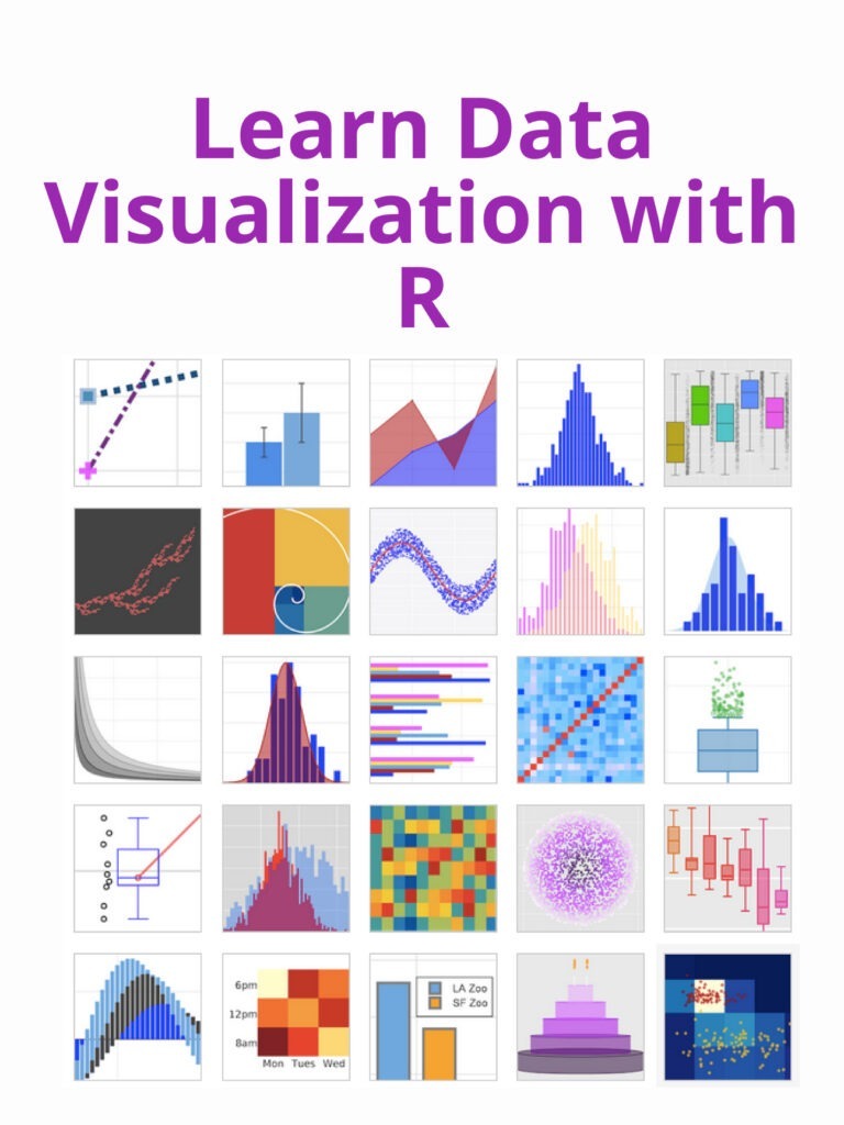
Learn Data Visualization with R: R is a popular programming language for data analysis and visualization. There are many more types of charts and graphs you can create, and R offers a wide range of tools for customizing your visualizations. Here are just a few examples of the types of data visualizations you can create with R.
- Scatter plot: A scatter plot is used to visualize the relationship between two variables. In R, you can create a scatter plot using the “plot” function. For example:
x <- c(1, 2, 3, 4, 5)
y <- c(2, 4, 6, 8, 10)
plot(x, y)
- Bar chart: A bar chart is used to compare the values of different categories. In R, you can create a bar chart using the “barplot” function. For example:
data <- c(10, 20, 30, 40, 50)
names <- c("A", "B", "C", "D", "E")
barplot(data, names.arg=names)
- Line chart: A line chart is used to show the trend of a variable over time. In R, you can create a line chart using the “plot” function with the “type” argument set to “l”. For example:
x <- c(1, 2, 3, 4, 5)
y <- c(2, 4, 6, 8, 10)
plot(x, y, type="l")
- Heat map: A heat map is used to visualize the intensity of a variable over a two-dimensional space. In R, you can create a heat map using the “heatmap” function. For example:
data <- matrix(c(1, 2, 3, 4, 5, 6, 7, 8, 9), nrow=3, ncol=3)
heatmap(data)
- Box plot: A box plot is used to show the distribution of a variable. In R, you can create a box plot using the “boxplot” function. For example:
data <- c(1, 2, 3, 4, 5)
boxplot(data)