As a student of data analysis, we understand that Principal Component Analysis (PCA) is a powerful tool that helps reduce the dimensionality of large datasets while retaining the most relevant information. PCA is widely used in various fields such as finance, biology, and image processing. In this article, we will guide you through the process of performing PCA using R, a popular statistical software.
Understanding Principal Component Analysis
PCA is a statistical method used to reduce the number of variables in a dataset while retaining the most important information. It works by transforming the original variables into a new set of uncorrelated variables, called principal components. These principal components are ordered in terms of the amount of variance they explain in the original data.
Performing PCA with R
In this section, we will show you how to perform PCA using R. We will use the iris dataset, which is included in the base R installation. The iris dataset contains measurements of the sepal length, sepal width, petal length, and petal width of three different species of iris flowers.

First, we load the iris dataset into R:
data(iris)
Next, we standardize the variables to have a mean of 0 and a standard deviation of 1, which is necessary for PCA:
irisscale <- scale(iris[,1:4])
Now, we can perform PCA on the standardized iris dataset:
irispca <- prcomp(irisscale)
The prcomp() function in R performs PCA and returns a list of objects. The most important object in the list is the rotation matrix, which contains the principal components.
Visualizing the Results of PCA
To visualize the results of PCA, we can create a scree plot, which shows the amount of variance explained by each principal component. We can create a scree plot using the following code:
plot(irispca)
This will create a plot that shows the proportion of variance explained by each principal component. The x-axis represents the principal components, and the y-axis represents the proportion of variance explained.
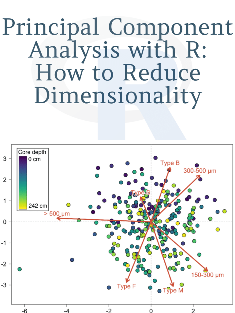
Next, we can create a biplot, which shows the relationship between the variables and the principal components. We can create a biplot using the following code:
biplot(irispca)
This will create a plot that shows the variables as arrows and the observations as points. The length and direction of the arrows represent the contribution of each variable to the principal components.
Download: Introduction to Scientific Programming and Simulation using R
