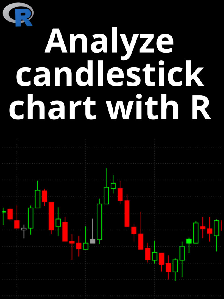
Analyze candlestick chart with R: A candlestick chart is a type of financial chart used to represent the price movement of an asset, such as a stock, currency, or commodity, over a specific period of time. It is called a “candlestick” chart because each data point is represented by a rectangular box with a vertical line protruding from the top and bottom, resembling a candle with a wick. To analyze a candlestick chart in R, you can use the quantmod package which provides functions for downloading financial data and plotting candlestick charts. Here’s an example of how to analyze a candlestick chart in R:
- Install and load the
quantmodpackage:
install.packages("quantmod")
library(quantmod)
- Download financial data for a stock using the
getSymbols()function. In this example, we’ll download data for Apple (AAPL) from Yahoo Finance:
getSymbols("AAPL", from = "2020-01-01", to = "2022-02-27")
This downloads daily data for AAPL from January 1, 2020 to February 27, 2022.
- Plot a candlestick chart using the
chartSeries()function fromquantmod:
chartSeries(AAPL, theme = "white", TA = NULL)
This will plot a candlestick chart for AAPL with a white background and no technical indicators.
- Analyze the chart. Candlestick charts can provide a wealth of information about price movements and trends. Here are some things to look for:
- Long green candles (or “bullish” candles) indicate that buyers were in control and pushed the price up.
- Long red candles (or “bearish” candles) indicate that sellers were in control and pushed the price down.
- Small candles with long upper and lower wicks indicate indecision or uncertainty in the market.
- Patterns such as “doji” candles (where the opening and closing prices are very close together) can indicate a potential trend reversal.
You can also use technical indicators and overlays to further analyze the chart, such as moving averages, Bollinger Bands, or MACD. The quantmod package provides functions for adding these indicators to your chart.
Here’s an example of how to add a simple moving average to your chart:
addSMA(20)
This will add a 20-day simple moving average to your chart. You can adjust the period of the moving average by changing the number in the function call.
Overall, analyzing candlestick charts requires some knowledge and interpretation of the technical analysis. It’s important to remember that past performance is not necessarily indicative of future results, and that chart patterns and indicators should be used in conjunction with other information to make trading decisions.