Graphics for Statistics and Data Analysis with R: In the realm of statistics and data analysis, visual representation plays a pivotal role in conveying insights effectively. Graphics, in this context, refer to the graphical representation of data through various plots, charts, and diagrams. These visuals are indispensable tools for analysts and researchers to comprehend complex datasets and communicate findings with clarity.
What are Graphics?
Graphics encompass a wide array of visual representations, including scatter plots, line graphs, bar charts, histograms, and more. These graphical elements serve to illustrate patterns, trends, and relationships within datasets, making it easier for data practitioners to interpret and draw conclusions.
Importance of Graphics in Data Analysis
The significance of graphics in data analysis cannot be overstated. While raw data may be difficult to interpret at a glance, well-designed graphics can elucidate underlying patterns and insights that might otherwise remain obscured. Moreover, visual representations facilitate effective communication of findings to stakeholders, enabling informed decision-making processes.
Download:
Basics of Data Visualization
Understanding Data Visualization
Data visualization is the graphical representation of information and data. It uses visual elements like charts, graphs, and maps to provide an accessible way to see and understand trends, outliers, and patterns in data.
Types of Data Visualization Techniques
Data visualization techniques vary based on the nature of the data and the insights being sought. Common types include:
- Scatter plots: Displaying the relationship between two variables.
- Line graphs: Showing trends over time or continuous data.
- Histograms: Representing the distribution of numerical data.
- Bar charts: Comparing categories of data using rectangular bars.
Introduction to R for Data Analysis
R is a powerful programming language and environment for statistical computing and graphics. It provides a wide variety of statistical and graphical techniques, making it a preferred choice for data analysis tasks.
Overview of R Programming Language
R is an open-source language with a vibrant community of users and developers. It offers extensive libraries and packages for various statistical analyses, making it versatile and adaptable to diverse data analysis needs.
Why Use R for Data Analysis?
R’s rich ecosystem of packages, particularly for graphics and visualization, sets it apart as a premier tool for data analysis. Its flexibility and scalability make it suitable for both exploratory data analysis and production-level applications.
Graphics Packages in R
R boasts several graphics packages, each with its strengths and capabilities. Some of the most prominent packages include ggplot2, lattice, and base R graphics.
ggplot2
ggplot2 is a widely used package for creating graphics in R. It follows a layered approach to plotting, allowing users to build complex visualizations with ease.
lattice
lattice is another popular package for producing trellis plots in R. It excels in creating conditioned plots, which display subsets of data based on specified conditions.
base R graphics
Base R graphics provide a foundation for creating basic plots such as scatter plots, histograms, and bar charts. While less flexible than ggplot2 or lattice, base R graphics are intuitive and sufficient for many data visualization tasks.
Creating Basic Plots in R
R offers straightforward methods for generating common types of plots, making them accessible to beginners and experts alike.
Scatter Plots
Scatter plots are useful for visualizing the relationship between two continuous variables. They plot data points on a two-dimensional plane, with one variable on each axis.
Line Graphs
Line graphs depict trends over time or continuous data points by connecting data points with straight lines. They are effective for illustrating changes and patterns in data.
Histograms
Histograms display the distribution of numerical data by dividing it into intervals, or bins, and counting the number of data points in each bin. They provide insights into the shape and spread of the data.
Bar Charts
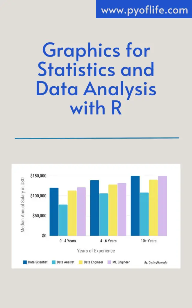
Bar charts represent categorical data with rectangular bars of lengths proportional to the values they represent. They are suitable for comparing the frequencies or proportions of different categories.
Advanced Plotting Techniques
Once familiar with the basics, users can leverage advanced techniques to create more sophisticated and customized plots in R.
Adding Layers and Aesthetics in ggplot2
ggplot2 allows users to add layers to plots, enabling the overlay of multiple visual elements such as points, lines, and shapes. Additionally, aesthetics such as color, size, and shape can be customized to enhance the visual appeal of plots.
Customizing Plots with Themes and Color Palettes
Themes and color palettes can significantly impact the appearance of plots. ggplot2 offers a variety of pre-defined themes and color schemes, as well as options for creating custom themes to match specific preferences or branding requirements.
Faceting and Grouping Data
Faceting involves dividing a plot into multiple panels based on the values of one or more categorical variables. This allows for comparisons across different subsets of the data. Similarly, grouping data enables the creation of separate visualizations for each group, facilitating deeper insights into patterns and trends.
Interactive Visualization with Shiny
Shiny is an R package that enables the creation of interactive web applications for data visualization. It allows users to build dynamic dashboards and visualizations that respond to user inputs in real time.
Introduction to Shiny for Web-based Visualization
Shiny simplifies the process of developing interactive web-based applications, making it accessible to data analysts and researchers without extensive web development experience.
Building Interactive Dashboards with Shiny
Shiny provides a framework for designing interactive dashboards with features such as sliders, dropdown menus, and checkboxes for user interaction. These dashboards can incorporate multiple plots and visualizations, allowing users to explore data from different perspectives.
Best Practices in Data Visualization
Effective data visualization hinges on adhering to best practices that ensure clarity, accuracy, and interpretability.
Choosing the Right Plot for Your Data
Selecting the appropriate type of plot depends on the nature of the data and the insights being conveyed. Understanding the strengths and limitations of each plot type is essential for effective communication of findings.
Ensuring Clarity and Readability
Clear labeling, appropriate scaling, and judicious use of color are crucial for ensuring that visualizations are easily interpretable by viewers of varying backgrounds and expertise levels.
Labeling and Annotating Plots Effectively
Labels, titles, and annotations provide context and explanation for visualizations. They should be concise yet informative, guiding viewers’ interpretation of the data without overwhelming them with unnecessary detail.
Conclusion: Graphics for Statistics and Data Analysis with R
Graphics are indispensable tools for statistics and data analysis, enabling analysts to explore, visualize, and communicate insights effectively. R provides a comprehensive suite of tools and packages for creating a wide range of plots and visualizations, from basic charts to interactive dashboards. By mastering the fundamentals of data visualization and leveraging advanced techniques, analysts can unlock the full potential of graphics to extract meaningful insights from complex datasets.
Read More: R Graphics Cookbook: Practical Recipes for Visualizing Data