Data Analysis with Microsoft Excel

Data Analysis with Microsoft Excel: Data analysis is an essential part of any business or research project. It helps you to make informed decisions and understand the patterns and trends in your data. Microsoft Excel is one of the most widely used tools for data analysis, thanks to its versatility and user-friendliness. In this article, we will explore some of the basic and advanced techniques you can use to analyze data in Microsoft Excel.

Data Analysis with Microsoft Excel
  1. Sorting and filtering data:

Sorting and filtering are basic features that help you organize and narrow down your data to a specific range. To sort your data in Excel, select the data range, click on the Data tab, and then click on the Sort icon. Choose the column you want to sort by and select either ascending or descending order.

Filtering is used to display specific data within a range. To filter your data, select the data range, click on the Data tab, and then click on the Filter icon. You can then select the column you want to filter and choose the specific criteria for the filter.

  1. Pivot tables:

Pivot tables are a powerful tool for analyzing large amounts of data. They allow you to summarize and aggregate data based on different criteria. To create a pivot table in Excel, select the data range, click on the Insert tab, and then click on the Pivot Table icon. You can then choose the columns you want to include in the pivot table and drag and drop them into the appropriate areas of the pivot table.

  1. Conditional formatting:

Conditional formatting is used to highlight specific data based on certain conditions. For example, you can highlight all the cells that contain a value greater than a certain threshold. To apply conditional formatting in Excel, select the data range, click on the Home tab, and then click on the Conditional Formatting icon. You can then choose the formatting rules you want to apply.

  1. Charts and graphs:

Charts and graphs are a great way to visualize your data and identify patterns and trends. Excel offers a wide range of chart types, including column charts, line charts, and pie charts. To create a chart in Excel, select the data range, click on the Insert tab, and then click on the chart type you want to create.

  1. Regression analysis:

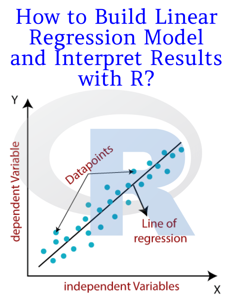
Regression analysis is a statistical technique used to analyze the relationship between two or more variables. Excel provides a built-in tool for performing regression analysis. To perform a regression analysis in Excel, select the data range, click on the Data Analysis icon in the Data tab, and then choose Regression from the list of options.

Microsoft Excel provides a wide range of tools and features for data analysis. By mastering these tools, you can analyze your data more effectively and make informed decisions based on your findings. Whether you are a business professional or a researcher, Excel is a powerful tool that can help you unlock the insights hidden in your data.

Download(PDF)

Data Visualisation in Python Quick and Easy

Data Visualisation in Python Quick and Easy: Data visualization is an essential aspect of data science and analytics. It involves representing data in graphical form to make it easier to understand and extract insights from. Python is a popular programming language for data visualization, thanks to its versatility and numerous libraries available for data visualization.

In this article, we will explore some quick and easy routes to creating stunning data visualizations in Python.

Data Visualisation in Python Quick and easy
  1. Matplotlib Matplotlib is a popular data visualization library in Python. It provides a wide range of options for creating high-quality charts, graphs, and plots. With Matplotlib, you can create line plots, scatter plots, bar plots, histograms, and more. It is easy to use and is often the go-to library for many data scientists.

To create a line plot in Matplotlib, for instance, you can use the following code:

import matplotlib.pyplot as plt
x = [1, 2, 3, 4, 5]
y = [10, 8, 6, 4, 2]
plt.plot(x, y)
plt.show()
  1. Seaborn Seaborn is another popular data visualization library in Python that is built on top of Matplotlib. It provides a higher-level interface for creating visually appealing and informative statistical graphics. Seaborn includes features such as easy-to-use color palettes, attractive default styles, and built-in themes.

To create a histogram using Seaborn, you can use the following code:

import seaborn as sns
import pandas as pd
data = pd.read_csv('data.csv')
sns.histplot(data=data, x='age', bins=20)
  1. Plotly Plotly is a web-based data visualization library that enables you to create interactive plots and charts. It is easy to use and offers a wide range of customization options, making it ideal for creating stunning visualizations for web applications.

To create an interactive scatter plot using Plotly, you can use the following code:

import plotly.express as px
import pandas as pd
data = pd.read_csv('data.csv')
fig = px.scatter(data, x='height', y='weight', color='gender')
fig.show()
  1. Bokeh Bokeh is a Python data visualization library that provides interactive and responsive visualization tools for modern web browsers. It is particularly useful for creating dynamic visualizations such as interactive dashboards and real-time data streaming applications.

To create a scatter plot with hover tooltips using Bokeh, you can use the following code:

from bokeh.plotting import figure, output_file, show
import pandas as pd
data = pd.read_csv('data.csv')
p = figure(title='Height vs Weight', x_axis_label='Height', y_axis_label='Weight', tooltips=[('Gender', '@gender')])
p.circle(data['height'], data['weight'], color=data['gender'], size=10)
output_file('scatter.html')
show(p)

In conclusion, Python provides several libraries for data visualization, each with its strengths and weaknesses. Choosing the right library for your visualization task will depend on your data, the type of visualization you want to create, and your specific requirements. The four libraries discussed above are just some of the popular ones in the Python data science community, and they can help you create beautiful and informative data visualizations with ease.

Download(PDF)

Exploring the Titanic Dataset with R: A Beginner’s Guide to EDA

Exploring the Titanic Dataset with R: A Beginner’s Guide to EDA It contains information about the passengers who were aboard the ill-fated Titanic, including their demographics, ticket information, cabin information, and survival status.

This dataset is often used for exploring various data analysis techniques and machine learning algorithms. In this article, we will explore the Titanic dataset using R and perform exploratory data analysis (EDA) to understand the data better.

Exploring the Titanic Dataset with R A Beginner's Guide to EDA
A Beginner’s Guide to EDA

Loading the Titanic Dataset

The Titanic Dataset can be downloaded from various sources, but in this article, we will use the “titanic” package, which is available on the Comprehensive R Archive Network (CRAN). To load the package and the dataset, we can use the following code:

# Install the titanic package if not already installed
# install.packages("titanic")

# Load the titanic package
library(titanic)

# Load the titanic dataset
data("Titanic")

Understanding the Titanic Dataset

Before we dive into the EDA, let’s understand the structure of the Titanic dataset. We can use the str() function to get the structure of the dataset:

str(Titanic)

The output of the above code shows that the Titanic dataset is a 4-dimensional array with dimensions Class, Sex, Age, and Survived. The Class dimension has three levels (1st, 2nd, and 3rd class), the Sex dimension has two levels (male and female), the Age dimension has two levels (child and adult), and the Survived dimension has two levels (no and yes).

Exploring the Titanic Dataset

Now that we understand the structure of the Titanic dataset let’s perform an EDA to understand the data better. We will start by looking at the overall survival rate of the passengers.

# Calculate the overall survival rate
overall_survival_rate <- sum(Titanic) / length(Titanic)
overall_survival_rate

The output of the above code shows that the overall survival rate of the passengers was around 32%. Now, let’s look at the survival rate by sex.

# Calculate the survival rate by sex
sex_survival_rate <- prop.table(Titanic, margin = c(2, 4))
sex_survival_rate

The output of the above code shows that the survival rate of female passengers was significantly higher than that of male passengers. Now, let’s look at the survival rate by class.

# Calculate the survival rate by class
class_survival_rate <- prop.table(Titanic, margin = c(1, 4))
class_survival_rate

The output of the above code shows that the survival rate of first-class passengers was significantly higher than that of second and third-class passengers. Finally, let’s look at the survival rate by age group.

# Calculate the survival rate by age group
age_survival_rate <- prop.table(Titanic, margin = c(3, 4))
age_survival_rate

The output of the above code shows that the survival rate of children was significantly higher than that of adults.

ANOVA and Tukey’s HSD Test with R: How to Compare Multiple Means

ANOVA and Tukey’s HSD Test with R: When conducting statistical analysis, it is often necessary to compare multiple means to determine if they are statistically significant. One commonly used method for doing so is ANOVA, or analysis of variance, which is a hypothesis-testing technique used to determine if there is a significant difference between the means of two or more groups.

In this article, we will discuss how to use ANOVA and Tukey’s HSD test in R to compare multiple means.

ANOVA and Tukey's HSD Test with R How to Compare Multiple Means
ANOVA and Tukey’s HSD Test with R How to Compare Multiple Means

Step 1: Load the Data To begin, you will need to load your data into R. You can do this using the read.csv() function or by importing your data from a file. Once your data is loaded, you can use the summary() function to get a quick overview of the data.

Step 2: Conduct ANOVA Analysis To conduct an ANOVA analysis in R, you can use the aov() function. The aov() function takes two arguments: the first is the formula, which specifies the variables you want to compare, and the second is the data frame containing the variables.

For example, if you have a data frame called “mydata” with three variables called “group1”, “group2”, and “group3”, you can conduct an ANOVA analysis using the following code:

mydata.aov <- aov(formula = c(group1, group2, group3) ~ 1, data = mydata)

The “formula” argument specifies that we want to compare the means of the three groups, while the “data” argument specifies the name of the data frame containing the variables.

Step 3: View the ANOVA Results Once you have conducted the ANOVA analysis, you can view the results using the summary() function:

summary(mydata.aov)

The summary() function will provide you with information about the F-statistic, degrees of freedom, and p-value.

Step 4: Conduct Tukey’s HSD Test If the ANOVA analysis shows that there is a significant difference between the means of the groups, you can use Tukey’s HSD test to determine which groups are different from each other.

To conduct Tukey’s HSD test in R, you can use the TukeyHSD() function:

tukey <- TukeyHSD(mydata.aov)

The TukeyHSD() function takes the ANOVA object as its argument and returns a matrix that shows the difference between the means of each group, along with the p-value and confidence interval.

Step 5: View the Tukey’s HSD Test Results To view the results of the Tukey’s HSD test, you can use the print() function:

print(tukey)

This will provide you with a table showing the means, the differences between the means, and the confidence intervals.

Download:

Beginning Python: From Novice to Professional

Beginning Python: From Novice to Professional: Python is one of the most popular programming languages in the world. It is easy to learn, versatile, and widely used in a variety of industries, from data science to web development. If you are a beginner in Python, this article is for you. In this article, we will take you on a journey from a beginner to an expert in Python.

Getting Started with Python

Python is an interpreted language, which means that you don’t need to compile your code before running it. To get started with Python, you need to install it on your computer. You can download Python from the official website, and the installation process is straightforward. Once you have installed Python, you can start coding.

Beginning Python From Novice to Professional

Python basics

Python syntax is easy to learn, and you can write your first program in a matter of minutes. In Python, you use the print() function to display output on the screen. Here is an example:

print("Hello, World!")

This program will display the message “Hello, World!” on the screen.

Variables in Python

In Python, you use variables to store data. A variable is a container that holds a value. To create a variable in Python, you simply assign a value to it. Here is an example:

name = "John"
age = 25

In this example, we created two variables, name and age, and assigned them the values “John” and 25, respectively.

Data types in Python

Python supports several data types, including strings, integers, floats, and booleans. A string is a sequence of characters, enclosed in quotes. An integer is a whole number, and a float is a decimal number. A boolean is a value that is either true or false. Here are some examples:

name = "John"    # string
age = 25         # integer
height = 1.75    # float
is_student = True   # boolean

Control flow in Python

Control flow is how a program decides which statements to execute. Python has several control flow statements, including if, elif, and else. Here is an example:

age = 25

if age < 18:
    print("You are too young to vote.")
elif age >= 18 and age < 21:
    print("You can vote but not drink.")
else:
    print("You can vote and drink.")

In this example, we used if, elif, and else statements to determine if a person is eligible to vote and drink.

Functions in Python

A function is a block of code that performs a specific task. In Python, you define a function using the def keyword. Here is an example:

def add_numbers(x, y):
    return x + y

result = add_numbers(3, 5)
print(result)

In this example, we defined a function add_numbers that takes two parameters, x and y, and returns their sum. We then called the function with the arguments 3 and 5 and printed the result, which is 8.

How to Build Linear Regression Model and Interpret Results with R?

Linear regression is a widely used statistical modeling technique for predicting the relationship between a dependent variable and one or more independent variables. It is commonly used in various fields such as economics, finance, marketing, and social sciences. In this article, we will discuss how to build a linear regression model in R and interpret its results.

How to Build Linear Regression Model and Interpret Results with R?

Steps to build a linear regression model in R:

Step 1: Install and load the necessary packages

To build a linear regression model in R, we need to install and load the necessary packages. The “tidyverse” package includes many useful packages, including “dplyr”, “ggplot2”, and “tidyr”. We will also use the “lm” function, which is built into R, for building the linear regression model.

# install.packages("tidyverse")
library(tidyverse)

Step 2: Load and explore the data

We need to load the data into R and explore its structure, dimensions, and summary statistics to gain insights into the data. In this example, we will use the “mtcars” dataset, which is included in R. This dataset contains information about various car models and their performance characteristics.

data(mtcars)
head(mtcars)
summary(mtcars)

Step 3: Create the model

To create the linear regression model, we need to use the “lm” function in R. We need to specify the dependent variable and the independent variables in the formula. In this example, we will use the “mpg” (miles per gallon) variable as the dependent variable and the “wt” (weight) variable as the independent variable.

# Create the linear regression model
model <- lm(mpg ~ wt, data = mtcars)

Step 4: Interpret the model

Once the model is created, we need to interpret its coefficients, standard errors, p-values, and R-squared value to understand its significance and predictive power.

# Display the model coefficients, standard errors, p-values, and R-squared value
summary(model)

The output of the summary() function shows the following:

Call:
lm(formula = mpg ~ wt, data = mtcars)

Residuals:
    Min      1Q  Median      3Q     Max 
-4.5432 -2.3647 -0.1252  1.4096  6.8727 

Coefficients:
            Estimate Std. Error t value Pr(>|t|)    
(Intercept)  37.2851     1.8776  19.858  < 2e-16 ***
wt           -5.3445     0.5591  -9.559 1.29e-10 ***
---
Signif. codes:  0 ‘***’ 0.001 ‘**’ 0.01 ‘*’ 0.05 ‘.’ 0.1 ‘ ’ 1

Residual standard error: 3.046 on 30 degrees of freedom
Multiple R-squared:  0.7528,    Adjusted R-squared:  0.7446 
F-statistic: 91.38 on 1 and 30 DF,  p-value: 1.294e-10

The “Estimate” column shows the coefficients of the linear regression model. The intercept value is 37.2851, which represents the predicted value of the dependent variable when the independent variable is zero. The coefficient of the “wt” variable is -5.3445, which indicates that as the weight of the car increases by one.

Download(PDF)


Read More: Learn R for Applied Statistics: With Data Visualizations, Regressions, and Statistics

An Introduction to Spatial Regression Analysis in R

An Introduction to Spatial Regression Analysis in R: Spatial regression analysis is a statistical technique used to model spatial relationships between variables. It is an important tool for analyzing data that exhibit spatial dependence, such as data that is geographically referenced. Spatial regression analysis allows us to identify and quantify the spatial patterns in data and to make predictions based on these patterns.

R is a popular programming language used for statistical computing and graphics. It is a powerful tool for performing spatial regression analysis. In this article, we will provide an introduction to spatial regression analysis in R.

An Introduction to Spatial Regression Analysis in R

Download:

Getting Started with R

To get started with R, you need to install the R software on your computer. You can download the software from the official website. Once you have installed R, you can open it and start using it to perform spatial regression analysis.

Spatial Regression Analysis in R

Spatial regression analysis in R involves several steps. First, you need to load the data into R. The data should be in a format that R can read, such as a comma-separated value (CSV) file. Once the data is loaded into R, you can perform spatial regression analysis using the spatial regression functions available in R.

One of the most common spatial regression models used in R is the spatial autoregressive model. This model assumes that the value of a variable at a given location is influenced by the values of that variable at neighboring locations. The spatial autoregressive model can be estimated using the spatialreg package in R.

Another commonly used spatial regression model is the spatial error model. This model assumes that the values of a variable at neighboring locations are correlated due to unobserved factors. The spatial error model can also be estimated using the spatialreg package in R.

Spatial regression analysis in R involves several other functions and packages, such as the spdep package, which provides tools for spatial dependence analysis, and the rgdal package, which provides tools for reading and writing spatial data.

Visualizing Spatial Data in R

R provides a range of tools for visualizing spatial data. You can create maps and plots of spatial data using the ggplot2 package and the leaflet package in R. These packages allow you to create interactive maps and visualizations that can be customized to suit your needs.

Storytelling with Data: A Data Visualization Guide for Business Professionals

Storytelling with Data: Do you want to learn how to communicate effectively with data? Do you want to impress your boss, clients, and colleagues with your data-driven insights and recommendations? Do you want to master the art and science of storytelling with data?

If you answered yes to any of these questions, then this blog post is for you. In this post, I will share with you some tips and tricks on how to use data storytelling to enhance your business communication skills and achieve your goals.

Storytelling with Data: A Data Visualization Guide for Business Professionals

What is data storytelling?

Data storytelling is the process of creating and delivering a narrative that explains, illustrates, or persuades using data as evidence. Data storytelling combines three elements: data, visuals, and narrative.

Data is the raw material that provides the facts and figures that support your message. Visuals are the graphical representations that help you display and highlight the key patterns, trends, and insights from your data. A narrative is a verbal or written explanation that connects the dots and tells a coherent and compelling story with your data.

Why is data storytelling important?

Data storytelling is important because it helps you:

  • Capture and maintain your audience’s attention. Data storytelling makes your message more engaging and memorable by using visuals and narrative techniques that appeal to human emotions and curiosity.
  • Simplify and clarify complex information. Data storytelling helps you distill and organize large amounts of data into meaningful and actionable insights that your audience can easily understand and relate to.
  • Influence and persuade your audience. Data storytelling helps you establish credibility and trust by backing up your claims with evidence. It also helps you motivate and inspire your audience to take action by showing them the benefits and implications of your data analysis.

How to create a data story?

Creating a data story is not a one-size-fits-all process. It depends on various factors such as your audience, your purpose, your data, and your medium. However, here are some general steps that can guide you in crafting a data story:

  1. Define your audience and your goal. Before you start working on your data story, you need to know who you are talking to and what you want to achieve. Ask yourself: Who is my audience? What do they care about? What do they already know? What do they need to know? What do I want them to do or feel after hearing my story?
  2. Find and analyze your data. Once you have a clear idea of your audience and your goal, you need to find and analyze the data that will support your message. Ask yourself: What data sources are available and relevant? How can I clean, transform, and explore the data? What are the key insights and patterns that emerge from the data?
  3. Choose your visuals and narrative techniques. After you have identified the main insights from your data, you need to choose how to present them visually and verbally. Ask yourself: What type of chart or graph best suits my data and my message? How can I design my visuals to make them clear, attractive, and effective? What narrative techniques can I use to structure my story and make it interesting and persuasive?
  4. Deliver your data story. The final step is to deliver your data story to your audience using the appropriate medium and format. Ask yourself: How can I tailor my delivery to suit my audience’s preferences and expectations? How can I use verbal and non-verbal cues to enhance my presentation skills? How can I solicit feedback and measure the impact of my data story?

Read more: Data Visualization and Exploration with R

Download(PDF)

Exploratory Data Analysis with R: How to Visualize and Summarize Data

Exploratory Data Analysis with R: How to Visualize and Summarize Data: Exploratory Data Analysis (EDA) is a critical step in any data analysis project. It involves the use of statistical and visualization techniques to summarize and understand the main characteristics of a dataset. R is a powerful programming language and environment for statistical computing and graphics, making it an excellent choice for EDA. In this article, we will explore how to perform EDA with R, focusing on data visualization and summary statistics.

Exploratory Data Analysis with R How to Visualize and Summarize Data

Download:

Importing Data

The first step in EDA is importing the data into R. R supports various file formats, including CSV, Excel, and SPSS. Let’s assume that we have a CSV file named “data.csv” in our working directory that we want to import. We can use the read.csv() function to import the data.

data <- read.csv("data.csv")

Exploring the Data

Once the data is imported, we can begin exploring it. We can start by getting an overview of the data using the summary() function, which provides basic summary statistics for each column of the dataset.

summary(data)

This will give us information such as the minimum and maximum values, mean, median, and quartiles for each numeric column, as well as the number of unique values for categorical columns.

We can also use the str() function to get a more detailed view of the structure of the data.

str(data)

This will show us the type of each column, as well as the number of observations and the number of missing values.

Visualizing the Data

EDA is not complete without data visualization. R provides a wide range of graphical tools for data visualization, including scatter plots, histograms, box plots, and more. Let’s look at some of the most common types of plots used in EDA.

Scatter Plots

A scatter plot is a graph that displays the relationship between two numeric variables. We can create a scatter plot using the plot() function.

plot(data$variable1, data$variable2)

This will create a scatter plot of “variable1” on the x-axis and “variable2” on the y-axis.

Histograms

A histogram is a graph that displays the distribution of a numeric variable. We can create a histogram using the hist() function.

hist(data$variable)

This will create a histogram of “variable”.

Box Plots

A box plot is a graph that displays the distribution of a numeric variable, as well as any outliers. We can create a box plot using the boxplot() function.

boxplot(data$variable)

This will create a box plot of “variable”.

Summary Statistics

In addition to visualization, we can also use summary statistics to understand the main characteristics of the data. R provides several functions for computing summary statistics, including mean, median, standard deviation, and more. Let’s look at some of the most common summary statistics.

Mean

The mean is the average value of a numeric variable. We can calculate the mean using the mean() function.

mean(data$variable)

This will calculate the mean of “variable”.

Median

The median is the middle value of a numeric variable. We can calculate the median using the median() function.

median(data$variable)

This will calculate the median of “variable”.

Standard Deviation

The standard deviation is a measure of the spread of a numeric variable. We can calculate the standard deviation using the sd() function.

sd(data$variable)

This will calculate the standard deviation of “variable”.

Practical Web Scraping for Data Science: Best Practices and Examples with Python

Practical Web Scraping for Data Science: Web scraping, also known as web harvesting or web data extraction, is a technique used to extract data from websites. It involves writing code to parse HTML content and extract information that is relevant to the user. Web scraping is an essential tool for data science, as it allows data scientists to gather information from various online sources quickly and efficiently. In this article, we will discuss practical web scraping techniques for data science using Python.

Before diving into the practical aspects of web scraping, it is essential to understand the legal and ethical implications of this technique. Web scraping can be used for both legal and illegal purposes, and it is essential to use it responsibly. It is crucial to ensure that the data being extracted is not copyrighted, and the website’s terms of service permit web scraping. Additionally, it is important to avoid overloading a website with requests, as this can be seen as a denial-of-service attack.

Practical Web Scraping for Data Science Best Practices and Examples with Python

Now let’s dive into the practical aspects of web scraping for data science. The first step is to identify the website that contains the data you want to extract. In this example, we will use the website “https://www.imdb.com” to extract information about movies. The website contains a list of top-rated movies, and we will extract the movie title, release year, and rating.

To begin, we need to install the following Python libraries: Requests, Beautiful Soup, and Pandas. These libraries are essential for web scraping and data manipulation.

!pip install requests
!pip install beautifulsoup4
!pip install pandas

After installing the necessary libraries, we can begin writing the code to extract the data. The first step is to send a request to the website and retrieve the HTML content.

import requests

url = 'https://www.imdb.com/chart/top'
response = requests.get(url)

Once we have the HTML content, we can use Beautiful Soup to parse the HTML and extract the information we want.

from bs4 import BeautifulSoup

soup = BeautifulSoup(response.content, 'html.parser')
movies = soup.select('td.titleColumn')

The select method is used to select elements that match a specific CSS selector. In this example, we are selecting all the elements with the class “titleColumn.”

We can now loop through the movies list and extract the movie title, release year, and rating.

movie_titles = []
release_years = []
ratings = []

for movie in movies:
    title = movie.find('a').get_text()
    year = movie.find('span', class_='secondaryInfo').get_text()[1:-1]
    rating = movie.find('td', class_='ratingColumn imdbRating').get_text().strip()
    
    movie_titles.append(title)
    release_years.append(year)
    ratings.append(rating)

Finally, we can create a Pandas dataframe to store the extracted data.

import pandas as pd

df = pd.DataFrame({'Title': movie_titles, 'Year': release_years, 'Rating': ratings})
print(df.head())

The output will be a dataframe containing the movie title, release year, and rating.

 Title  Year Rating
0  The Shawshank Redemption  1994    9.2
1             The Godfather  1972    9.1
2    The Godfather: Part II  1974    9.0
3           The Dark Knight  2008    9.0
4              12 Angry Men  1957    8.9

Downlod(PDF)