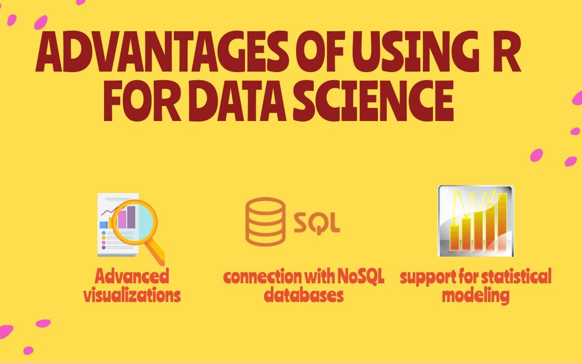
Data science

Advantages of Using R for Data Science

Advantages of Using R for Data Science, In modern times, the field of data science is evolving at a breakneck pace. Hence, businesses need to embrace the same before getting left behind at a distance that will keep on increasing over time. R is a powerful tool that has excellent statistical and visualization capabilities, making it very attractive to data scientists.

R is the most powerful tool to execute algorithms related to data science and has the capability of working with abundant data. It provides a wide variety of linear and non-linear models, classical statistical tests, time series analysis and machine learning capabilities (i.e., classification, clustering, regression, and reinforcement learning), and excellent visualization techniques.

5 Advantages of Using R for Data Science

1) Free and Open Source

An open-source language is a language on which we can work without needing a license or a fee. R is an open-source language. We can contribute to the development of R by optimizing our packages, developing new ones, and resolving issues.

2) Extensive support for statistical modeling

Statistical modeling is essential to determine how one variable is related to others. R provides powerful capabilities to deal with statistical modeling. It has excellent functions for central tendency, the measure of variability, probability, hypothesis testing, ANOVA, and regression analysis.

3) Extremely easy data wrangling

R has several packages that hugely simplify the process of preparing your data for analysis. You may have your data stored in the .csv or .txt file, in Excel spreadsheets, in relational databases, or as a SAS or Stata file. R can load these various types of files with just one line of code. 

The process of data cleaning and transforming is also straightforward. One line of code – and you create a separate dataset without any missing values, another line – and you impose multiple filters on your data. With such powerful capabilities, the time you spend preparing your data for analysis can decrease significantly, giving you more time to spend it on the analysis itself. 

4) The connection with NoSQL databases

The majority of data science projects deal with unstructured data. R can provide interfaces with NoSQL databases and analyze unstructured data in effective ways.

5) Advanced visualizations

Even the basic functionality of R allows you to create histograms, scatterplots, or line plots with only a tiny bit of code. These are very convenient functions for visualizing your data before even starting any analysis. In a few seconds, you can see your data and get insights that are not visible from the tabulated data alone.

However, if you spend some time learning more advanced visualization packages, such as ggplot2, for example, you’ll be able to build some very impressive graphs. R provides seemingly countless ways to visualize your data. These graphs will look very professional. And you’ll get access to a whole host of extra options, such as adding maps to your visualizations or making them animated.

How to Choose the Right Data Visualization

How to Choose the Right Data Visualization is divided into chapters, one for each of the main categories for using data visualization. Each chapter is headed by a short introduction and a list of chart types falling into that category. Each chart type is accompanied by a brief description and one or more icons. Below is a key for decoding these symbols:

BASIC: Chart types with this icon represent typical or standard chart types. When you need to create a data visualization, try to see if one of these chart, types works first, before deciding on an uncommon or advanced type.
UNCOMMON: Chart types with this icon are slightly more unusual than the most common chart types. Use cases for these charts are more specialized than other chart types in that same category or more frequently seen in other roles.
ADVANCED: Chart types with this icon are even more specialized in their roles. Make sure that the chart type is the best one for your use case before implementing it. Sometimes, these chart types will not be built into visualization software or libraries, and additional work will need to be done to put these types of charts together.

How to Choose the Right Data Visualization

Follow us on Facebook: https://www.facebook.com/pyoflife

Solving a System of Equations in R With Examples

Solving a System of Equations in R With Examples: Solving a system of equations in R is a common task in mathematical and statistical applications. R has several built-in functions and packages to solve systems of equations, including the lm() function and the ‘rootSolve’ package. In this article, we will demonstrate how to solve a system of equations in R using these tools, with examples.

Solving a System of Equations in R With Examples

Example 1: Solving a System of Linear Equations with lm() Function

The lm() function can be used to solve a system of linear equations, where the equation can be represented in the form of y = mx + b, where m is the slope and b is the y-intercept. Let’s consider the following system of two linear equations:

y = 2x + 1

y = -x + 3

To solve this system of equations using lm() function, we first have to create a data frame to represent the equations, and then use the lm() function to fit a linear model to the data.

Creating a data frame to represent the equations

df <- data.frame(x = c(1, 2, 3), y = c(3, 5, 7))

Fitting a linear model to the data

lm_fit <- lm(y ~ x, data = df)

Extracting the coefficients of the model

coeffs <- coefficients(lm_fit)

Solving for x and y

x <- -(coeffs[1]/coeffs[2]) y <- coeffs[1] + coeffs[2] * x

Printing the solution

cat(“The solution is x =”, x, “and y =”, y)

The output will be:

The solution is x = 1.5 and y = 4

Example 2: Solving a Non-Linear System of Equations with rootSolve Package

The rootSolve package can be used to solve a non-linear system of equations, where the equations are not represented in the form of y = mx + b. Let’s consider the following system of two non-linear equations:

x^2 + y^2 = 1

x + y = 1

To solve this system of equations using rootSolve package, we first have to install and load the package, and then use the uniroot() function to find the solution.

Installing and loading the rootSolve package

install.packages(“rootSolve”) library(rootSolve)

Defining the system of equations

equations <- function(z) { x <- z[1] y <- z[2] f1 <- x^2 + y^2 – 1 f2 <- x + y – 1 c(f1, f2) }

Solving for x and y

solution <- uniroot(equations, c(-1, -1))

Printing the solution

cat(“The solution is x =”, solution$root[1], “and y =”, solution$root[2])

The output will be:

The solution is x = 0.5 and y = 0.5

Solving a system of equations in R is a straightforward task with the help of built-in functions and packages such as lm() and rootSolve. These functions can be used to solve both linear and non-linear systems of equations and provide accurate solutions for real-world problems.

Hypothesis testing A Visual Introduction To Statistical Significance

This book contains examples of different types of hypothesis testing to determine if you have a statistically significant result. It is intended to be direct and to give easy to follow example problems that you can duplicate. In addition to information about what statistical significance is, or what the normal curve is exactly, the book contains a worked example for these types of statistical significance problems

  • Z Test
  • 1 Sample T-Test
  • Paired T-Test ( 2 examples )
  • 2 Sample T-Test with Equal Variance
  • 2 Sample T-Test with Unequal Variance
  • Every example has been worked by hand showing the appropriate equations
  • and also done in Excel using the Excel functions. So every example has 2
  • different ways to solve the problem. Additionally, this book includes a
  • Z Table
  • T Table
  • Along with the functions that you can use to create your own Z-Table or TTable
  • in Excel.

Table of Contents
Statistical Significance Overview
The Most Important Concept In This Book (If you read
nothing else, read this)
Variations Of Statistical Significance Problems
Example 1 – Z Test
But What Is The Normal Curve?
Doing A T-Test, Which Is Slightly Different Than A Z Test
Example 2 – 1 Sample T-Test
Paired T-Test – When You Use The Same Test Subject
Multiple Times
Example 3 – Paired T-Test
Example 3A – Paired T-Test With Non-Zero Hypothesis
Example 4 – Two-Sample T-Test with Equal Variance
Example 5 – 2 Sample T-Test With Unequal Variance
What If You Mix Up Equal Variance With Unequal Variance?
If You Found Errors Or Omissions
More Books
Thank You & Author Information

Download Statistics And Machine Learning In Python

Download Statistics And Machine Learning We will go back to mathematics and study statistics, and how to calculate important numbers based on data sets. We will also learn how to use various Python modules to get the answers we need. And we will learn how to make functions that can predict the outcome based on what we have learned.

Download Statistics And Machine Learning In Python

Related post: Python Cheat Sheet 

Download(PDF)

R Programming Cheat Sheet For Basics Level

With the help of the R programming cheat sheet, we can perform a wide variety of statistical (linear and nonlinear modelling, classical statistical tests, time-series analysis, classification, clustering, …) and graphical techniques, and is highly extensible.

One of R’s strengths is the ease with which well-designed publication-quality plots can be produced, including mathematical symbols and formulae where needed. Great care has been taken over the defaults for the minor design choices in graphics, but the user retains full control.

R Programming Cheat Sheet For Basics Level

Related post: R Libraries Every Data Scientist Should Know

R Libraries Every Data Scientist Should Know

I have been using R for the longest time in my professional life, I realized that R outclasses Python in several use cases, particularly for statistical analyses. As well, R has some powerful packages that were built by the world’s biggest tech companies, and they aren’t in Python! And so, in this article, I wanted to go over three R packages that I highly recommend that you take the time to learn and add to your arsenal of tools because they are seriously powerful tools. Without further ado, here are three R packages that every data scientist should know:

R Libraries Every Data Scientist Should Know

1. Causal Impact (Google)

The package is designed to make a counterfactual inference as easy as fitting a regression model, but much more powerful, provided the assumptions above are met. The package has a single entry point, the function CausalImpact(). Given a response time series and a set of control time series, the function constructs a time-series model, performs posterior inference on the counterfactual, and returns an CausalImpact object. The results can be summarized in terms of a table, a verbal description, or a plot.

2. Robyn (Meta / Facebook)

Robyn is an automated Marketing Mix Modeling (MMM) code. It aims to reduce human bias by means of ridge regression and evolutionary algorithms, enables actionable decision making provides a budget allocator and diminishing returns curves and allows ground-truth calibration to account for causation

3. Anomaly Detection (Twitter)

AnomalyDetection is an open-source R package to detect anomalies that is robust, from a statistical standpoint, in the presence of seasonality and an underlying trend. The anomaly detection package can be used in a wide variety of contexts. For example, detecting anomalies in system metrics after a new software release, user engagement post an A/B test, or problems in econometrics, financial engineering, political and social sciences.

Download: Data Science with R: A Step-by-Step Guide

7 Free Datasets for Data Science Project

If you’ve ever worked on a personal data science project, you’ve probably spent a lot of time browsing the internet looking for interesting datasets to analyze. It can be fun to sift through dozens of datasets to find the perfect one, but it can also be frustrating to download and import several CSV files, only to realize that the data isn’t that interesting after all. In this post, we’ll walk through several types of data science projects, including data visualization projects, data cleaning projects, and machine learning projects, and identify good places to find datasets for each.

1. Kaggle

Kaggle is a great resource for machine learning datasets. The advantage of using Kaggle is it contains datasets from almost every domain and you can find the number of kernels relating to each dataset.

7 Free Datasets for Data Science Projects

2. NASA

NASA is a publicly-funded government organization, and thus all of its data is public. It maintains websites where anyone can download its datasets related to earth science and datasets related to space. You can even sort by format on the earth science site to find all of the available CSV datasets.

7 Free Datasets for Data Science Projects

3. UCI

The UCI has publically available datasets specifically for machine learning and data analysis. The datasets present are tagged up with categories e.g. Classification, Regression, Recommender-Systems, etc. so you can easily search for a dataset to practice a particular machine learning technique.

7 Free Datasets for Data Science Projects

4. Quandl

Quandl is a repository of economic and financial data. Some of this information is free, but many data sets require purchase. Quandl is useful for building models to predict economic indicators or stock prices. Due to a large number of available data sets, it’s possible to build a complex model that uses many data sets to predict values in another. View Quandl Data sets.

5. US Government Open Dataset — DATA.GOV

US Government Open Dataset — DATA.GOV is the website by the US government that provide free datasets. Here you can find datasets based on different categories like Agriculture, Climate, Health and many more.

6. World Bank Dataset

For your data science project, The World Bank Dataset is the best open dataset provided by the World Bank. Here you can find many resources related to the datasets like Open Data Catalog, DataBank, Microdata Library and many more.

7. Google Cloud BigQuery public datasets

Google Cloud BigQuery public datasets provide various public datasets by Google Cloud Marketplace. Datasets provided here are not completely free. The first 1TB of data per month is free, after that, they have some price associated. In order to access the datasets present, you have to create a project in the Google Cloud Platform.

5 Steps to Improve Your Data Visualization In Excel

You can display your data analysis reports in several ways in Excel. However, if you know the right data visualization technique your data analysis results can be more notable, and your audience can quickly grasp what you want to project in the data. It also leaves a good impact on your presentation style. You can improve your data visualization productivity by using the built-in table functionality available in Excel.

1. Create The Table

Place your cursor in the area you want to make a table. On the menu bar, select Insert, Table.  Excel will guess the range to create the table.

5 Steps to Improve Your Data Visualization In Excel

You will then validate the area that Excel has determined is the table you wish to create. Your table should have headers and the checkbox will default to accept the first row of the range to be the table headers.

5 Steps to Improve Your Data Visualization In Excel

Once you hit OK the range will format as a table with the default formatting. Select Table Tools that will now be visible on the menu bar which will display more formatting options.

The Design menu bar has many visual and operational options to choose from, some of which we will cover below.

2. Name the Table to Allow for Easier References

As shown in the screen capture above, the default name for the first table is “Table1”. Naming the table something meaningful allows you to reference the table in calculations and other functionality. The reference, rather being Table1 would be YearlySalary which allows for built-in documentation making your calculations more meaningful.

To change the table name, enter a new value in the Table Name box under the Table Tools option on the toolbar, as pictured below.

5 Steps to Improve Your Data Visualization In Excel

3. Format the Columns

As you use the tables in other Excel features, such as pivot tables and graphs, the column format will be picked up in the other tools. For example, formatting the columns as Currency and then no decimals will cause the formats to be used in Graphs as shown in the last section below.

4. Insert Slicers

Under the table tools, there is a Slicer option. Clicking on this option allows you to use various columns in the table as filters which allows you to slice the data for different views. With a cell selected in the table, select the Insert Slicer toolbar item in the Table Tools menu bar. You can then select the slicers you want to add.  The final view is below with the Insert Slicer dialogue.

5. Insert a Chart

Now that you have filters you can easily add a chart. Selecting the table, you can insert a graph by selecting the Insert menu option then, select a chart you want to view by selecting that option on the toolbar.  The graph is then filtered based on your slicer selection.

Note: The graph pictured has the axis formatted with the Year value removed.  There are several formats available in the graph format menu option.

5 Steps to Improve Your Data Visualization In Excel

10 Effective Way To Clean Data On Excel

In this day and age, our data dependence is overwhelming. Thanks to our cellphones and laptop, a halo of data surrounds our life. Data is nothing but a piece of classified information. Microsoft Excel is one of the most used data handling/analysis software. At the same time, one tiny mistake in analyzing data can cause headaches. Data is the backbone of any analysis that you do. It is an eternal problem and not only in Excel! Here’s a list of the top 10 Super Neat Ways to Clean Data in Excel as follows.

1. Get Rid of Extra Spaces

When it comes to clean data on excel extra spaces are painfully difficult to spot. While you may somehow spot the extra spaces between words or numbers, trailing spaces are not even visible. Here is a neat way to get rid of these extra spaces.

– Use TRIM Function.

Here a practical examples of using the TRIM function.

Example 1 – Remove Leading, Trailing, and Double Spaces

TRIM function is made to do this.

Below is an example where there are leading, trailing, and double spaces in the cells.

Excel TRIM Function - Data set Example 1

You can easily remove all these extra spaces by using the below TRIM function:

=TRIM(A1)

Copy-paste this into all the cells and you are all set.

2. Select & Treat all blank cells

Blank cells are troublesome because they often create errors while creating reports. And, people usually want to replace such cells with 0, Not Available or something like that. But replacing each cell manually on a large data table would take hours. Luckily, there’s an easy way to tackle this problem.


Steps:

  • Select the entire Data (you want to treat)
  • Press F5 (on the keyboard)
  • A dialogue box will appear > Select “Special
  • Select “Blanks” & click “OK
  • Now, all blank cells will be highlighted in pale grey color, out of which one cell would be white with a different border. That’s the active cell, type the statement you want to replace in blank cells.
  • Hit “Ctrl+Enter

3. Convert Numbers Stored as Text into Numbers

When you want to Clean Data On Excel Sometimes you import data from text files or external databases, numbers get stored as text. Also, some people are in the habit of using an apostrophe (‘) before a number to make it text. This could create serious issues if you are using these cells in calculations. Here is a foolproof way to convert these numbers stored as text back into numbers.

Steps:

  • In any blank cell, type 1
  • Select the cell where you typed 1, and press Control + C
  • Select the cell/range which you want to convert to numbers
  • Select Paste –> Paste Special (KeyBoard Shortcut – Alt + E + S)
  • In the Paste Special Dialogue box, select Multiply (in the operations category)
  • Click OK. This converts all the numbers in text format back to numbers.
Clean Data in Excel - Paste Special Multiply

4. Remove Duplicates

Elimination of duplicate data is necessary for the creation of unique data & less usage of storage. In duplication, you can either highlight it or delete it.

A) Highlight Duplicates:

  • Select the data & go to Home > Conditional Formatting > Highlight Cell Rules > Duplicate Values
  • A dialogue box will appear (Duplicate Values), Select Duplicate & format colour
  • Press OK
  • All duplicate values will be highlighted!
Clean Data in Excel - Highlight Duplicates

B) Delete Duplicates:

  • Select the data & go to DATA > Remove Duplicates
  • A dialogue box will appear (Remove Duplicates), and tick columns whose duplicates need to be found.
  • Remember to click on “My data has headers” (if your Data has headers) or else column heads will be considered as data & a duplication search will be applied to it too.
  • Click OK!
Clean Data in Excel - Remove Duplicates select column

Duplicate values will be removed! Suppose you select 4 of 4 columns. Then that four column rows should also match or else; they won’t be considered a duplicate.

5. Highlight Errors

There are 2 ways you can highlight Errors while cleaning Data on Excel:

Using Conditional Formatting

  • Select the entire data set
  • Go to Home –> Conditional Formatting –> New Rule
  • In New Formatting Rule Dialogue Box select ‘Format Only Cells that Contain’
  • In the Rule Description, select Errors from the drop-down
  • Set the format and click OK. This highlights any error value in the selected dataset
Clean Data in Excel - Highlight Errors

Using Go To Special

  • Select the entire data set
  • Press F5 (this opens the Go To Dialogue box)
  • Click on Special Button at the bottom left
  • Select Formulas and uncheck all options except Errors

This selects all the cells that have an error in it. Now you can manually highlight these, delete them, or type anything into them.

Clean Data in Excel - Select Errors

6. Change Text to Lower/Upper/Proper Case

While importing data, we often find names in irregular forms like lower, upper case, or sometimes mixed. Such errors are not easy to eliminate manually. Here’s a fingertip trick to bring back the consistency.

  • LOWER(text)
  • UPPER(text)
  • PROPER(text)

Steps:

  • Just type the formula you want to use, suppose “LOWER(“ and select the cell whose case needs to be changed.
  • Hit “CTRL+ENTER.”
  • The case has been changed & Consistent
  • Drag down to do the same for other cells.
  • Similarly for UPPER() & PROPER()

7. Parse Data Using Text to Column

Sometimes the received Data has texts filled in one cell, only separated by punctuations. Usually, the addresses are cramped in one cell separated by a comma. To distinguish values in separate cells, we can use “Text to Column.”

Steps:

  • Select the Data
  • Go to Data> Text to Column
  • A dialogue box will appear (Convert Text to Columns Wizard – Step 1 of 3), select Delimited or Fixed Width as per your convenience.
  • Delimited is to be selected if the width isn’t fixed, click “NEXT
  • In Delimiters tick the option which separates your text in the cell. Suppose “Norwich Cathedral, Norwich, UK,” here three values are separated by commas. So we will select “Comma” for this example. And, deselect the rest options.
  • View the preview & click on “NEXT
  • Select Column Data Format & destination cell address
  • Click “FINIS

8. Spell Check

Spelling mistakes are common in text files & PowerPoint. However, MS points out such errors by underlining them with colourful dashes. And, MS Excel doesn’t have such a feature. But you can use it below steps to clean data on excel.

  • Select the Data
  • Press “F7
  • A dialogue box appears, which shows you the possible wrong word & it’s the possible correct spelling. Click on “Change,” if you agree with the suggestion.
  • Check & change till it says “Spell check complete. You’re good to go!

9. Delete all Formatting

In my job, I used multiple databases to get the data in excel. Every database had it’s own data formatting. When you have all the data in place, here is how you can delete all the formatting in one go:

  1. Select the data set
  2. Go to Home –> Clear –> Clear Formats

Similarly, you can clear Content, Comments, Hyperlink, or entire data (using Clear All).

Clean Data in Excel - Clear Formats

10. Use Find & Replace to Clean Data in Excel

A) Changing Cell References:

  • Press “CTRL+H” to open “Find and Replace
  • Now in Replace > “Find What” (change the reference range too) “Replace With
  • Suppose Find What: $B to Replace With $C
  • Click on “Replace All
  • Similarly finding & replacing using reference range we can clean the Data

B) Find & Change Specific Format:

  • Press “CTRL+H
  • Select “Options
  • Now go to “Format” of “Find What.” Here you can specify the format or choose a format from the cell. Suppose you select a format.
  • Now it will show you the preview for “Find What.”
  • Click on “Format” of “Replace With.” Suppose we go for “Format…”
  • Now select format, for example, Number, Alignment, Font, Border, Fill, Protection.
  • Suppose we select Color and then select any colour to fill the column header cell.
  • Click on Replace All
  • Instantly the format has been changed!

C) Removal of Line Breaks:

Suppose we have data where it is separated by line breaks (same cell but different rows). To remove these line breaks, follow the below steps:

  • Press “CTRL+H
  • Find and Replace dialogue box will appear, press “CTRL+J
  • Go to the replace with box & type a single space
  • Click Replace All
  • All rows will be managed in one row within the same cell!

D) Removal of Parenthesis:

  • Select the Data
  • Press “CTRL+H
  • Type (*) in “Find What” (This will consider all characters within parenthesis)
  • Leave the Replace With column empty & click Replace
  • Parenthesis characters are removed!