If you’ve ever worked on a personal data science project, you’ve probably spent a lot of time browsing the internet looking for interesting datasets to analyze. It can be fun to sift through dozens of datasets to find the perfect one, but it can also be frustrating to download and import several CSV files, only to realize that the data isn’t that interesting after all. In this post, we’ll walk through several types of data science projects, including data visualization projects, data cleaning projects, and machine learning projects, and identify good places to find datasets for each.
1. Kaggle
Kaggle is a great resource for machine learning datasets. The advantage of using Kaggle is it contains datasets from almost every domain and you can find the number of kernels relating to each dataset.
2. NASA
NASA is a publicly-funded government organization, and thus all of its data is public. It maintains websites where anyone can download its datasets related to earth science and datasets related to space. You can even sort by format on the earth science site to find all of the available CSV datasets.
3. UCI
The UCI has publically available datasets specifically for machine learning and data analysis. The datasets present are tagged up with categories e.g. Classification, Regression, Recommender-Systems, etc. so you can easily search for a dataset to practice a particular machine learning technique.
4. Quandl
Quandl is a repository of economic and financial data. Some of this information is free, but many data sets require purchase. Quandl is useful for building models to predict economic indicators or stock prices. Due to a large number of available data sets, it’s possible to build a complex model that uses many data sets to predict values in another. View Quandl Data sets.
5. US Government Open Dataset — DATA.GOV
US Government Open Dataset — DATA.GOV is the website by the US government that provide free datasets. Here you can find datasets based on different categories like Agriculture, Climate, Health and many more.
6. World Bank Dataset
For your data science project, The World Bank Dataset is the best open dataset provided by the World Bank. Here you can find many resources related to the datasets like Open Data Catalog, DataBank, Microdata Library and many more.
7. Google Cloud BigQuery public datasets
Google Cloud BigQuery public datasets provide various public datasets by Google Cloud Marketplace. Datasets provided here are not completely free. The first 1TB of data per month is free, after that, they have some price associated. In order to access the datasets present, you have to create a project in the Google Cloud Platform.
You can display your data analysis reports in several ways in Excel. However, if you know the right data visualization technique your data analysis results can be more notable, and your audience can quickly grasp what you want to project in the data. It also leaves a good impact on your presentation style. You can improve your data visualization productivity by using the built-in table functionality available in Excel.
1. Create The Table
Place your cursor in the area you want to make a table. On the menu bar, select Insert, Table. Excel will guess the range to create the table.
You will then validate the area that Excel has determined is the table you wish to create. Your table should have headers and the checkbox will default to accept the first row of the range to be the table headers.
Once you hit OK the range will format as a table with the default formatting. Select Table Tools that will now be visible on the menu bar which will display more formatting options.
The Design menu bar has many visual and operational options to choose from, some of which we will cover below.
2. Name the Table to Allow for Easier References
As shown in the screen capture above, the default name for the first table is “Table1”. Naming the table something meaningful allows you to reference the table in calculations and other functionality. The reference, rather being Table1 would be YearlySalary which allows for built-in documentation making your calculations more meaningful.
To change the table name, enter a new value in the Table Name box under the Table Tools option on the toolbar, as pictured below.
3. Format the Columns
As you use the tables in other Excel features, such as pivot tables and graphs, the column format will be picked up in the other tools. For example, formatting the columns as Currency and then no decimals will cause the formats to be used in Graphs as shown in the last section below.
4. Insert Slicers
Under the table tools, there is a Slicer option. Clicking on this option allows you to use various columns in the table as filters which allows you to slice the data for different views. With a cell selected in the table, select the Insert Slicer toolbar item in the Table Tools menu bar. You can then select the slicers you want to add. The final view is below with the Insert Slicer dialogue.
5. Insert a Chart
Now that you have filters you can easily add a chart. Selecting the table, you can insert a graph by selecting the Insert menu option then, select a chart you want to view by selecting that option on the toolbar. The graph is then filtered based on your slicer selection.
Note: The graph pictured has the axis formatted with the Year value removed. There are several formats available in the graph format menu option.
In this day and age, our data dependence is overwhelming. Thanks to our cellphones and laptop, a halo of data surrounds our life. Data is nothing but a piece of classified information. Microsoft Excel is one of the most used data handling/analysis software. At the same time, one tiny mistake in analyzing data can cause headaches. Data is the backbone of any analysis that you do. It is an eternal problem and not only in Excel! Here’s a list of the top 10 Super Neat Ways to Clean Data in Excel as follows.
1. Get Rid of Extra Spaces
When it comes to clean data on excel extra spaces are painfully difficult to spot. While you may somehow spot the extra spaces between words or numbers, trailing spaces are not even visible. Here is a neat way to get rid of these extra spaces.
– Use TRIM Function.
Here a practical examples of using the TRIM function.
Example 1 – Remove Leading, Trailing, and Double Spaces
TRIM function is made to do this.
Below is an example where there are leading, trailing, and double spaces in the cells.
You can easily remove all these extra spaces by using the below TRIM function:
=TRIM(A1)
Copy-paste this into all the cells and you are all set.
2. Select & Treat all blank cells
Blank cells are troublesome because they often create errors while creating reports. And, people usually want to replace such cells with 0, Not Available or something like that. But replacing each cell manually on a large data table would take hours. Luckily, there’s an easy way to tackle this problem.
Steps:
Select the entire Data (you want to treat)
Press F5 (on the keyboard)
A dialogue box will appear > Select “Special”
Select “Blanks” & click “OK”
Now, all blank cells will be highlighted in pale grey color, out of which one cell would be white with a different border. That’s the active cell, type the statement you want to replace in blank cells.
Hit “Ctrl+Enter”
3. Convert Numbers Stored as Text into Numbers
When you want to Clean Data On Excel Sometimes you import data from text files or external databases, numbers get stored as text. Also, some people are in the habit of using an apostrophe (‘) before a number to make it text. This could create serious issues if you are using these cells in calculations. Here is a foolproof way to convert these numbers stored as text back into numbers.
Steps:
In any blank cell, type 1
Select the cell where you typed 1, and press Control + C
Select the cell/range which you want to convert to numbers
Select Paste –> Paste Special (KeyBoard Shortcut – Alt + E + S)
In the Paste Special Dialogue box, select Multiply (in the operations category)
Click OK. This converts all the numbers in text format back to numbers.
4. Remove Duplicates
Elimination of duplicate data is necessary for the creation of unique data & less usage of storage. In duplication, you can either highlight it or delete it.
A) Highlight Duplicates:
Select the data & go to Home > Conditional Formatting > Highlight CellRules > Duplicate Values
A dialogue box will appear (Duplicate Values), Select Duplicate & format colour
Press OK
All duplicate values will be highlighted!
B) Delete Duplicates:
Select the data & go to DATA > Remove Duplicates
A dialogue box will appear (Remove Duplicates), and tick columns whose duplicates need to be found.
Remember to click on “My data has headers” (if your Data has headers) or else column heads will be considered as data & a duplication search will be applied to it too.
Click OK!
Duplicate values will be removed! Suppose you select 4 of 4 columns. Then that four column rows should also match or else; they won’t be considered a duplicate.
5. Highlight Errors
There are 2 ways you can highlight Errors while cleaning Data on Excel:
Using Conditional Formatting
Select the entire data set
Go to Home –> Conditional Formatting –> New Rule
In New Formatting Rule Dialogue Box select ‘Format Only Cells that Contain’
In the Rule Description, select Errors from the drop-down
Set the format and click OK. This highlights any error value in the selected dataset
Using Go To Special
Select the entire data set
Press F5 (this opens the Go To Dialogue box)
Click on Special Button at the bottom left
Select Formulas and uncheck all options except Errors
This selects all the cells that have an error in it. Now you can manually highlight these, delete them, or type anything into them.
6. Change Text to Lower/Upper/Proper Case
While importing data, we often find names in irregular forms like lower, upper case, or sometimes mixed. Such errors are not easy to eliminate manually. Here’s a fingertip trick to bring back the consistency.
LOWER(text)
UPPER(text)
PROPER(text)
Steps:
Just type the formula you want to use, suppose “LOWER(“ and select the cell whose case needs to be changed.
Hit “CTRL+ENTER.”
The case has been changed & Consistent
Drag down to do the same for other cells.
Similarly for UPPER() & PROPER()
7. Parse Data Using Text to Column
Sometimes the received Data has texts filled in one cell, only separated by punctuations. Usually, the addresses are cramped in one cell separated by a comma. To distinguish values in separate cells, we can use “Text to Column.”
Steps:
Select the Data
Go to Data> Text to Column
A dialogue box will appear (Convert Text to Columns Wizard – Step 1 of 3), select Delimited or Fixed Width as per your convenience.
Delimited is to be selected if the width isn’t fixed, click “NEXT”
In Delimiters tick the option which separates your text in the cell. Suppose “Norwich Cathedral, Norwich, UK,” here three values are separated by commas. So we will select “Comma” for this example. And, deselect the rest options.
View the preview & click on “NEXT”
Select Column Data Format & destination cell address
Click “FINIS
8. Spell Check
Spelling mistakes are common in text files & PowerPoint. However, MS points out such errors by underlining them with colourful dashes. And, MS Excel doesn’t have such a feature. But you can use it below steps to clean data on excel.
Select the Data
Press “F7”
A dialogue box appears, which shows you the possible wrong word & it’s the possible correct spelling. Click on “Change,” if you agree with the suggestion.
Check & change till it says “Spell check complete. You’re good to go!”
9. Delete all Formatting
In my job, I used multiple databases to get the data in excel. Every database had it’s own data formatting. When you have all the data in place, here is how you can delete all the formatting in one go:
Select the data set
Go to Home –> Clear –> Clear Formats
Similarly, you can clear Content, Comments, Hyperlink, or entire data (using Clear All).
10. Use Find & Replace to Clean Data in Excel
A) Changing Cell References:
Press “CTRL+H” to open “Find and Replace”
Now in Replace > “Find What” (change the reference range too) “Replace With”
Suppose Find What: $B to Replace With $C
Click on “Replace All”
Similarly finding & replacing using reference range we can clean the Data
B) Find & Change Specific Format:
Press “CTRL+H”
Select “Options”
Now go to “Format” of “Find What.” Here you can specify the format or choose a format from the cell. Suppose you select a format.
Now it will show you the preview for “Find What.”
Click on “Format” of “Replace With.” Suppose we go for “Format…”
Now select format, for example, Number, Alignment, Font, Border, Fill, Protection.
Suppose we select Color and then select any colour to fill the column header cell.
Click on Replace All
Instantly the format has been changed!
C) Removal of Line Breaks:
Suppose we have data where it is separated by line breaks (same cell but different rows). To remove these line breaks, follow the below steps:
Press “CTRL+H”
Find and Replace dialogue box will appear, press “CTRL+J”
Go to the replace with box & type a single space
Click Replace All
All rows will be managed in one row within the same cell!
D) Removal of Parenthesis:
Select the Data
Press “CTRL+H”
Type (*) in “Find What” (This will consider all characters within parenthesis)
Leave the Replace With column empty & click Replace
This is a useful trick that is ideal for updating cells in bulks. It’s another one that does exactly what it says and is extremely useful for updating URLs, removing unintentional spaces or spelling errors. In the example above, the formula is replacing the letter ‘t’ with ‘b’.
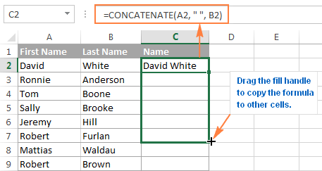
2. CONCATENATE
=CONCATENATE is one of the easiest to learn but most powerful formulas when conducting data analysis. Combine text, numbers, dates and more from multiple cells into one. This is an excellent function for creating API endpoints, product SKUs, and Java queries.
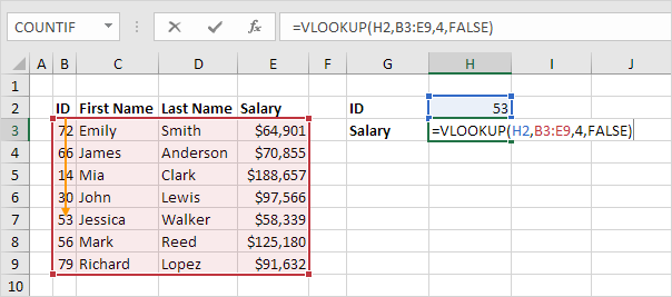
3. VLOOKUP
You’ve no doubt come across =VLOOKUP, which will be familiar to anyone who’s used Excel. The formula allows you to lookup data that is arranged in vertical columns. For example, if you have a list of months of the year with the profit made in each month, =VLOOKUP can present the data from the month of your choice.
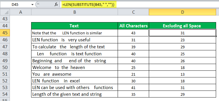
4. LEN
=LEN quickly provides the number of characters in a given cell. As in the example above, you can identify two different kinds of product Stock Keeping Units (SKUs) using the =LEN formula to see how many characters the cell contains. LEN is especially useful when trying to determine the differences between different Unique Identifiers (UIDs), which are often lengthy and not in the right order.
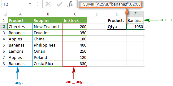
5. SUMIFS
The =SUMIF function is an essential formula in the world of data analytics. The formula adds up the values in cells that meet a selected number. In the above example, the formula is adding up the numbers in cells that are higher than the number 8.
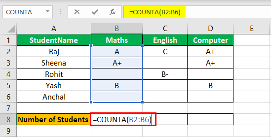
=COUNTA identifies whether a cell is empty or not. In the life of a data analyst, you’re going to run into incomplete data sets daily. COUNTA will allow you to evaluate any gaps the dataset might have without having to reorganize the data.
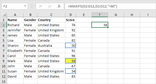
7. MINIFS/MAXIFS
This handy formula identifies which value is the lowest and which is the highest. But it does more than just that, it also sorts values in relation to particular criteria too. For example, you can use it to sort the oldest and youngest ages from a sample of men and women, displaying the values by gender.
8. FIND/SEARCH
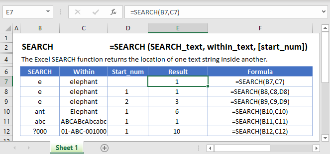
=FIND/=SEARCH are powerful functions for isolating specific text within a data set. Both are listed here because =FIND will return a case-sensitive match, i.e. if you use FIND to query for “Big” you will only return Big=true results. But a =SEARCH for “Big” will match with Big or big, making the query a bit broader. This is particularly useful for looking for anomalies or unique identifiers.
9. IFERROR
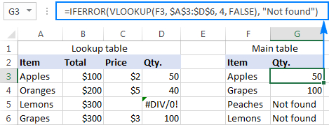
=IFERROR is something that any analyst who actively presents data should take advantage of. .You can use the IFERROR function to trap and handle errors in a formula. IFERROR returns a value you specify if a formula evaluates to an error; otherwise, it returns the result of the formula.
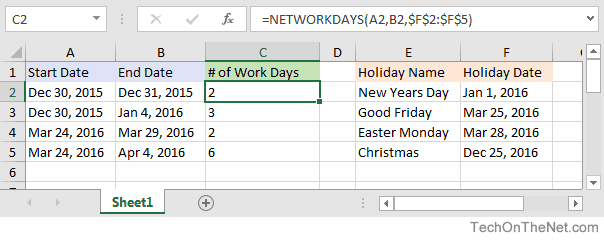
10. DAYS/NETWORKDAYS
This one is fairly self-explanatory. =DAYS determines the number of days between two calendar dates, and is commonly used to determine product life cycles or contract periods. =NETWORKDAYS is its more useful counterpart and is used to calculate the number of working days between two dates. You could say this formula lives for the weekend.
Algorithms are used by all of us all the time with or without our direct knowledge. They have applications in many different disciplines, frommath andphysics to, of course, computing. These are the most important algorithms that you should know.
1. Boolean (binary) algebra
You might be familiar with the term Boolean from mathematics, logic, and computer coding. It was created by George Boole in 1847 work An Investigation of the Laws of Thought. Boolean algebra is a branch of algebra in which a variable can only ever be true or false (usually binary 1 or 0). This algorithm is widely recognized as the foundation of modern computer coding. It is still in use today, especially in computer circuitry.
Most Important Algorithms That You Should Know: Logic gates and Boolean algebra
2. Fast Fourier Transform
This algorithm was created by Carl Gauss, Joseph Fourier, James Cooley, and John Tukey in 1802, 1822 and 1965. It is used to break down a signal into the frequencies that compose it – much like a musical chord can be expressed in frequencies, or pitches, of each note therein. “FFT relies on a divide-and-conquer strategy to reduce an ostensibly O(N2) chore to an O(N log N) frolic.
Most Important Algorithms That You Should Know: FFT – Fast Fourier Transformation
3. Google’s ranking algorithm
PageRank is, arguably, the most used algorithm in the world today. It is, of course, the foundation of the ranking of pages on Google’s search engine. It was created by Larry Page (mainly) and Sergey Brin in 1996. It is not the only algorithm that Google uses nowadays to order pages on its search result, but it is the oldest and best known of them.
The PageRank algorithm is given by the following formula:
PR(A) = (1-d) + d (PR(T1)/C(T1) + … + PR(Tn)/C(Tn))
where:
PR(A) is the PageRank of page A,
PR(Ti) is the PageRank of pages Ti which links to page A,
C(Ti) is the number of outbound links on page Ti and;
d is a damping factor that can be set between 0 and 1.
Most Important Algorithms That You Should Know
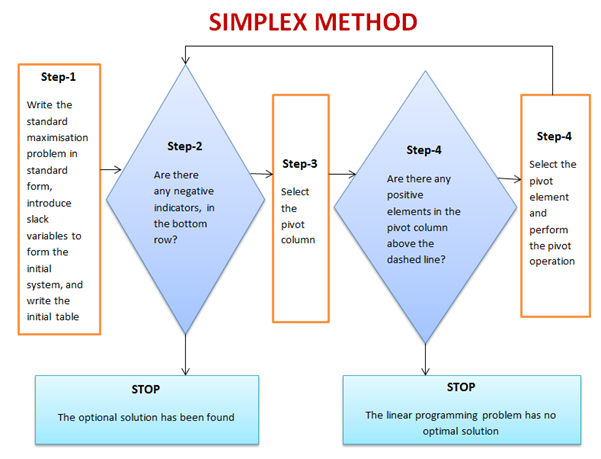
4. The simplex method for linear programming
This is one of the most successful algorithms of all time despite the fact that most real-world problems are rarely linear in nature. It was created by George Dantzig in 1947. It was widely used in the world of industry or any other situation where economic survival rests on the ability to maximize efficiency within a budget and/or other constraints.
It works by using a systematic strategy to generate and validate candidate vertex solutions within a linear program. At each iteration, the algorithm chooses the variable that makes the biggest modification towards the minimum-cost solution. That variable then replaces one of its covariables, which is most drastically limiting it, thereby shifting the simplex method to another part of the solution set and toward the final solution.
Most Important Algorithms That You Should Know
5. Kalman Filter
Kalman Filtering, aka linear quadratic estimation (LQE), helps you make an educated guess about what a system will likely do next, within reason, of course. Kalman filters are great for situations where systems are constantly changing. Created by Rudolf E. Kálmán in 1958-1961 is a general and powerful tool for combining information in the presence of uncertainty.
Most Important Algorithms That You Should Know: Kalman Filter algorithm
6. QR algorithms for computing eigenvalues
It was created in the late 1950s by John G. F. Francis and by Vera N. Kublanovskaya independently. The QR algorithm, aka eigenvalue algorithm, greatly simplifies the calculations of eigenvalues it is important in numerical linear algebra. In addition to enabling the swift calculation of eigenvalues, it also aids in the processing of eigenvectors in a given matrix. Its basic function is to perform QR decomposition, write a matrix as a product of an orthogonal matrix and an upper triangular matrix, multiply the factors in the reverse order and iterate.
Most Important Algorithms That You Should Know: QR algorithms for computing eigenvalues
7. JPEG and other data compression algorithms
It was created in 1992 by the Joint Photographic Experts Group, IBM, Mitsubishi Electric, AT&T, Canon Inc., and ITU-T Study Group 16. It is difficult to single out one particular data compression algorithm as its value or importance depends on the files’ applications. Data compression algorithms, like JPEG, MP3, zip, or MPEG-2, are widely used the world over. Most have become the de facto standard for their particular application. They have made computer systems cheaper and more efficient over time.
Most Important Algorithms That You Should Know: JPEG compression algorithm.
8. Quicksort algorithm
Created by Tony Hoare of Elliott Brothers, Limited, London in 1962. It provided a means of quickly and efficiently sorting lists alphabetically and numerically. Quicksort algorithm used a recursive strategy to “divide and conquer” to rapidly reach a solution. It would prove to be two to three times quicker than its main competitors’ merge sort and heapsort. It works by choosing one element to be the “pivot”. All others are then sorted into “bigger” and “smaller” piles of elements relative to the pivot. This process is then repeated in each pile.
Most Important Algorithms That You Should Know: Quicksort algorithm
Since 1987, Microsoft Excel has been used in virtually every office by employees with various job titles. But how is Excel used in data analysis today and can it be learned? While some enjoy playing with pivotal tables and histograms, others limit themselves to simple pie charts and conditional formatting. We explain the pros and cons of using Excel for data analysis and the top Excel functions that every data analyst needs to know.
What is Excel?
Excel is spreadsheet software. Excel is a convenient go-to software that is both comprehensible and familiar, and a key part of Excel is how it can be used for ad hoc analysis. Many people are familiar with Excel and that level of comfort is where much of its power stems from.
What types of data can be entered into an Excel spreadsheet?
Everyone thinks of financial data with Excel, but it can apply to any industry data. All types of data are appropriate! The only exception would be the size of the datasets. Small to medium-sized datasets are best for Excel. If a dataset becomes too large, it’s cumbersome in Excel. Many times, data analysts will take a look at the underlying data using Excel before they use a heavier application like Python or SQL.
Pros & Cons of Excel in Data Analysis
Excel is powerful because it’s quick and easy to use, but the downside is that it isn’t scalable. As data sizes become larger, we hit limits in our notebook and time limits on our computers. Excel also lacks the ability to automate processes.
Alternatives to Excel
Google Sheets is a free alternative to Excel. The collaborative aspect of Google Sheets is great, but it also makes it harder to protect your data from other parts of the company. It is awesome software but Google Sheets isn’t quite as advanced as Excel is and I doubt they will ever catch up. Excel is continuously improving and expanding.
Analyzing Data Sets with Excel
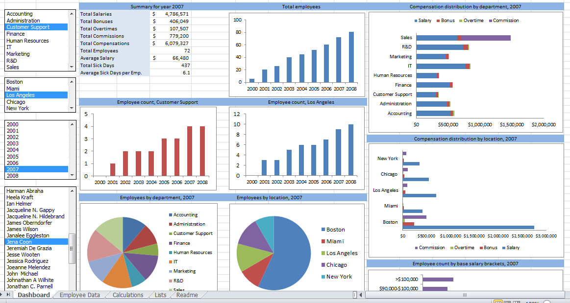
To know how to analyze data in Excel, you can instantly create different types of charts, including line and column charts, or add miniature graphs. You can also apply a table style, create PivotTables, quickly insert totals, and apply conditional formatting. Analyzing large data sets with Excel makes work easier if you follow a few simple rules:
Select the cells that contain the data you want to analyze.
Click the Quick Analysis button image button that appears at the bottom right of your selected data (or press CRTL + Q).
Selected data with Quick Analysis Lens button visible
In the Quick Analysis gallery, select a tab you want. For example, choose Charts to see your data in a chart.
Pick an option, or just point to each one to see a preview.
You might notice that the options you can choose are not always the same. That is often because the options change based on the type of data you have selected in your workbook.
To understand the best way to analyze data in excel, you might want to know which analysis option is suitable for you. Here we offer you a basic overview of some of the best options to choose from.
Formatting: Formatting lets you highlight parts of your data by adding things like data bars and colors. This lets you quickly see high and low values, among other things.
Charts: Charts Excel recommends different charts, based on the type of data you have selected. If you do not see the chart you want, click More Charts.
Totals: Totals let you calculate the numbers in columns and rows. For example, Running Total inserts a total that grows as you add items to your data. Click the little black arrows on the right and left to see additional options.
Tables: Tables make it easy to filter and sort your data. If you do not see the table style you want, click More.
Sparklines: Sparklines are like tiny graphs that you can show alongside your data. They provide a quick way to see trends.
How to Analyze Data in Excel: Data Analysis
Data Analysis is simpler and faster with Excel analytics. Here, we offer some tips for work:
Create auto expandable ranges with Excel tables: One of the most underused features of MS Excel is Excel Tables. Excel Tables have wonderful properties that allow you to work more efficiently. Some of these features include:
Formula Auto Fill: Once you enter a formula in a table it will be automatically copied to the rest of the table.
Auto Expansion: New items typed below or at the right of the table become part of the table.
Visible headers: Regardless of your position within the table, your headers will always be visible.
Automatic Total Row: To calculate the total of a row, you just have to select the desired formula.
Use Excel Tables as part of a formula: Like in dropdown lists, if you have a formula that depends on a Table, when you add new items to the Table, the reference in the formula will be automatically updated.
Use Excel Tables as a source for a chart: Charts will be updated automatically as well if you use an Excel Table as a source. As you can see, Excel Tables allow you to create data sources that do not have to be updated when new data is included.
How to Analyze Data in Excel: Data Visualization
Quickly visualize trends with sparklines: Sparklines are a visualization feature of MS Excel that allows you to quickly visualize the overall trend of a set of values. Sparklines are mini-graphs located inside of cells. You may want to visualize the overall trend of monthly sales by a group of salesmen.
To create the sparklines, follow these steps below:
Select the range that contains the data that you will plot (This step is recommended but not required, you can select the data range later).
Go to Insert > Sparklines > Select the type of sparkline you want (Line, Column, or Win/Loss). For this specific example, I will choose Lines.
Click on the range selection button Select Range Excel Button to browse for the location of the sparklines, press Enter and click OK. Make sure you select a location that is proportional to the data source. For example, if the data source range contains 6 rows then the location of the sparkline must contain 6 rows.
To format the sparkline you may try the following:
To change the colour of markers:
Click on any cell within the sparkline to show the Sparkline Tools menu.
In the Sparkline tools menu, go to Marker Color and change the colour for the specific markers you want.
For example High points on the green, Low points on red, and the remaining in blue.
To change the width of the lines:
Click on any cell within the sparkline to show the Sparkline Tools menu.
In the Sparkline tools contextual menu, go to Sparkline Color > Weight and change the width of the line as you desire.
Save Time with Quick Analysis: One of the major improvements introduced back in Excel 2013 was the Quick Analysis feature. This feature allows you to quickly create graphs, sparklines, PivotTables, PivotCharts, and summary functions by just clicking on a button.
When you select data in Excel 2013 or later, you will see the Quick Analysis button Quick Analysis Excel Button in the bottom-right corner of the range selected. If you click on the Quick Analysis button you will see the following options:
1. Formatting
2. Charts
3. Totals
4. Tables
5. Sparklines
When you click on any of the options, Excel will show a preview of the possible results you could obtain given the data you selected.
If you click on the Quick Analysis button and go to charts, you could quickly create the graph below just by clicking a button.
If you go to Totals, you can quickly insert a row with the average for each column:
If you click on Sparklines, you can quickly insert Sparklines:
As you can see, the Quick Analysis feature really allows you to quickly perform different visualizations and analyses with almost no effort.
Data Jobs that Use Excel
Any position with the word “analyst” at the end of it requires Excel! That includes Data Analyst, Business Analyst, Business Operations Analyst, and Reporting Analyst.
Today, data science jobs are some of the highest paying occupations on the planet. Data science jobs are on high demand from both the company and employee perspective. The current shortage of big data talent across the globe is well-documented. In 2018, there was a 56% demand for data science jobs in the U.S. So if you’re interested in working within this space, what’s the best approach to finding a job or an internship? You have the usual suspects like Indeed, LinkedIn, and Monster, but these aren’t your only options. There are also niche recruitment portals where you can stand out and make an impression.
Since you’ve done all the hard work studying big data and analytics to get to this point, we did the legwork and put together a list of our 10 favorite data science-related job sites where you can start applying for data science, deep learning (DL), machine learning (ML), and statistical analysis jobs.
StackOverflow is one of the biggest Q&A websites for programming and engineering. It also so happens that they have a job board! This is a great place to check not just for data scientists, but also software engineers and developers.
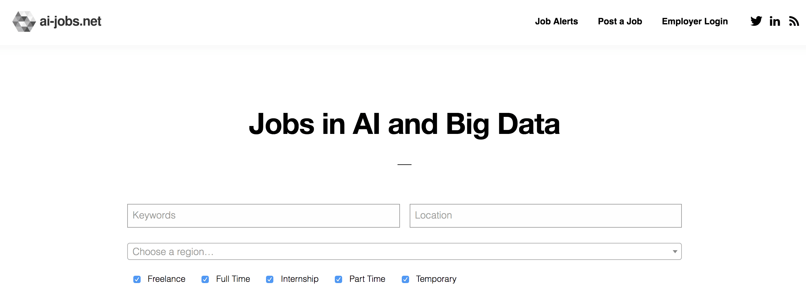
Ai-jobs.net is a job board that specifically serves the artificial intelligence (AI) and data science community. Whether you’re looking for something permanent or a contract role, there’s an option for everyone. The jobs listed on the website can also be found on their Reddit thread. The aim here is to provide a comprehensive and clear listing of jobs related to AI, big data, DL, and ML. So the site is pretty basic, straightforward, and all the focus is on current vacancies.
Y Combinator is one of the largest seed accelerators in the world and has funded some very established tech companies like Stripe, Airbnb, and DoorDash. They also have a job board that connects you with over 400 startups funded by YC.
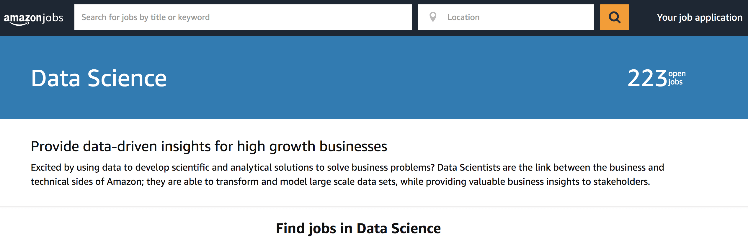
When it comes to data science jobs, Amazon is a leading employer. They have openings for a broad spectrum of roles from Senior Data Scientist – Prime Air to WWPS Data Analyst – Intern. Amazon provides a job opening for a broad spectrum of roles. Being a leader in technology, their job postings are listed on their website. Amazon is of the opinion that data scientists are a significant link between enterprises and the technical side of Amazon. If transforming and modeling data sets and providing insights to stakeholders interests you, Amazon Jobs is an excellent destination for both recent graduates and seasoned professionals.
AngelList is one of the largest platforms for startups that facilitates investments and recruitment. Like LinkedIn, you’ll create your own profile, fill in your information, and have access to a number of startup jobs. I found that this website is especially good if you’re looking for smaller startups (1–10 people).
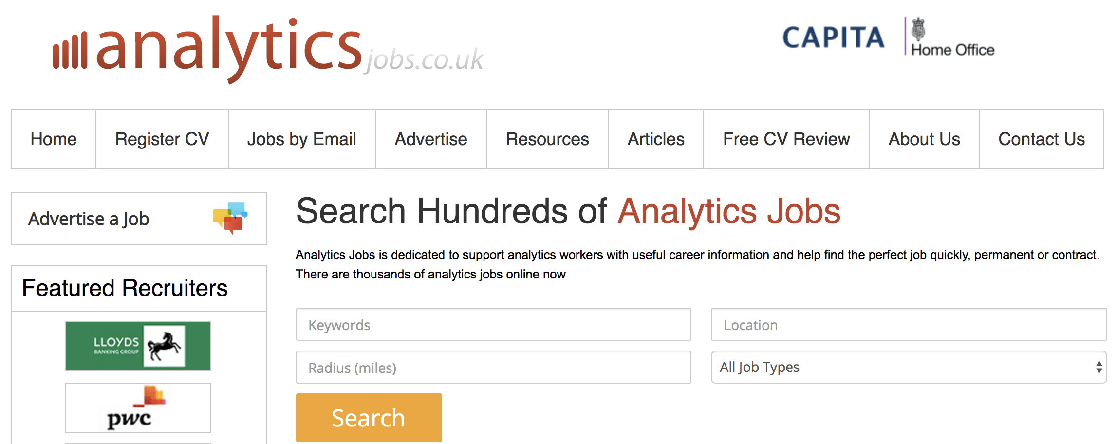
Analytics Jobs hosts job postings that are related to analytics. So you don’t have to waste time filtering your searches or hunting down relevant vacancies. However, this job board is dedicated to big-data vacancies in the United Kingdom. Owned and operated by Technojobs Group for over 20 years, it’s a source of useful career and training information to keep you up to date with industry trends and requirements. Finding the appropriate listing is as easy as clicking the relevant category on the left sidebar.
Leetcode, similar to HackeRank and InterviewBit, is a website where you can practice your coding skills by completing coding challenges. This is a great place to brush up on sorting algorithms and SQL. They’ve also included a new feature where you can practice mock interviews! Overall, I highly recommend you use this to help you prepare for your technical interviews.
Jumpstart is a really neat resource that I only came across recently through a friend. Think of it like Reddit, but for tech jobs. While primarily used as a forum, they also have their own job board and have a calendar full of various tech events that you can sign up for!
Kaggle boasts one of the world’s largest communities of data scientists, machine learning engineers, and statisticians. Members can subscribe to the latest updates on job openings and post their own vacancies. You can filter your results based on role, salary, and experience level. You can find top-ranked global companies like Amazon, Facebook, Google, and Microsoft posting their job openings here. So it might serve you well to join this community of data professionals.
Yes, I know Glassdoor is a job board. But personally, I never really used it for that purpose. Instead, I like to use it for its unique features like the ability to see company reviews and interview questions for a plethora of companies. If you’re applying for companies that you’ve never heard of, take advantage of this and know what you’re getting yourself into. And if you want to get a better idea of a company’s interview process, this is a great resource too.
Data engineer, data analyst and data scientist are job titles you’ll often hear mentioned together when people are talking about the fast-growing field of data science. Of course, there are plenty of other job titles in data science, but here, we’ll talk about these three primary roles, how they differ from one another, and which position might be best for you. Although each company may have its own definitions for each position, there are big differences between what you might be doing each day as a data analyst, data scientist, or data engineer. We’re going to dig into each of these specific roles in more depth.
Data Scientist vs Data Analyst vs Data Engineer: Job Role, Skills, and Salary
They use advanced data techniques such as clustering, neural networks, decision trees, and the like for deriving business insights. In this role, you will be the senior-most in a team and should have deep expertise in machine learning, statistics, and data handling. You will be responsible for developing actionable business insights after they get inputs from Data Analysts and Data Engineers. You should have the skill set of both a data analyst and a data engineer. However, in the case of a data scientist, the skill sets need to be more in-depth and exhaustive.
The Required Skillsets
Coding skills are central to each of these job roles – data scientists need to have mastery over programming languages like Java, Python, SQL, R, and SAS, to name a few. Additionally, you need a working knowledge of Big Data frameworks like Hadoop, Spark, and Pig. Understanding the basics of technologies such as Deep learning, Machine learning, and the like also can propel your career in this role.
Responsibilities
The responsibilities you have to shoulder as a data scientist include:
1. Manage, mine, and clean unstructured data to prepare it for practical use.
2. Develop models that can operate on Big Data
3. Understand and interpret Big Data analysis
4. Take charge of the data team and help them towards their respective goals
5. Deliver results that have an impact on business outcomes
Salary of data scientist
As a data scientist, you can earn as much as $137,000 a year.
A Data Analyst occupies an entry-level role in a data analytics team. In this role, you need to be adept at translating numeric data into a form that can be understood by everyone in an organization. Moreover, you need to have required proficiency in several areas, including programming languages such as python, tools such as excel, and fundamentals of data handling, reporting, and modelling. With enough experience under your belt, you can gradually progress from a data analyst to assume the role of a data engineer and a data scientist.
The Required Skillsets
When we talk about the role of a data analyst, you should know that it is less technical. It is an entry-level role, and you need to have an understanding of tools such as SAS Miner, Microsoft Excel, SPSS, and SSAS. If you have a basic knowledge of Python, SQL, R, SAS, and JavaScript, it would be a plus point.
Responsibilities
As a data analyst, you will have to assume specific responsibilities, including:
1. Collecting information from a database with the help of a query
2. Enable data processing and summarize results
3. Use basic algorithms in their work like logistic regression, linear regression and so on
4. Possess and display deep expertise in data munging, data visualization, exploratory data analysis and statistics
Salary of data analyst
Data analysts can expect an average salary of $67,000 per year, which is remarkable, considering that it is an entry-level role.
Data Engineers
Data Engineers are the intermediary between data analysts and data scientists. As a data engineer, you will be responsible for the pairing and preparation of data for operational or analytical purposes. A lot of experience in the construction, development, and maintenance of data architecture will be demanded from you for this role. Usually, in this role, you will get to work on Big Data, compile reports on it, and send them to data scientists for analysis.
The role of a Data Engineer requires you to have a deep understanding of programming languages such as Java, SQL, SAS, Python, and the like. You should also be adept at handling frameworks such as Hadoop, MapReduce, Pig, Hive, Apache Spark, NoSQL, and Data Streaming, at naming a few.
Responsibilities
Your responsibilities in this role are:
1. Data Mining for getting insights from data
2. Conversion of erroneous data into a useable form for data analysis
3. Writing queries on data
4. Maintenance of the data design and architecture
5. Develop large data warehouses with the help of extra transform load (ETL)
Salary of a data engineer
Data engineers can have a salary upwards of $116,000 a year which is remarkable.
In the fast-paced world of technology, the role of a data scientist has become increasingly crucial. As businesses rely on data-driven insights to make informed decisions, the demand for skilled data scientists continues to soar. If you aspire to embark on a career in data science, this comprehensive guide will walk you through the essential steps and considerations to build a successful path.
Introduction
The field of data science is a dynamic and interdisciplinary domain that combines expertise in statistics, mathematics, and computer science. As businesses harness the power of data to gain a competitive edge, the role of a data scientist has evolved into one of the most sought-after positions in the job market.
Understanding the Role of a Data Scientist
At its core, a data scientist is responsible for extracting meaningful insights from complex datasets. This involves employing statistical analysis, machine learning algorithms, and data visualization techniques. The role is not only about crunching numbers but also requires effective communication to convey findings to non-technical stakeholders.
To embark on a career in data science, a strong educational foundation is crucial. Most data scientists hold advanced degrees in fields such as computer science, statistics, or mathematics. Additionally, acquiring certifications in relevant technologies and methodologies enhances one’s credibility in the field.
Building a Strong Foundation in Programming
Proficiency in programming is a cornerstone skill for a data scientist. The ability to code allows professionals to manipulate and analyze data efficiently. Python, R, and SQL are among the preferred programming languages in the field, with each offering unique advantages for specific tasks.
Specializations in Data Science
Data science encompasses various specializations, including machine learning, data engineering, and business analytics. Aspiring data scientists should explore these branches to identify their interests and align their career goals accordingly. Each specialization presents distinct opportunities and challenges.
Gaining Practical Experience
While theoretical knowledge is essential, gaining practical experience is equally crucial. Engaging in real-world projects, and internships, and participating in open-source initiatives contribute significantly to skill development. Platforms like Kaggle provide a competitive environment for honing problem-solving skills.
Networking in the Data Science Community
Building a network within the data science community opens doors to valuable opportunities. Joining online forums, attending conferences, and networking events allows aspiring data scientists to connect with industry professionals, share insights, and stay abreast of the latest trends.
Crafting an Impressive Data Scientist Resume
A well-crafted resume is the first step in securing a data science position. Highlighting academic achievements, relevant projects, and acquired skills is essential. A strong resume showcases expertise and demonstrates the ability to apply knowledge in practical scenarios.
Preparing for Data Science Interviews
Data science interviews often include technical assessments and problem-solving challenges. Aspiring data scientists should prepare for common interview questions, showcasing their analytical and problem-solving abilities. Effective communication of methodologies and findings is equally important.
Salary Expectations and Job Market Trends
Salary expectations in data science vary based on factors such as experience, location, and industry. Analyzing current job market trends provides insights into the demand for specific skill sets. Staying informed about salary benchmarks ensures fair compensation negotiations.
Continuous Learning and Professional Development
Data science is a rapidly evolving field. Continuous learning is essential to stay updated on new technologies and methodologies. Online courses, workshops, and industry conferences provide opportunities for professional development.
Challenges Faced by Data Scientists
While a career in data science is rewarding, it comes with its challenges. Aspiring data scientists should be prepared to face obstacles such as handling massive datasets, overcoming algorithmic biases, and addressing ethical considerations in data analysis.
Diversity and Inclusion in Data Science
Diversity and inclusion are integral to fostering innovation in data science. Initiatives and programs promoting diversity create a more vibrant and creative work environment. Embracing diverse perspectives enhances problem-solving and contributes to a more robust data science community.
Future of Data Science
The future of data science holds exciting possibilities with emerging technologies such as artificial intelligence, blockchain, and quantum computing. As the field evolves, data scientists can anticipate new challenges and opportunities, making adaptability and continuous learning paramount.
Conclusion
Embarking on a career in data science is an exciting journey filled with opportunities for growth and innovation. By following this comprehensive career guide, aspiring data scientists can navigate the complexities of the field, build a strong foundation, and contribute meaningfully to the ever-expanding world of data.
Learning how to use LinkedIn for professional development is a great step toward improving your network, keeping in touch with colleagues, finding that perfect job and making new connections that offer exciting opportunities. LinkedIn is one of the fastest-growing and most valuable assets to access. In 2019 alone, LinkedIn had 645 million accounts, and 40% of those users actually logged on every single day. With over 30 million companies now active on the platform, there were over 20 million open job postings in 2019 alone.
LinkedIn provides a vast set of internal tools for building one’s profile. Make sure you fill out all areas and provide enough value in order to demonstrate your skills and qualifications in the best possible manner. Use a specific headline that corresponds with your core skill. Craft a genuine summary that outlines your top accomplishments and your main focus. Update your skills, the job experience (in details), communities you participate with and certificates that you hold. You can use a trustworthy photo which showcases your best self. Apply that same photo to your other online accounts so that people can connect the dots. Upload any SlideShare presentations or additional assets applicable to LinkedIn.
Remember first impressions matter, and not just in person. Before ever meeting you, 41% of recruiters have admitted judging candidates by their photos. Your profile picture is your calling card on LinkedIn.
2. Use the app to your advantage.
When you are on the job hunt, find companies you want to work for, and make it a point to follow their accounts so you can stay aware of the company’s current happenings. The “companies” tab will display updates, employees and job postings, all in one central location that will then make its way over to your news feed. Once you land an interview, you will already be well up to date on their latest product releases or corporate announcements, and this makes you stand out more than you realize
The app also contains a pulse tab, which allows you to see personalized articles and topics related to your industry and target audience. Dedicate a little time each morning to sift through the app. With your morning cup of coffee, spend 10 minutes finding articles worth sharing, or work towards building content around your industry (articles, blog posts, etc) so you can establish yourself as a thought-leader in your niche.
3. Produce Regular Valuable Content
Out of the 645 million LinkedIn accounts, less than .5% are actually contributing new content. This place is a goldmine for sharing content and being seen. Low competition means high view opportunities, a recipe for success. If you find an article you liked within your realm of subject matter, read the comments section to find questions that other viewers may have posed as a way to search for and address gaps that weren’t covered on the topic. Tag other people who will get notified once mentioned – especially if you discuss more active LinkedIn members.
Recording daily educational videos (or every few days) will most likely receive more attention than standard textual posts. If you want to build your portfolio for work purposes, make sure your topics are closely related to your speciality. You want to end up with a complete profile that screams “professional” and is focused on what you do and are eager to do.
4. Connect with the right people
You met someone a few years back in college doesn’t necessarily mean you want to connect with them on this professional platform. Your level of reach depends largely on how social and engaged you are on the platform, not necessarily how many people are connected with you. Start by connecting with existing professional and personal contacts in the industry you are working in, or want to move into. If you meet a new coworker or connect with a professional during a networking event, seek out their account and send them a LinkedIn request that contains a short personalized message.
Join LinkedIn groups and interact with people. Comment on discussions, share topics on your own feed, mention other team members. Most people would be sending invitations every now and then and don’t be afraid to ask for a connection request after a couple of interactions.