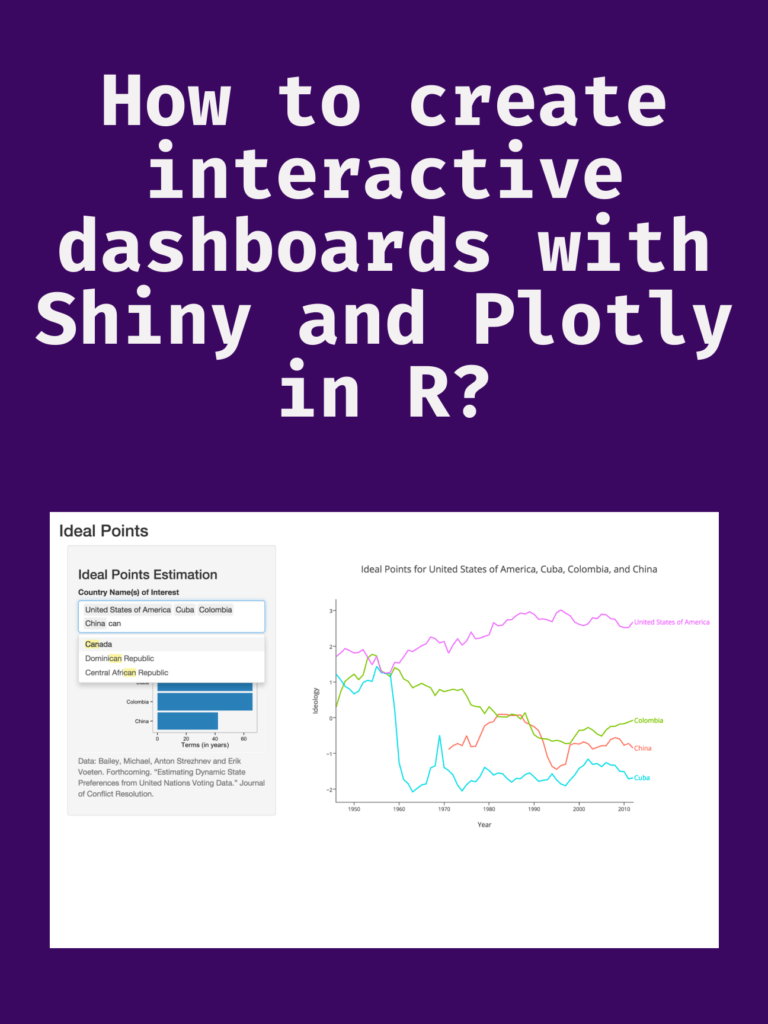
Data Science

Creating a normal distribution plot using ggplot2 in R

Creating a normal distribution plot using ggplot2 in R: The normal distribution is a probability distribution that is often used to model real-world phenomena, such as the distribution of test scores or the heights of a population. It is a bell-shaped curve that is symmetric around its mean value, and its standard deviation determines its spread. In this article, we will walk through the steps of creating a normal distribution plot using the ggplot2 package in R.

Creating a normal distribution plot using ggplot2 in R

Download:

Step 1: Generate a dataset

To create a normal distribution plot, we first need to generate a dataset that follows a normal distribution. We can use the rnorm function in R to generate a random sample of numbers that follow a normal distribution with a specified mean and standard deviation. For example, let’s generate a sample of 1000 numbers with a mean of 50 and a standard deviation of 10:

set.seed(123)  # for reproducibility
data <- data.frame(x = rnorm(1000, mean = 50, sd = 10))

This will create a data frame with one column, “x”, that contains our randomly generated numbers.

Step 2: Create a histogram

Next, we can create a histogram of our data using the ggplot2 package. A histogram is a graphical representation of the distribution of a dataset, and it can help us visualize the shape of our normal distribution.

library(ggplot2)
ggplot(data, aes(x = x)) +
  geom_histogram(binwidth = 1, color = "black", fill = "white") +
  labs(x = "Values", y = "Frequency", title = "Histogram of Normal Distribution")

This code will create a histogram with a binwidth of 1, a black border, and white fill. The x-axis will be labeled “Values”, the y-axis will be labeled “Frequency”, and the title of the plot will be “Histogram of Normal Distribution”.

Step 3: Add a density curve

To make our plot more informative, we can add a density curve to show the shape of the normal distribution. A density curve is a smoothed version of the histogram that shows the distribution of our data more clearly.

ggplot(data, aes(x = x)) +
  geom_histogram(binwidth = 1, color = "black", fill = "white") +
  geom_density(color = "blue", size = 1) +
  labs(x = "Values", y = "Density", title = "Histogram and Density Curve of Normal Distribution")

This code will add a blue density curve to our histogram with a size of 1. The x-axis will be labeled “Values”, the y-axis will be labeled “Density”, and the title of the plot will be “Histogram and Density Curve of Normal Distribution”.

Step 4: Customize the plot

Finally, we can customize our plot by adding axis labels, changing the colors and fonts, and adjusting the layout.

ggplot(data, aes(x = x)) +
  geom_histogram(binwidth = 1, color = "black", fill = "#69b3a2") +
  geom_density(color = "#e9c46a", size = 1) +
  labs(x = "Values", y = "Density", title = "Normal Distribution Plot") +
  theme_minimal() +
  theme(plot.title = element_text(size = 18, face = "bold"),
        axis.title = element_text(size = 14, face = "bold"),
        axis.text = element_text(size = 12),
        legend.position = "none")

This code will change the fill color of the histogram to “#69b3a2” and the color of the density curve to “#e9c46

The Python Workbook

The Python Workbook” is a collection of exercises and projects designed to help individuals learn and practice the Python programming language. It is suitable for beginners who have little or no prior experience with programming, as well as for intermediate programmers who want to enhance their skills.

The workbook covers various topics in Python, including variables, data types, operators, control structures, functions, and object-oriented programming. Each chapter contains multiple exercises that range in difficulty from simple to challenging, and solutions to the exercises are provided at the end of the book.

The Python Workbook
A Brief Introduction with Exercises and Solutions
The Python Workbook A Brief Introduction with Exercises and Solutions

The exercises in “The Python Workbook” are designed to be self-contained and can be completed independently of each other. This allows readers to skip around and focus on specific areas of interest or to work through the book linearly.

Some of the projects included in the workbook require the use of third-party libraries, such as NumPy and Matplotlib, which are commonly used in data analysis and visualization. This provides readers with an opportunity to explore the broader Python ecosystem and gain experience working with real-world tools and technologies.

Overall, “The Python Workbook” is an excellent resource for anyone looking to learn or improve their skills in Python programming. It provides a structured and engaging approach to learning, and the exercises and projects are designed to reinforce key concepts and help readers build practical skills.

Download(PDF)

How to use RStudio’s visual editor and code snippets for faster dataviz?

How to use RStudio’s visual editor and code snippets for faster dataviz? RStudio is a popular Integrated Development Environment (IDE) for the R programming language. It offers a variety of features that can help make data visualization easier and faster. One of these features is the visual editor, which allows users to create visualizations by dragging and dropping elements onto a canvas. Another feature is code snippets, which are pre-written code snippets that can be inserted into a script to perform specific tasks. In this article, we will explore how to use RStudio’s visual editor and code snippets to create faster data visualizations.

How to use RStudio's visual editor and code snippets for faster dataviz?
How to use RStudio’s visual editor and code snippets for faster dataviz?

Using RStudio’s Visual Editor

A visual editor is a great tool for creating data visualizations quickly and easily. It allows you to create visualizations by dragging and dropping elements onto a canvas, which can be a great way to experiment with different layouts and designs.

Here’s how to use the visual editor in RStudio:

  1. Open a new R script file in RStudio.
  2. Click on the “Plots” tab in the bottom-right corner of the window.
  3. Click on the “Visualize” button to open the visual editor.
  4. Choose a data source from the list on the left-hand side of the window.
  5. Drag and drop elements onto the canvas to create your visualization.
  6. Use the settings on the right-hand side of the window to customize your visualization.

The visual editor offers a variety of elements that you can use to create your visualization, including:

  • Scatterplots
  • Bar charts
  • Line charts
  • Histograms
  • Heatmaps

To create a scatterplot, for example, simply drag and drop the “Scatterplot” element onto the canvas, select your data source, and choose the variables to use for the x-axis and y-axis. You can then customize the appearance of the scatterplot using the settings on the right-hand side of the window.

Using Code Snippets

Code snippets are pre-written blocks of code that can be inserted into a script to perform specific tasks. RStudio comes with a variety of code snippets that can be used to create data visualizations more quickly and easily.

Here’s how to use code snippets in RStudio:

  1. Open a new R script file in RStudio.
  2. Click on the “Code” tab in the bottom-right corner of the window.
  3. Click on the “Insert Snippet” button to open the code snippet library.
  4. Choose a snippet from the list and click “Insert” to insert it into your script.

Some of the code snippets available in RStudio include:

  • Creating a bar chart
  • Creating a scatterplot
  • Creating a line chart
  • Creating a histogram
  • Creating a heatmap

To use a code snippet, simply insert it into your script and customize it as needed. For example, if you want to create a bar chart, you can insert the “ggplot2_bar” snippet and then modify it to use your own data and variables.

Download(PDF)

Introduction to Econometrics with R

Econometrics is a branch of economics that uses statistical and mathematical methods to analyze economic data. It is an important tool for economists and policymakers to make informed decisions about economic policies and forecast economic outcomes. R is a programming language widely used in econometrics to analyze, visualize, and interpret data. In this article, we will provide an introduction to econometrics with R. We will discuss the basic concepts of econometrics and how R can be used to apply these concepts.

Introduction to Econometrics with R

Download:

What is Econometrics?

Econometrics is the application of statistical methods to economic data to test economic theories and forecast economic outcomes. It is used to estimate the relationships between economic variables, such as price and quantity, income and expenditure, and interest rates and investment. Econometrics uses statistical models to describe the relationships between these variables and to make predictions about future economic behavior.

Econometrics involves three steps:

  1. Specification: This involves defining the economic theory and the variables that will be used to test it.
  2. Estimation: This involves estimating the parameters of the model using statistical methods.
  3. Evaluation: This involves testing the validity of the model and the accuracy of the predictions.

R and Econometrics

R is a popular programming language used in econometrics because of its versatility and its ability to handle large and complex datasets. R provides a wide range of functions for econometric analysis, including linear regression, time-series analysis, panel data analysis, and non-parametric analysis.

R also provides a wide range of visualization tools, including graphs, charts, and tables, to help economists and policymakers understand economic data and make informed decisions.

Using R for Econometric Analysis

To use R for econometric analysis, you will need to install the relevant packages for your analysis. There are several packages available for econometric analysis, including:

  1. plm: This package is used for panel data analysis.
  2. lmtest: This package is used for hypothesis testing of linear regression models.
  3. tsDyn: This package is used for time-series analysis.
  4. ggplot2: This package is used for data visualization.

Once you have installed the relevant packages, you can start using R for econometric analysis. Here are some basic steps:

  1. Load the data: You can load data into R using various methods, including CSV files, Excel files, or SQL databases.
  2. Clean and preprocess the data: This involves removing missing values, and outliers, and transforming the data if necessary.
  3. Model specification: This involves defining the economic theory and the variables that will be used to test it.
  4. Estimation: This involves estimating the parameters of the model using statistical methods.
  5. Evaluation: This involves testing the validity of the model and the accuracy of the predictions.
  6. Visualization: This involves creating graphs, charts, and tables to help understand and communicate the results of the analysis.

Download(PDF)

Geocomputation with R

Geocomputation with R is a powerful tool for spatial analysis that has gained widespread popularity in recent years. R is a free and open-source programming language that provides a comprehensive platform for geocomputation, which combines statistical and computational methods with geographic information systems (GIS) to analyze spatial data.

R provides a wide range of functions and packages for geocomputation, including mapping, geostatistics, spatial data manipulation, and spatial analysis. It also offers access to a wealth of data sources, including remote sensing data, census data, and environmental data, among others.

One of the key advantages is its ability to handle large and complex spatial datasets. R provides an efficient and flexible framework for data manipulation and processing, allowing users to work with datasets that would be too large or too complex to analyze using traditional GIS software.

Geocomputation with R

Another advantage of geocomputation with R is its ability to integrate with other data analysis tools. R provides easy integration with other programming languages, such as Python and SQL, as well as with popular data analysis tools like Excel and Tableau. This makes it easy for users to import and export data, as well as to share results with others.

Geocomputation with R is also highly customizable, allowing users to tailor their analysis to their specific needs. R provides a wide range of packages and functions, as well as the ability to create custom functions and scripts. This flexibility enables users to adapt their analysis to different types of spatial data, as well as to different research questions and hypotheses.

The popularity of geocomputation with R has led to the development of a vibrant and supportive community of users and developers. The R spatial community includes a wide range of individuals, from academics and researchers to practitioners and enthusiasts. This community provides a rich source of knowledge and support, as well as a forum for sharing ideas and best practices.

Geocomputation with R has numerous applications across a range of disciplines, including geography, ecology, epidemiology, and urban planning, among others. Some of the key applications of geocomputation with R include:

  • Mapping and visualization of spatial data
  • Spatial analysis of environmental and ecological data
  • Spatial modeling and prediction
  • Spatial optimization and decision-making
  • Geostatistics and spatial interpolation

Geocomputation with R is a powerful tool for spatial analysis that provides a flexible and efficient platform for handling large and complex spatial datasets. Its ability to integrate with other data analysis tools, as well as its highly customizable nature, make it a popular choice for researchers and practitioners across a range of disciplines. With a supportive and active community of users and developers, geocomputation with R is poised to remain a leading tool for spatial analysis in the years to come.

Read More: Geographic Data Science with R

Download(PDF)

Tips to Learn R using chatGPT

R is a popular programming language for data analysis and visualization. It has a rich set of packages and functions that make it easy to manipulate, explore and present data in various formats. However, learning R can be challenging for beginners who may not have a strong background in statistics or programming. One way to overcome this challenge is to use chatGPT, a chatbot that can generate code snippets and explanations based on natural language queries. ChatGPT is powered by GPT-4, a state-of-the-art natural language processing model that can produce coherent and relevant texts on any topic. ChatGPT can help you learn R by providing you with examples, tips, and feedback as you interact with it.

Tips to Learn R using chatGPT

In this post, we will show you how to use chatGPT to learn R in three steps:

  1. Ask chatGPT to generate a code snippet based on your query. For example, you can ask “How do I create a scatter plot in R?” or “How do I filter a data frame by a condition in R?” ChatGPT will respond with a code snippet that performs the task you requested, along with some comments or explanations. You can copy and paste the code into your R console or script and run it to see the result.
  2. Ask chatGPT to explain the code snippet or any part of it that you don’t understand. For example, you can ask “What does the ggplot function do?” or “What does the aes argument mean?” ChatGPT will respond with a clear and concise explanation of the function or argument, along with some examples or links to more resources. You can use this information to learn more about the syntax and logic of R.
  3. Ask chatGPT to modify the code snippet or suggest improvements. For example, you can ask “How do I add a title to the plot?” or “How do I make the points bigger?” ChatGPT will respond with a modified code snippet that incorporates your request, along with some comments or explanations. You can compare the original and modified code snippets and see how they affect the output.

By using chatGPT to learn R, you can benefit from the following advantages:

  • You can learn at your own pace and level of difficulty. You can ask chatGPT any question related to R, from basic to advanced, and get an appropriate answer. You can also adjust the complexity and length of the code snippets by using keywords like “simple”, “short”, “complex” or “long”.
  • You can learn by doing and experimenting. You can run the code snippets generated by chatGPT and see the results immediately. You can also modify the code snippets and see how they change the output. This way, you can learn from trial and error and discover new features and possibilities of R.
  • You can learn by having fun and being creative. You can ask chatGPT to generate code snippets for any data analysis or visualization task that interests you. You can also challenge chatGPT to generate code snippets for unusual or difficult tasks and see how it responds. This way, you can enjoy the process of learning R and express your creativity.

Learn More: R For Everyone: Advanced Analytics And Graphics

Download:

Introduction to Scientific Programming with Python

Introduction to Scientific Programming with Python: Python is a popular programming language that has become widely used in scientific programming. Its popularity is due to its simplicity, readability, and ease of use. Python has a vast library of modules that provide powerful tools for scientific programming. In this article, we will explore what scientific programming is, and how Python can be used to perform scientific computations.

What is Scientific Programming?

Scientific programming is the process of using computer algorithms and programming to analyze and solve scientific problems. It involves developing numerical models and simulations to study complex systems and processes in the natural world. Scientific programming can be used to solve problems in fields such as physics, chemistry, biology, and engineering.

Python for Scientific Programming

Python has a rich set of libraries that make it a popular choice for scientific programming. Some of the most popular libraries for scientific programming in Python include NumPy, SciPy, Matplotlib, Pandas, and SymPy.

NumPy is a library for numerical computing that provides a powerful array data structure and functions for manipulating arrays. NumPy arrays are used for storing and processing large arrays of data, which are common in scientific computing.

SciPy is a library for scientific computing that provides algorithms for optimization, integration, interpolation, and linear algebra. SciPy provides tools for solving differential equations, numerical integration, optimization problems, and much more.

Matplotlib is a library for data visualization that provides a simple and powerful interface for creating publication-quality plots. Matplotlib is used to create various types of graphs, such as line plots, scatter plots, bar plots, and histograms.

Pandas is a library for data analysis that provides data structures and functions for working with tabular data. Pandas provides tools for manipulating and transforming data, performing statistical analysis, and creating data visualizations.

SymPy is a library for symbolic mathematics that provides tools for performing algebraic computations, calculus, and other mathematical operations. SymPy is used for symbolic computation in physics, engineering, and mathematics.

Introduction to Scientific Programming with Python

Getting Started with Python for Scientific Programming

To get started with Python for scientific programming, you will need to install Python and the necessary libraries. Python can be downloaded from the official Python website (https://www.python.org/). The NumPy, SciPy, Matplotlib, Pandas, and SymPy libraries can be installed using the pip package manager.

Once you have installed Python and the necessary libraries, you can start writing Python code for scientific programming. The first step is to import the required libraries using the import statement. For example, to import NumPy and Matplotlib, you can use the following code:

import numpy as np
import matplotlib.pyplot as plt

The np and plt aliases are used to reference the NumPy and Matplotlib libraries respectively. The next step is to create arrays using NumPy, and then use Matplotlib to create visualizations of the data. Here’s an example:

import numpy as np
import matplotlib.pyplot as plt

x = np.linspace(0, 10, 100)
y = np.sin(x)

plt.plot(x, y)
plt.xlabel('x')
plt.ylabel('sin(x)')
plt.title('Sine Wave')
plt.show()

This code creates an array of 100 equally spaced values between 0 and 10, calculates the sine of each value, and then plots the data using Matplotlib. The resulting plot shows a sine wave.

Read More: Data Structures and Algorithms with Python

Download(PDF)

Geographic Data Science with Python

Geographic Data Science is an emerging field that combines spatial analysis, statistical modeling, and data visualization techniques to explore patterns and relationships within geographic data. With the advent of open-source software and programming languages like Python, it has become easier than ever before to work with large datasets and create dynamic visualizations that reveal complex patterns in geographic data.

Geographic Data Science with Python

Python is a popular programming language for Geographic Data Science due to its versatility, ease of use, and wide range of powerful libraries such as geopandas, matplotlib, and seaborn. These libraries enable users to easily manipulate, visualize and analyze geographic data.

The geopandas library is particularly useful for working with geospatial data as it provides an easy way to read, write, and manipulate geographic data in a variety of formats, such as shapefiles and GeoJSON files. It also allows users to perform spatial operations such as overlaying polygons, buffering points, and calculating distances.

Matplotlib and seaborn are two popular libraries for data visualization in Python. Matplotlib provides a wide range of customizable plots such as scatterplots, histograms, and heatmaps. Seaborn, on the other hand, provides a higher-level interface for creating more complex visualizations such as heatmaps with annotations and faceted plots.

Another important library for Geographic Data Science in Python is scikit-learn. It provides a range of machine learning algorithms that can be applied to geographic data, such as clustering and classification. For instance, clustering algorithms can be used to group similar locations together based on their features, while classification algorithms can be used to predict the land use of a given area based on its features.

With these libraries, Geographic Data Science with Python can be applied to a wide range of applications. For instance, it can be used to analyze environmental data, such as air pollution levels, and identify hotspots where pollution is most severe. It can also be used to analyze demographic data and identify patterns of inequality or segregation within a city.

Learn More: Geographic Data Science with R

Download(PDF)

Time Series Analysis With Applications in R

Time series analysis is a statistical technique used to analyze and interpret data that varies over time. Time series data is common in many fields, including economics, finance, engineering, and environmental science. In this response, we will discuss the basics of time series analysis and its applications in R.

Basics of Time Series Analysis

A time series is a collection of observations made over time. The data can be in continuous or discrete time intervals. Time series data can be analyzed to identify patterns, trends, and relationships between variables. Some common characteristics of time series data include:

  • Trend: The overall direction of the data over time.
  • Seasonality: Repeating patterns over fixed time intervals.
  • Cyclicity: Repeating patterns over variable time intervals.
  • Autocorrelation: Correlation between observations at different time points.

Time series analysis involves several steps, including data visualization, identifying trends and patterns, fitting models to the data, and making forecasts. There are several statistical techniques used in time series analysis, including autoregressive integrated moving average (ARIMA) models, exponential smoothing models, and spectral analysis.

Time Series Analysis With Applications in R

Applications in R

R is a powerful programming language for statistical computing and graphics that is widely used for time series analysis. The forecast package in R provides several functions for time series analysis, including auto.arima for automatically selecting an appropriate ARIMA model, ets for exponential smoothing models, and acf and pacf for autocorrelation and partial autocorrelation plots.

To get started with time series analysis in R, you can use the ts function to create a time series object from a vector or matrix of data. You can then plot the data using the plot function, and use the various functions in the forecast package to fit models and make forecasts.

Here is an example of fitting an ARIMA model to time series data:

# Load the data
data <- read.csv("data.csv")

# Convert data to time series object
ts_data <- ts(data$Sales, start = c(2010, 1), frequency = 12)

# Fit an ARIMA model
model <- auto.arima(ts_data)

# Make a forecast for the next 12 months
forecast <- forecast(model, h = 12)

# Plot the forecast
plot(forecast)

In this example, we first load the data from a CSV file and convert it to a time series object using the ts function. We then fit an ARIMA model to the data using the auto.arima function, which automatically selects an appropriate model based on the data. We make a forecast for the next 12 months using the forecast function, and plot the forecast using the plot function.

Overall, R provides a powerful and flexible environment for time series analysis, with many built-in functions and packages for working with time series data.

Learn More: Statistics and Data Analysis for Financial Engineering

Download(PDF)

ggplot2 cheat sheet for data visualization

If you’re an aspiring data scientist, chances are you’ve come across ggplot2, a powerful data visualization package in R. However, with its wide range of options and functionalities, it can be overwhelming to memorize all the different commands and syntax. Fortunately, ggplot2 has a handy cheat sheet that summarizes all the basic elements and syntax, making it easier for you to create beautiful visualizations.

The ggplot2 cheat sheet covers all the key components of the package, including data layers, scales, aesthetics, and geometries. It’s a comprehensive guide that can help you quickly create complex visualizations without having to remember all the details of the package’s syntax.

ggplot2 cheat sheet for data visualization

Here are some of the key elements you’ll find on the ggplot2 cheat sheet:

  • Data layers: The data layer is the foundation of any ggplot2 visualization. It’s where you specify the dataset you want to use and the variables you want to visualize. The cheat sheet provides examples of how to create data layers using the data and aes functions.
  • Scales: Scales help you map data values to visual properties like color and size. The cheat sheet includes examples of how to create different scales using the scale_ functions, such as scale_color_manual and scale_fill_gradient.
  • Aesthetics: Aesthetics are the visual properties that are mapped to data values. The cheat sheet provides examples of how to specify aesthetics using the aes function, such as aes(x = ..., y = ..., color = ...). It also includes examples of how to customize aesthetics using the theme function.
  • Geometries: Geometries are the visual elements that represent data points. The cheat sheet includes examples of how to create different geometries using the geom_ functions, such as geom_point and geom_bar.

The ggplot2 cheat sheet is an invaluable resource for anyone learning or using the package. It provides a quick reference guide for all the key elements and syntax, making it easier to create beautiful visualizations in R. Additionally, the cheat sheet is regularly updated, so you can be sure you’re always using the latest version of ggplot2.

If you’re looking to improve your data visualization skills using ggplot2, the cheat sheet is a must-have resource. With its clear and concise explanations of all the package’s key elements, it’s a valuable tool for both beginners and advanced users alike. So don’t hesitate to download and print it out, and keep it handy as you explore the many possibilities of ggplot2!

Read more: Master Data Visualization Using ggplot2

Download(PDF)