Python cheat sheet can be an essential tool for anyone looking to learn or improve their skills in this powerful and versatile programming language. Whether you’re just starting out or you’re an experienced developer, a Python cheat sheet is a handy reference that can help you quickly and easily find the information you need to write your code. In this article, we’ll explore some of the key features of Python and provide you with a comprehensive Python cheat sheet that you can use to get up and running quickly.
Basic Syntax: Python uses indentation to define blocks of code, and its syntax is straightforward and easy to read. The print statement is used to output data to the console, and variables can be defined using the assignment operator (=).
Data Types: Python supports several data types, including integers, floating-point numbers, strings, and lists. There are also several built-in functions and methods that allow you to manipulate and analyze data, such as len(), min(), max(), and sorted().
Operators: Python supports several basic arithmetic operators, such as +, -, *, and /, as well as comparison operators like <, >, and ==. There are also several logical operators, such as and, or, and not, which can be used to control the flow of your code.
Control Flow: Python uses if-elif-else statements to control the flow of your code, and there are also several built-in functions, such as range(), that can be used to loop through data. Additionally, there are several built-in functions for working with arrays and lists, such as sorted(), reversed(), and enumerate().
Functions: Functions are an important part of any programming language, and Python is no exception. Functions can be defined using the def keyword, and they can accept parameters and return values. There are also several built-in functions, such as len(), that can be used to manipulate data.
Libraries: Python is widely used for data analysis, and there are several libraries, such as NumPy and Pandas, that provide tools for working with data. Additionally, there are several libraries for machine learning and artificial intelligence, such as TensorFlow and scikit-learn, that can be used to build sophisticated models.
Here is a comprehensive Python cheat sheet that summarizes the key features of Python:
Basic syntax:
Use indentation to define blocks of code
The print statement is used to output data to the console
Variables are defined using the assignment operator (=)
Data types:
Integers
Floating-point numbers
Strings
Lists
Built-in functions and methods for manipulating and analyzing data
Operators:
Arithmetic operators: +, -, *, /
Comparison operators: <, >, ==
Logical operators: and, or, not
Control flow:
if-elif-else statements
Built-in functions for looping through data: range()
Built-in functions for working with arrays and lists: sorted(), reversed(), enumerate()
Functions:
Defined using the def keyword
Can accept parameters and return values
Built-in functions for manipulating data: len()
Libraries:
NumPy and Pandas for data analysis
TensorFlow and scikit-learn for machine learning and artificial intelligence.
While it’s relatively easy to create standard plots in R, if you need to make a custom plot, things can get hairy fast. That’s why ggplot2 was born: to make building custom plots easier. ggplot2 is based on The Grammar of Graphics, a system for understanding graphics as composed of various layers that together create a complete plot. With ggplot2, you can, for instance, start building your plot with axes, then add points, then a line, a confidence interval, and so on. The drawback of ggplot2 is that it may be slower than base R, and new programmers may find the learning curve to be a bit steep.
Colourpicker is a tool for the Shiny framework and for selecting colours in plots. This tool supports various options, such as alpha opacity, custom colour palettes, and more. The most common uses of this tool include the utilisation of the colourInput() function to create a colour input in Shiny as well as the use of the plotHelper() function/RStudio Addin to select colours for a plot.
Highcharter makes dynamic charting easy. It uses a single function, hchart(), to draw plots for all kinds of R object classes, from data frame to dendrogram to phylo. It also gives R coders a handy way to access the other popular Highcharts plot types, Highstock (for financial charting) and Highmaps (for schematic maps in web-based projects). The package has easy-to-customize themes, along with built-in themes like “economist,” “financial times,” and “538,” in case you want to borrow a look for your chart from the pros.
The esquisse package allows a user to interactively explore data by visualising it with the ggplot2 package. It allows a user to draw bar graphs, curves, scatter plots, and histograms, export the graphs, and retrieve the code generating the graph. With the help of esquisse, one can quickly visualise the data according to their type, export it to PNG or PowerPoint, and retrieve the code to reproduce the chart.
You might know Plotly as an online platform for data visualization, but did you know you can access its capabilities from an R or Python Notebook? Like highcharter, Plotly’s forte is making interactive plots, but it offers some charts you won’t find in most packages, like contour plots, candlestick charts, and 3D charts.
Quantmod is an R package that provides a framework for quantitative financial modelling and trading. It provides a rapid prototyping environment that makes modelling easier by removing the repetitive workflow issues surrounding data management and visualisation.
Leaflet offers a lightweight but powerful way to build interactive maps, which you’ve probably seen in action (in their JS form) on sites ranging from The New York Times and The Washington Post to GitHub and GIS specialists like Mapbox and CartoDB. The R interface for Leaflet was developed using the htmlwidgets framework, which makes it easy to control and integrate Leaflet maps right in R Markdown documents (v2), RStudio, or Shiny apps.
R is the most powerful tool to execute algorithms related to data science and has the capability of working with abundant data. It provides a wide variety of linear and non-linear models, classical statistical tests, time series analysis and machine learning capabilities (i.e., classification, clustering, regression, and reinforcement learning), and excellent visualization techniques.
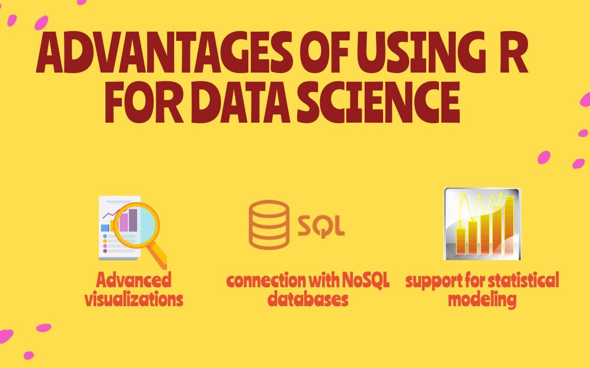
Advantages of Using R for Data Science
5 Advantages of Using R for Data Science
1) Free and Open Source
An open-source language is a language on which we can work without needing a license or a fee. R is an open-source language. We can contribute to the development of R by optimizing our packages, developing new ones, and resolving issues.
2) Extensive support for statistical modeling
Statistical modeling is essential to determine how one variable is related to others. R provides powerful capabilities to deal with statistical modeling. It has excellent functions for central tendency, the measure of variability, probability, hypothesis testing, ANOVA, and regression analysis.
3) Extremely easy data wrangling
R has several packages that hugely simplify the process of preparing your data for analysis. You may have your data stored in the .csv or .txt file, in Excel spreadsheets, in relational databases, or as a SAS or Stata file. R can load these various types of files with just one line of code.
The process of data cleaning and transforming is also straightforward. One line of code – and you create a separate dataset without any missing values, another line – and you impose multiple filters on your data. With such powerful capabilities, the time you spend preparing your data for analysis can decrease significantly, giving you more time to spend it on the analysis itself.
4) The connection with NoSQL databases
The majority of data science projects deal with unstructured data. R can provide interfaces with NoSQL databases and analyze unstructured data in effective ways.
5) Advanced visualizations
Even the basic functionality of R allows you to create histograms, scatterplots, or line plots with only a tiny bit of code. These are very convenient functions for visualizing your data before even starting any analysis. In a few seconds, you can see your data and get insights that are not visible from the tabulated data alone.
However, if you spend some time learning more advanced visualization packages, such as ggplot2, for example, you’ll be able to build some very impressive graphs. R provides seemingly countless ways to visualize your data. These graphs will look very professional. And you’ll get access to a whole host of extra options, such as adding maps to your visualizations or making them animated.
How to Choose the Right Data Visualization is divided into chapters, one for each of the main categories for using data visualization. Each chapter is headed by a short introduction and a list of chart types falling into that category. Each chart type is accompanied by a brief description and one or more icons. Below is a key for decoding these symbols:
BASIC: Chart types with this icon represent typical or standard chart types. When you need to create a data visualization, try to see if one of these chart, types works first, before deciding on an uncommon or advanced type. UNCOMMON: Chart types with this icon are slightly more unusual than the most common chart types. Use cases for these charts are more specialized than other chart types in that same category or more frequently seen in other roles. ADVANCED: Chart types with this icon are even more specialized in their roles. Make sure that the chart type is the best one for your use case before implementing it. Sometimes, these chart types will not be built into visualization software or libraries, and additional work will need to be done to put these types of charts together.
This is less an R hack and more about the RStudio IDE, but the shortcut keys available for common commands are super useful and can save a lot of typing time. My two favourites are Ctrl+Shift+M for the pipe operator %>% and Alt+- for the assignment operator<-. If you want to see a full set of these awesome shortcuts just type Atl+Shift+K in RStudio.
2. Automate tidyverse styling with styler
It’s been a tough day, you’ve had a lot on your plate. Your code isn’t as neat as you’d like and you don’t have time to line edit it. Fear not. The stylerpackage has numerous functions to allow automatic restyling of your code to match tidyverse style. It’s as simple as running styler::style_file() on your messy script and it will do a lot (though not all) of the work for you.
3. The Switch function
I LOVE switch(). It’s basically a convenient shortening of an if a statement that chooses its value according to the value of another variable. I find it particularly useful when I am writing code that needs to load a different dataset according to a prior choice you make. For example, if you have a variable called animal and you want to load a different set of data according to whether animal is a dog, cat or rabbit you might write this:
k-means is an increasingly popular statistical method to cluster observations in data, often to simplify a large number of data points into a smaller number of clusters or archetypes. The kml package now allows k-means clustering to take place on longitudinal data, where the ‘data points’ are actually data series. This is super useful where the data points you are studying are actually readings over time. This could be the clinical observation of weight gain or loss in hospital patients or compensation trajectories of employees.
kml works by first transforming data into an object of the class ClusterLongDatausing the cld function. Then it partitions the data using a ‘hill climbing’ algorithm, testing several values of k 20 times each. Finally, the choice()function allows you to view the results of the algorithm for each k graphically and decide what you believe to be an optimal clustering.
5. Text searching
If you’ve been using regular expressions to search for text that starts or ends with a certain character string, there’s an easier way. “startsWith() and endsWith() — did I really not know these?” tweeted data scientist Jonathan Carroll. “That’s it, I’m sitting down and reading through dox for every #rstats function.”
6. The req and validate functions in R Shiny
R Shiny development can be frustrating, especially when you get generic error messages that don’t help you understand what is going wrong under the hood. As Shiny develops, more and more validation and testing functions are being added to help better diagnose and alert when specific errors occur. The req() function allows you to prevent an action from occurring unless another variable is present in the environment, but does so silently and without displaying an error. So you can make the display of UI elements conditional on previous actions. For example:
output$go_button <- shiny::renderUI({
  # only display button if an animal input has been chosen

  shiny::req(input$animal)
  # display button
  shiny::actionButton("go",
                      paste("Conduct", input$animal, "analysis!")
  )
})
validate() checks before rendering output and enables you to return a tailored error message should a certain condition not be fulfilled, for example, if the user uploaded the wrong file:
# get csv input file
inFile <- input$file1
data <- inFile$datapath
# render table only if it is dogs
shiny::renderTable({
  # check that it is the dog file, not cats or rabbits
  shiny::validate(
    need("Dog Name" %in% colnames(data)),
    "Dog Name column not found - did you load the right file?"
  )
  data
})
7. revealjs
revealjs is a package which allows you to create beautiful presentations in HTML with an intuitive slide navigation menu, with embedded R code. It can be used inside R Markdown and has very intuitive HTML shortcuts to allow you to create a nested, logical structure of pretty slides with a variety of styling options. The fact that the presentation is in HTML means that people can follow along on their tablets or phones as they listen to you speak, which is really handy. You can set up a revealjspresentation by installing the package and then calling it in your YAML header. Here’s an example YAML header of a talk I gave recently using revealjs
---
title: "Exporing the Edge of the People Analytics Universe"
author: "Keith McNulty"
output:
  revealjs::revealjs_presentation:
    center: yes
    template: starwars.html
    theme: black
date: "HR Analytics Meetup London - 18 March, 2019"
resource_files:
- darth.png
- deathstar.png
- hanchewy.png
- millenium.png
- r2d2-threepio.png
- starwars.html
- starwars.png
- stormtrooper.png
---
8. Datatables in RMarkdown or Shiny using DT
The DT package is an interface from R to the DataTables javascript library. This allows a very easy display of tables within a shiny app or R Markdown document that has a lot of in-built functionality and responsiveness. This prevents you from having to code separate data download functions, gives the user flexibility around the presentation and the ordering of the data and has a data search capability built in. For example, a simple command such as :
DT::datatable(
  head(iris),
  caption = 'Table 1: This is a simple caption for the table.'
)
9. Pimp your RMarkdown with prettydoc
prettydoc is a package by Yixuan Qiu which offers a simple set of themes to create a different, prettier look and feel for your RMarkdown documents. This is super helpful when you just want to jazz up your documents a little but don’t have time to get into the styling of them yourself. It’s really easy to use. Simple edits to the YAML header of your document can invoke a specific style theme throughout the document, with numerous themes available. For example, this will invoke a lovely clean blue colouring and style across titles, tables, embedded code and graphics:
---
title: "My doc"
author: "Me"
date: June 3, 2019
output:
  prettydoc::html_pretty:
    theme: architect
    highlight: github
---
10. Get minimum and maximum values with a single command.
Talking about the useful R functions you might not know how can I miss to find the minimum and maximum values in a vector? Base R’s range() function does just that, returning a 2-value vector with the lowest and highest values. The help file says range() works on numeric and character values, but I’ve also had success using it with date objects.
Solving a System of Equations in R With Examples: Solving a system of equations in R is a common task in mathematical and statistical applications. R has several built-in functions and packages to solve systems of equations, including the lm() function and the ‘rootSolve’ package. In this article, we will demonstrate how to solve a system of equations in R using these tools, with examples.
Solving a System of Equations in R With Examples
Example 1: Solving a System of Linear Equations with lm() Function
The lm() function can be used to solve a system of linear equations, where the equation can be represented in the form of y = mx + b, where m is the slope and b is the y-intercept. Let’s consider the following system of two linear equations:
y = 2x + 1
y = -x + 3
To solve this system of equations using lm() function, we first have to create a data frame to represent the equations, and then use the lm() function to fit a linear model to the data.
Creating a data frame to represent the equations
df <- data.frame(x = c(1, 2, 3), y = c(3, 5, 7))
Fitting a linear model to the data
lm_fit <- lm(y ~ x, data = df)
Extracting the coefficients of the model
coeffs <- coefficients(lm_fit)
Solving for x and y
x <- -(coeffs[1]/coeffs[2]) y <- coeffs[1] + coeffs[2] * x
Printing the solution
cat(“The solution is x =”, x, “and y =”, y)
The output will be:
The solution is x = 1.5 and y = 4
Example 2: Solving a Non-Linear System of Equations with rootSolve Package
The rootSolve package can be used to solve a non-linear system of equations, where the equations are not represented in the form of y = mx + b. Let’s consider the following system of two non-linear equations:
x^2 + y^2 = 1
x + y = 1
To solve this system of equations using rootSolve package, we first have to install and load the package, and then use the uniroot() function to find the solution.
Installing and loading the rootSolve package
install.packages(“rootSolve”) library(rootSolve)
Defining the system of equations
equations <- function(z) { x <- z[1] y <- z[2] f1 <- x^2 + y^2 – 1 f2 <- x + y – 1 c(f1, f2) }
Solving for x and y
solution <- uniroot(equations, c(-1, -1))
Printing the solution
cat(“The solution is x =”, solution$root[1], “and y =”, solution$root[2])
The output will be:
The solution is x = 0.5 and y = 0.5
Solving a system of equations in R is a straightforward task with the help of built-in functions and packages such as lm() and rootSolve. These functions can be used to solve both linear and non-linear systems of equations and provide accurate solutions for real-world problems.
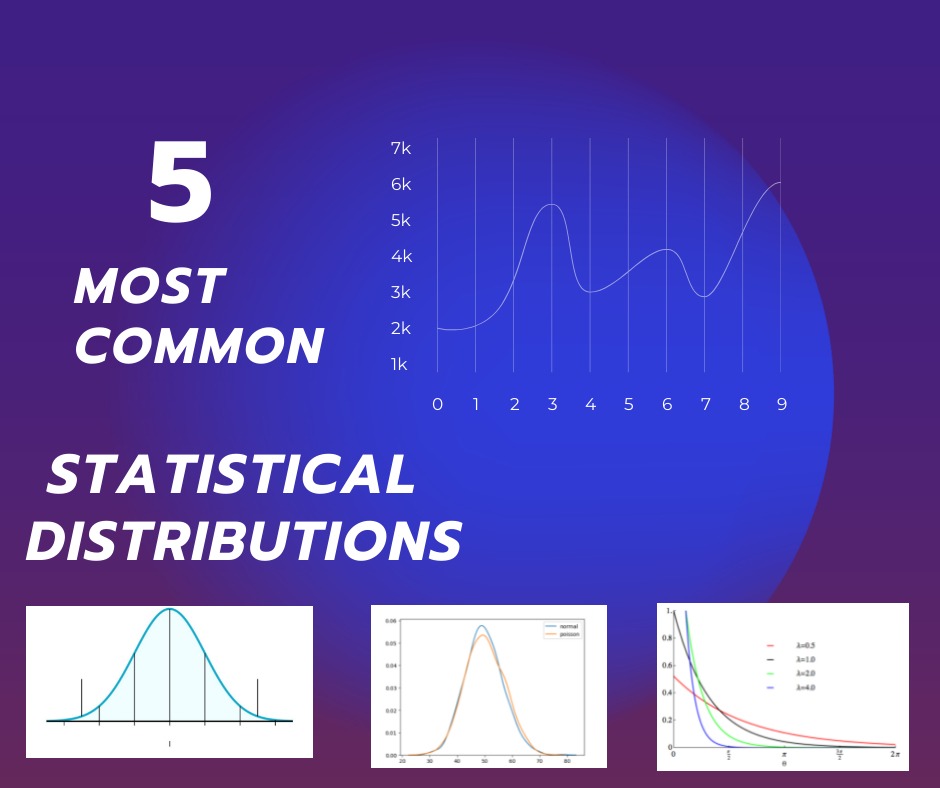
MOST COMMON STATISTICAL DISTRIBUTIONS: Statistics is an essential branch of mathematics that involves the collection, analysis, and interpretation of data. One of the central concepts in statistics is the idea of a distribution, which is a mathematical model that describes the pattern of the data. There are several common statistical distributions that are widely used in different areas of research and industry.
MOST COMMON STATISTICAL DISTRIBUTIONS
Normal Distribution: Also known as Gaussian Distribution, the normal distribution is a bell-shaped curve that represents the frequency of the data. It is commonly used to describe the distribution of continuous data that is symmetrical and follows a central tendency. The normal distribution is widely used in many fields, such as biology, finance, and psychology, to model the behavior of data.
Binomial Distribution: The binomial distribution is used to model the distribution of binary data, where there are only two possible outcomes. It is often used in medical trials, where the trial outcome can be either positive or negative. The binomial distribution is characterized by two parameters, n, and p, where n is the number of trials, and p is the probability of success in each trial.
Poisson Distribution: The Poisson distribution is used to model the number of events that occur in a fixed interval of time or space. It is often used in quality control, where the number of defects in a manufactured product is considered. The Poisson distribution is characterized by a single parameter, λ, which represents the average number of events in the interval.
Exponential Distribution: The exponential distribution is used to model the time between events in a Poisson process. It is often used in reliability engineering, where the time to failure of a device is modeled. The exponential distribution is characterized by a single parameter, λ, which represents the rate of events.
Log-Normal Distribution: The log-normal distribution is used to model data that is skewed to the right and has a heavy tail. It is often used in finance, where the distribution of stock prices is modeled. The log-normal distribution is characterized by two parameters, μ, and σ, which represent the mean and standard deviation of the logarithm of the data.
These are some of the most commonly used statistical distributions in various fields of research and industry. Understanding these distributions is essential for making informed decisions based on data. By knowing the pattern of the data, researchers can make predictions, test hypotheses, and draw conclusions about the population.
The distribution of wealth follows a well-known pattern sometimes called an 80:20 rule: 80 percent of the wealth is owned by 20 percent of the people. A report last year shows that just eight men had a total wealth equivalent to that of the world’s poorest 3.8 billion people. The distribution of wealth is among the most controversial because of the issues it raises about the role of randomness in success and failure.
Why should so few people have so much wealth? The most common explanation is that the wealthy have earned it, whether by IQ or intelligence or talent, virtuous hard work or sheer rapacity. Or all of the above, though it’s kind of tough to be both virtuous and rapacious.
But what about good old dumb luck? Luckily we have an answer thanks to the work of Alessandro Pluchino at the University of Catania in Italy and a couple of colleagues. These guys have created a computer model of human talent and the way people use it to exploit opportunities in life. The model allows the team to study the role of randomness in success and failure.
Somefindings of the Study:The role of randomness in success and failure
Talent vs Luck: The role of randomness in success and failure
The chance of becoming a CEO is influenced by your name or month of birth. The number of CEOs born in June and July is much smaller than the number of CEOs born in other months.
Those with last names earlier in the alphabet are more likely to receive tenure at top departments in Universities.
The display of middle initials increases positive evaluations of people’s intellectual capacities and achievements.
People with easy to pronounce names are judged more positively than those with difficult-to-pronounce names.
Females with masculine sounding names are more successful in legal careers.
A number of studies and books–including those by risk analyst Nassim Taleb, investment strategist Michael Mauboussin, and economist Robert Frank– have suggested that luck and opportunity may play a far greater role than we ever realized, across a number of fields, including financial trading, business, sports, art, music, literature, and science. Their argument is not that luck is everything; of course, talent matters.
Hypothesis testing A Visual Introduction To Statistical Significance
Table of Contents Statistical Significance Overview The Most Important Concept In This Book (If you read nothing else, read this) Variations Of Statistical Significance Problems Example 1 – Z Test But What Is The Normal Curve? Doing A T-Test, Which Is Slightly Different Than A Z Test Example 2 – 1 Sample T-Test Paired T-Test – When You Use The Same Test Subject Multiple Times Example 3 – Paired T-Test Example 3A – Paired T-Test With Non-Zero Hypothesis Example 4 – Two-Sample T-Test with Equal Variance Example 5 – 2 Sample T-Test With Unequal Variance What If You Mix Up Equal Variance With Unequal Variance? If You Found Errors Or Omissions More Books Thank You & Author Information
Download Statistics And Machine Learning We will go back to mathematics and study statistics, and how to calculate important numbers based on data sets. We will also learn how to use various Python modules to get the answers we need. And we will learn how to make functions that can predict the outcome based on what we have learned.
Download Statistics And Machine Learning In Python