With the help of the R programming cheat sheet, we can perform a wide variety of statistical (linear and nonlinear modelling, classical statistical tests, time-series analysis, classification, clustering, …) and graphical techniques, and is highly extensible.
One of R’s strengths is the ease with which well-designed publication-quality plots can be produced, including mathematical symbols and formulae where needed. Great care has been taken over the defaults for the minor design choices in graphics, but the user retains full control.
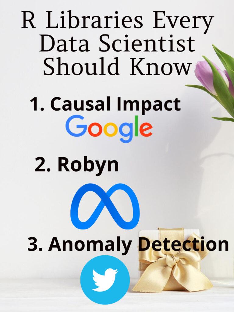
I have been using R for the longest time in my professional life, I realized that R outclasses Python in several use cases, particularly for statistical analyses. As well, R has some powerful packages that were built by the world’s biggest tech companies, and they aren’tin Python! And so, in this article, I wanted to go over three R packages that I highly recommendthat you take the time to learn and add to your arsenal of tools because they are seriously powerful tools. Without further ado, here are three R packages that every data scientist should know:
The package is designed to make a counterfactual inference as easy as fitting a regression model, but much more powerful, provided the assumptions above are met. The package has a single entry point, the function CausalImpact(). Given a response time series and a set of control time series, the function constructs a time-series model, performs posterior inference on the counterfactual, and returns an CausalImpact object. The results can be summarized in terms of a table, a verbal description, or a plot.
Robyn is an automated Marketing Mix Modeling (MMM) code. It aims to reduce human bias by means of ridge regression and evolutionary algorithms, enables actionable decision making provides a budget allocator and diminishing returns curves and allows ground-truth calibration to account for causation
AnomalyDetection is an open-source R package to detect anomalies that is robust, from a statistical standpoint, in the presence of seasonality and an underlying trend. The anomaly detection package can be used in a wide variety of contexts. For example, detecting anomalies in system metrics after a new software release, user engagement post an A/B test, or problems in econometrics, financial engineering, political and social sciences.
Statistics is a building block of data science. If you are working or plan to work in this field, then you will encounter the fundamental Statistical Concepts. Certainly, there is much more to learn in statistics, but once you understand these basics, then you can steadily build your way up to advanced topics.
In this article, I’m going to go over these 10 statistical Concepts, what they’re all about, and why they’re so important.
1) P-values
When it comes to Statistical Concepts P-value is the most technical. The precise definition of a p-value is that it is the probability of achieving a result that’s just as extreme or more extreme than the result if the null hypothesis is too.
If you think about it, this makes sense. In practice, if the p-value is less than the alpha, say of 0.05, then we’re saying that there’s a probability of less than 5% that the result could have happened by chance. Similarly, a p-value of 0.05 is the same as saying, “5% of the time, we would see this by chance.”
Statistical Concepts Everyone Should Know For Data Science Interviews
2) Confidence Intervals and Hypothesis Testing
Confidence intervals and hypothesis testing share a very close relationship. The confidence interval suggests a range of values for an unknown parameter and is then associated with a confidence level that the true parameter is within the suggested range of. Confidence intervals are often very important in medical research to provide researchers with a stronger basis for their estimations.
A confidence interval can be shown as “10 +/- 0.5” or [9.5, 10.5] to give an example.
Hypothesis testing is the basis of any research question and often comes down to trying to prove something did not happen by chance. For example, you could try to prove when rolling a dye, one number was more likely to come up than the rest.
Statistical Concepts Everyone Should Know For Data Science Interviews
3) Z-tests vs T-tests
Another important Statistical Concept is Z-tests vs T-tests. Understanding the differences between z-tests and t-tests as well as how and when you should choose to use each of them, is invaluable in statistics.
A Z-test is a hypothesis test with a normal distribution that uses a z-statistic. A z-test is used when you know the population variance or if you don’t know the population variance but have a large sample size.
A T-test is a hypothesis test with a t-distribution that uses a t-statistic. You would use a t-test when you don’t know the population variance and have a small sample size.
Statistical Concepts Everyone Should Know For Data Science Interviews
4) Linear regression and its assumptions
Linear Regression is one of the most fundamental algorithms used to model relationships between a dependent variable and one or more independent variables. In simpler terms, it involves finding the ‘line of best fit’ that represents two or more variables.
The line of best fit is found by minimizing the squared distances between the points and the line of best fit — this is known as minimizing the sum of squared residuals. A residual is simply equal to the predicted value minus the actual value.
In case it doesn’t make sense yet, consider the image above. Comparing the green line of best fit to the red line, notice how the vertical lines (the residuals) are much bigger for the green line than the red line. This makes sense because the green line is so far away from the points that it isn’t a good representation of the data at all!
There are four assumptions associated with a linear regression model:
Linearity: The relationship between X and the mean of Y is linear.
Homoscedasticity: The variance of the residual is the same for any value of X.
Independence: Observations are independent of each other.
Normality: For any fixed value of X, Y is normally distributed.
Statistical Concepts Everyone Should Know For Data Science Interviews
5) Logistic regression
Logistic regression is similar to linear regression but is used to model the probability of a discrete number of outcomes, typically two. For example, you might want to predict whether a person is alive or dead, given their age.
At a glance, logistic regression sounds much more complicated than linear regression but really only has one extra step.
First, you calculate a score using an equation similar to the equation for the line of best fit for linear regression.
The extra step is feeding the score that you previously calculated in the sigmoid function below so that you get a probability in return. This probability can then be converted to a binary output, either 1 or 0.
To find the weights of the initial equation to calculate the score, methods like gradient descent or maximum likelihood are used. Since it’s beyond the scope of this article, I won’t go into much more detail, but now you know how it works!
Statistical Concepts Everyone Should Know For Data Science Interviews
6) Sampling techniques
There are 5 main ways that you can sample data: Simple Random, Systematic, Convenience, Cluster, and Stratified sampling.
7) Central Limit Theorem
The central limit theorem is very powerful — it states that the distribution of sample means approximates a normal distribution.
To give an example, you would take a sample from a data set and calculate the mean of that sample. Once repeated multiple times, you would plot all your means and their frequencies onto a graph and see that a bell curve, also known as a normal distribution, has been created.
The mean of this distribution will closely resemble that of the original data. You can improve the accuracy of the mean and reduce the standard deviation by taking larger samples of data and more samples overall.
8) Combinations and Permutations
Combinations and permutations are two slightly different ways that you can select objects from a set to form a subset. Permutations take into consideration the order of the subset whereas combinations do not.
Combinations and permutations are extremely important if you’re working on network security, pattern analysis, operations research, and more. Let’s review what each of the two is in further detail:
Permutations
Definition: A permutation of n elements is any arrangement of those n elements in a definite order. There are n factorial (n!) ways to arrange n elements. Note the bold: order matters!
The number of permutations of n things taken r-at-a-time is defined as the number of r-tuples that can be taken from n different elements and is equal to the following equation:
Example Question: How many permutations does a license plate have with 6 digits?
Answer
Combinations
Definition: The number of ways to choose r out of n objects where order doesn’t matter.
The number of combinations of n things taken r-at-a-time is defined as the number of subsets with r elements of a set with n elements and is equal to the following equation:
Example Question: How many ways can you draw 6 cards from a deck of 52 cards?
Answer
Note that these are very very simple questions and that it can get much more complicated than this, but you should have a good idea of how it works with the examples above!
9) Bayes Theorem/Conditional Probability
Bayes theorem is a conditional probability statement, essentially it looks at the probability of one event (B) happening given that another event (A) has already happened.
One of the most popular machine learning algorithms, Naïve Bayes, is built on these two concepts. Additionally, if you enter the realm of online machine learning, you’ll most likely be using Bayesian methods.
Bayes Theorem EquationConditional Probability Equation
10) Probability Distributions
A probability distribution is an easy way to find your probabilities of different possible outcomes in an experiment. There are many different distribution types you should learn about but a few I would recommend are Normal, Uniform, and Poisson.
If you’ve ever worked on a personal data science project, you’ve probably spent a lot of time browsing the internet looking for interesting datasets to analyze. It can be fun to sift through dozens of datasets to find the perfect one, but it can also be frustrating to download and import several CSV files, only to realize that the data isn’t that interesting after all. In this post, we’ll walk through several types of data science projects, including data visualization projects, data cleaning projects, and machine learning projects, and identify good places to find datasets for each.
1. Kaggle
Kaggle is a great resource for machine learning datasets. The advantage of using Kaggle is it contains datasets from almost every domain and you can find the number of kernels relating to each dataset.
2. NASA
NASA is a publicly-funded government organization, and thus all of its data is public. It maintains websites where anyone can download its datasets related to earth science and datasets related to space. You can even sort by format on the earth science site to find all of the available CSV datasets.
3. UCI
The UCI has publically available datasets specifically for machine learning and data analysis. The datasets present are tagged up with categories e.g. Classification, Regression, Recommender-Systems, etc. so you can easily search for a dataset to practice a particular machine learning technique.
4. Quandl
Quandl is a repository of economic and financial data. Some of this information is free, but many data sets require purchase. Quandl is useful for building models to predict economic indicators or stock prices. Due to a large number of available data sets, it’s possible to build a complex model that uses many data sets to predict values in another. View Quandl Data sets.
5. US Government Open Dataset — DATA.GOV
US Government Open Dataset — DATA.GOV is the website by the US government that provide free datasets. Here you can find datasets based on different categories like Agriculture, Climate, Health and many more.
6. World Bank Dataset
For your data science project, The World Bank Dataset is the best open dataset provided by the World Bank. Here you can find many resources related to the datasets like Open Data Catalog, DataBank, Microdata Library and many more.
7. Google Cloud BigQuery public datasets
Google Cloud BigQuery public datasets provide various public datasets by Google Cloud Marketplace. Datasets provided here are not completely free. The first 1TB of data per month is free, after that, they have some price associated. In order to access the datasets present, you have to create a project in the Google Cloud Platform.
You can display your data analysis reports in several ways in Excel. However, if you know the right data visualization technique your data analysis results can be more notable, and your audience can quickly grasp what you want to project in the data. It also leaves a good impact on your presentation style. You can improve your data visualization productivity by using the built-in table functionality available in Excel.
1. Create The Table
Place your cursor in the area you want to make a table. On the menu bar, select Insert, Table. Excel will guess the range to create the table.
You will then validate the area that Excel has determined is the table you wish to create. Your table should have headers and the checkbox will default to accept the first row of the range to be the table headers.
Once you hit OK the range will format as a table with the default formatting. Select Table Tools that will now be visible on the menu bar which will display more formatting options.
The Design menu bar has many visual and operational options to choose from, some of which we will cover below.
2. Name the Table to Allow for Easier References
As shown in the screen capture above, the default name for the first table is “Table1”. Naming the table something meaningful allows you to reference the table in calculations and other functionality. The reference, rather being Table1 would be YearlySalary which allows for built-in documentation making your calculations more meaningful.
To change the table name, enter a new value in the Table Name box under the Table Tools option on the toolbar, as pictured below.
3. Format the Columns
As you use the tables in other Excel features, such as pivot tables and graphs, the column format will be picked up in the other tools. For example, formatting the columns as Currency and then no decimals will cause the formats to be used in Graphs as shown in the last section below.
4. Insert Slicers
Under the table tools, there is a Slicer option. Clicking on this option allows you to use various columns in the table as filters which allows you to slice the data for different views. With a cell selected in the table, select the Insert Slicer toolbar item in the Table Tools menu bar. You can then select the slicers you want to add. The final view is below with the Insert Slicer dialogue.
5. Insert a Chart
Now that you have filters you can easily add a chart. Selecting the table, you can insert a graph by selecting the Insert menu option then, select a chart you want to view by selecting that option on the toolbar. The graph is then filtered based on your slicer selection.
Note: The graph pictured has the axis formatted with the Year value removed. There are several formats available in the graph format menu option.
In this day and age, our data dependence is overwhelming. Thanks to our cellphones and laptop, a halo of data surrounds our life. Data is nothing but a piece of classified information. Microsoft Excel is one of the most used data handling/analysis software. At the same time, one tiny mistake in analyzing data can cause headaches. Data is the backbone of any analysis that you do. It is an eternal problem and not only in Excel! Here’s a list of the top 10 Super Neat Ways to Clean Data in Excel as follows.
1. Get Rid of Extra Spaces
When it comes to clean data on excel extra spaces are painfully difficult to spot. While you may somehow spot the extra spaces between words or numbers, trailing spaces are not even visible. Here is a neat way to get rid of these extra spaces.
– Use TRIM Function.
Here a practical examples of using the TRIM function.
Example 1 – Remove Leading, Trailing, and Double Spaces
TRIM function is made to do this.
Below is an example where there are leading, trailing, and double spaces in the cells.
You can easily remove all these extra spaces by using the below TRIM function:
=TRIM(A1)
Copy-paste this into all the cells and you are all set.
2. Select & Treat all blank cells
Blank cells are troublesome because they often create errors while creating reports. And, people usually want to replace such cells with 0, Not Available or something like that. But replacing each cell manually on a large data table would take hours. Luckily, there’s an easy way to tackle this problem.
Steps:
Select the entire Data (you want to treat)
Press F5 (on the keyboard)
A dialogue box will appear > Select “Special”
Select “Blanks” & click “OK”
Now, all blank cells will be highlighted in pale grey color, out of which one cell would be white with a different border. That’s the active cell, type the statement you want to replace in blank cells.
Hit “Ctrl+Enter”
3. Convert Numbers Stored as Text into Numbers
When you want to Clean Data On Excel Sometimes you import data from text files or external databases, numbers get stored as text. Also, some people are in the habit of using an apostrophe (‘) before a number to make it text. This could create serious issues if you are using these cells in calculations. Here is a foolproof way to convert these numbers stored as text back into numbers.
Steps:
In any blank cell, type 1
Select the cell where you typed 1, and press Control + C
Select the cell/range which you want to convert to numbers
Select Paste –> Paste Special (KeyBoard Shortcut – Alt + E + S)
In the Paste Special Dialogue box, select Multiply (in the operations category)
Click OK. This converts all the numbers in text format back to numbers.
4. Remove Duplicates
Elimination of duplicate data is necessary for the creation of unique data & less usage of storage. In duplication, you can either highlight it or delete it.
A) Highlight Duplicates:
Select the data & go to Home > Conditional Formatting > Highlight CellRules > Duplicate Values
A dialogue box will appear (Duplicate Values), Select Duplicate & format colour
Press OK
All duplicate values will be highlighted!
B) Delete Duplicates:
Select the data & go to DATA > Remove Duplicates
A dialogue box will appear (Remove Duplicates), and tick columns whose duplicates need to be found.
Remember to click on “My data has headers” (if your Data has headers) or else column heads will be considered as data & a duplication search will be applied to it too.
Click OK!
Duplicate values will be removed! Suppose you select 4 of 4 columns. Then that four column rows should also match or else; they won’t be considered a duplicate.
5. Highlight Errors
There are 2 ways you can highlight Errors while cleaning Data on Excel:
Using Conditional Formatting
Select the entire data set
Go to Home –> Conditional Formatting –> New Rule
In New Formatting Rule Dialogue Box select ‘Format Only Cells that Contain’
In the Rule Description, select Errors from the drop-down
Set the format and click OK. This highlights any error value in the selected dataset
Using Go To Special
Select the entire data set
Press F5 (this opens the Go To Dialogue box)
Click on Special Button at the bottom left
Select Formulas and uncheck all options except Errors
This selects all the cells that have an error in it. Now you can manually highlight these, delete them, or type anything into them.
6. Change Text to Lower/Upper/Proper Case
While importing data, we often find names in irregular forms like lower, upper case, or sometimes mixed. Such errors are not easy to eliminate manually. Here’s a fingertip trick to bring back the consistency.
LOWER(text)
UPPER(text)
PROPER(text)
Steps:
Just type the formula you want to use, suppose “LOWER(“ and select the cell whose case needs to be changed.
Hit “CTRL+ENTER.”
The case has been changed & Consistent
Drag down to do the same for other cells.
Similarly for UPPER() & PROPER()
7. Parse Data Using Text to Column
Sometimes the received Data has texts filled in one cell, only separated by punctuations. Usually, the addresses are cramped in one cell separated by a comma. To distinguish values in separate cells, we can use “Text to Column.”
Steps:
Select the Data
Go to Data> Text to Column
A dialogue box will appear (Convert Text to Columns Wizard – Step 1 of 3), select Delimited or Fixed Width as per your convenience.
Delimited is to be selected if the width isn’t fixed, click “NEXT”
In Delimiters tick the option which separates your text in the cell. Suppose “Norwich Cathedral, Norwich, UK,” here three values are separated by commas. So we will select “Comma” for this example. And, deselect the rest options.
View the preview & click on “NEXT”
Select Column Data Format & destination cell address
Click “FINIS
8. Spell Check
Spelling mistakes are common in text files & PowerPoint. However, MS points out such errors by underlining them with colourful dashes. And, MS Excel doesn’t have such a feature. But you can use it below steps to clean data on excel.
Select the Data
Press “F7”
A dialogue box appears, which shows you the possible wrong word & it’s the possible correct spelling. Click on “Change,” if you agree with the suggestion.
Check & change till it says “Spell check complete. You’re good to go!”
9. Delete all Formatting
In my job, I used multiple databases to get the data in excel. Every database had it’s own data formatting. When you have all the data in place, here is how you can delete all the formatting in one go:
Select the data set
Go to Home –> Clear –> Clear Formats
Similarly, you can clear Content, Comments, Hyperlink, or entire data (using Clear All).
10. Use Find & Replace to Clean Data in Excel
A) Changing Cell References:
Press “CTRL+H” to open “Find and Replace”
Now in Replace > “Find What” (change the reference range too) “Replace With”
Suppose Find What: $B to Replace With $C
Click on “Replace All”
Similarly finding & replacing using reference range we can clean the Data
B) Find & Change Specific Format:
Press “CTRL+H”
Select “Options”
Now go to “Format” of “Find What.” Here you can specify the format or choose a format from the cell. Suppose you select a format.
Now it will show you the preview for “Find What.”
Click on “Format” of “Replace With.” Suppose we go for “Format…”
Now select format, for example, Number, Alignment, Font, Border, Fill, Protection.
Suppose we select Color and then select any colour to fill the column header cell.
Click on Replace All
Instantly the format has been changed!
C) Removal of Line Breaks:
Suppose we have data where it is separated by line breaks (same cell but different rows). To remove these line breaks, follow the below steps:
Press “CTRL+H”
Find and Replace dialogue box will appear, press “CTRL+J”
Go to the replace with box & type a single space
Click Replace All
All rows will be managed in one row within the same cell!
D) Removal of Parenthesis:
Select the Data
Press “CTRL+H”
Type (*) in “Find What” (This will consider all characters within parenthesis)
Leave the Replace With column empty & click Replace
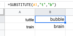
This is a useful trick that is ideal for updating cells in bulks. It’s another one that does exactly what it says and is extremely useful for updating URLs, removing unintentional spaces or spelling errors. In the example above, the formula is replacing the letter ‘t’ with ‘b’.
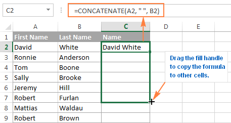
2. CONCATENATE
=CONCATENATE is one of the easiest to learn but most powerful formulas when conducting data analysis. Combine text, numbers, dates and more from multiple cells into one. This is an excellent function for creating API endpoints, product SKUs, and Java queries.
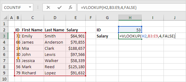
3. VLOOKUP
You’ve no doubt come across =VLOOKUP, which will be familiar to anyone who’s used Excel. The formula allows you to lookup data that is arranged in vertical columns. For example, if you have a list of months of the year with the profit made in each month, =VLOOKUP can present the data from the month of your choice.
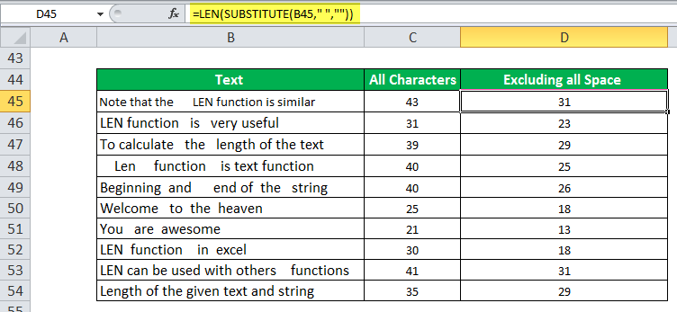
4. LEN
=LEN quickly provides the number of characters in a given cell. As in the example above, you can identify two different kinds of product Stock Keeping Units (SKUs) using the =LEN formula to see how many characters the cell contains. LEN is especially useful when trying to determine the differences between different Unique Identifiers (UIDs), which are often lengthy and not in the right order.
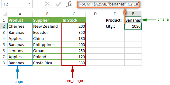
5. SUMIFS
The =SUMIF function is an essential formula in the world of data analytics. The formula adds up the values in cells that meet a selected number. In the above example, the formula is adding up the numbers in cells that are higher than the number 8.
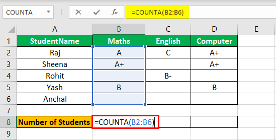
=COUNTA identifies whether a cell is empty or not. In the life of a data analyst, you’re going to run into incomplete data sets daily. COUNTA will allow you to evaluate any gaps the dataset might have without having to reorganize the data.
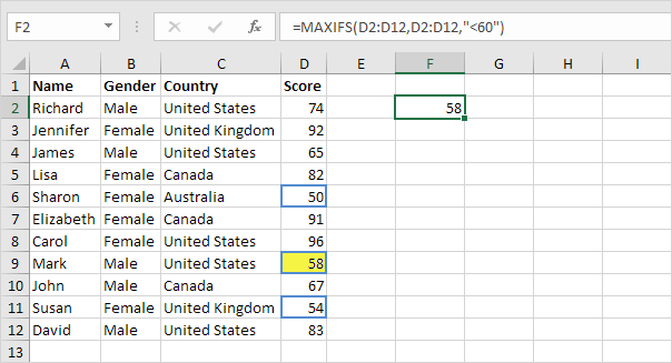
7. MINIFS/MAXIFS
This handy formula identifies which value is the lowest and which is the highest. But it does more than just that, it also sorts values in relation to particular criteria too. For example, you can use it to sort the oldest and youngest ages from a sample of men and women, displaying the values by gender.
8. FIND/SEARCH
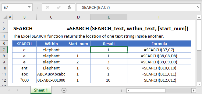
=FIND/=SEARCH are powerful functions for isolating specific text within a data set. Both are listed here because =FIND will return a case-sensitive match, i.e. if you use FIND to query for “Big” you will only return Big=true results. But a =SEARCH for “Big” will match with Big or big, making the query a bit broader. This is particularly useful for looking for anomalies or unique identifiers.
9. IFERROR
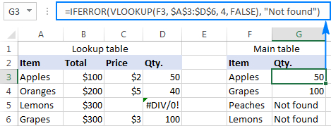
=IFERROR is something that any analyst who actively presents data should take advantage of. .You can use the IFERROR function to trap and handle errors in a formula. IFERROR returns a value you specify if a formula evaluates to an error; otherwise, it returns the result of the formula.
10. DAYS/NETWORKDAYS
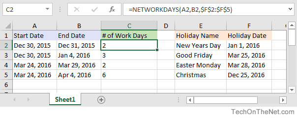
This one is fairly self-explanatory. =DAYS determines the number of days between two calendar dates, and is commonly used to determine product life cycles or contract periods. =NETWORKDAYS is its more useful counterpart and is used to calculate the number of working days between two dates. You could say this formula lives for the weekend.
Algorithms are used by all of us all the time with or without our direct knowledge. They have applications in many different disciplines, frommath andphysics to, of course, computing. These are the most important algorithms that you should know.
1. Boolean (binary) algebra
You might be familiar with the term Boolean from mathematics, logic, and computer coding. It was created by George Boole in 1847 work An Investigation of the Laws of Thought. Boolean algebra is a branch of algebra in which a variable can only ever be true or false (usually binary 1 or 0). This algorithm is widely recognized as the foundation of modern computer coding. It is still in use today, especially in computer circuitry.
Most Important Algorithms That You Should Know: Logic gates and Boolean algebra
2. Fast Fourier Transform
This algorithm was created by Carl Gauss, Joseph Fourier, James Cooley, and John Tukey in 1802, 1822 and 1965. It is used to break down a signal into the frequencies that compose it – much like a musical chord can be expressed in frequencies, or pitches, of each note therein. “FFT relies on a divide-and-conquer strategy to reduce an ostensibly O(N2) chore to an O(N log N) frolic.
Most Important Algorithms That You Should Know: FFT – Fast Fourier Transformation
3. Google’s ranking algorithm
PageRank is, arguably, the most used algorithm in the world today. It is, of course, the foundation of the ranking of pages on Google’s search engine. It was created by Larry Page (mainly) and Sergey Brin in 1996. It is not the only algorithm that Google uses nowadays to order pages on its search result, but it is the oldest and best known of them.
The PageRank algorithm is given by the following formula:
PR(A) = (1-d) + d (PR(T1)/C(T1) + … + PR(Tn)/C(Tn))
where:
PR(A) is the PageRank of page A,
PR(Ti) is the PageRank of pages Ti which links to page A,
C(Ti) is the number of outbound links on page Ti and;
d is a damping factor that can be set between 0 and 1.
Most Important Algorithms That You Should Know
4. The simplex method for linear programming
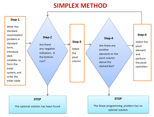
This is one of the most successful algorithms of all time despite the fact that most real-world problems are rarely linear in nature. It was created by George Dantzig in 1947. It was widely used in the world of industry or any other situation where economic survival rests on the ability to maximize efficiency within a budget and/or other constraints.
It works by using a systematic strategy to generate and validate candidate vertex solutions within a linear program. At each iteration, the algorithm chooses the variable that makes the biggest modification towards the minimum-cost solution. That variable then replaces one of its covariables, which is most drastically limiting it, thereby shifting the simplex method to another part of the solution set and toward the final solution.
Most Important Algorithms That You Should Know
5. Kalman Filter
Kalman Filtering, aka linear quadratic estimation (LQE), helps you make an educated guess about what a system will likely do next, within reason, of course. Kalman filters are great for situations where systems are constantly changing. Created by Rudolf E. Kálmán in 1958-1961 is a general and powerful tool for combining information in the presence of uncertainty.
Most Important Algorithms That You Should Know: Kalman Filter algorithm
6. QR algorithms for computing eigenvalues
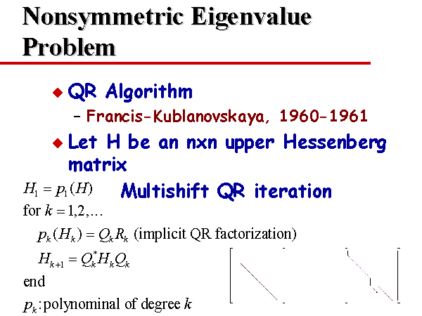
It was created in the late 1950s by John G. F. Francis and by Vera N. Kublanovskaya independently. The QR algorithm, aka eigenvalue algorithm, greatly simplifies the calculations of eigenvalues it is important in numerical linear algebra. In addition to enabling the swift calculation of eigenvalues, it also aids in the processing of eigenvectors in a given matrix. Its basic function is to perform QR decomposition, write a matrix as a product of an orthogonal matrix and an upper triangular matrix, multiply the factors in the reverse order and iterate.
Most Important Algorithms That You Should Know: QR algorithms for computing eigenvalues
7. JPEG and other data compression algorithms
It was created in 1992 by the Joint Photographic Experts Group, IBM, Mitsubishi Electric, AT&T, Canon Inc., and ITU-T Study Group 16. It is difficult to single out one particular data compression algorithm as its value or importance depends on the files’ applications. Data compression algorithms, like JPEG, MP3, zip, or MPEG-2, are widely used the world over. Most have become the de facto standard for their particular application. They have made computer systems cheaper and more efficient over time.
Most Important Algorithms That You Should Know: JPEG compression algorithm.
8. Quicksort algorithm
Created by Tony Hoare of Elliott Brothers, Limited, London in 1962. It provided a means of quickly and efficiently sorting lists alphabetically and numerically. Quicksort algorithm used a recursive strategy to “divide and conquer” to rapidly reach a solution. It would prove to be two to three times quicker than its main competitors’ merge sort and heapsort. It works by choosing one element to be the “pivot”. All others are then sorted into “bigger” and “smaller” piles of elements relative to the pivot. This process is then repeated in each pile.
Most Important Algorithms That You Should Know: Quicksort algorithm
The Sveriges Riksbank Prize in Economic Sciences in Memory of Alfred Nobel was established in 1968 by the Bank of Sweden, and it was first awarded in 1969, more than 60 years after the distribution of the first Nobel Prizes.
It has been awarded 51 times to 84 Laureates who have researched and tested dozens of ground-breaking ideas. Here are five prize-winning economic theories that you’ll want to be familiar with. These are ideas you’re likely to hear about in news stories because they apply to major aspects of our everyday lives.
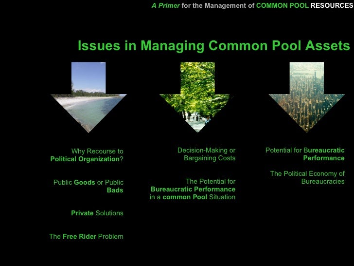
1. Management of Common Pool Resources
In 2009, Indiana University political science professor, Elinor Ostrom, became the first woman to win the Nobel Prize in economics. She received it “for her analysis of economic governance, especially the commons.
Management of common-pool resources is a resource that benefits a group of people, but which provides diminished benefits to everyone if each individual pursues his or her self-interest. The value of a common pool resource can be reduced through overuse because the supply of the resource is not unlimited, and using more than can be replenished can result in scarcity. Overuse of a common pool resource can lead to the tragedy of the commons problem.
The US academic Richard Thaler won the Nobel prize in economics for his pioneering work in behavioural economics. The Royal Swedish Academy of Sciences, which awarded the £845,000 prize, praised Thaler for incorporating psychological assumptions into analyses of economic decision-making.
Unlike the field of classical economics, in which decision-making is entirely based on cold-headed logic, behavioural economics allows for irrational behaviour and attempts to understand why this may be the case. The concept can be applied in miniature to individual situations, or more broadly to encompass the wider actions of a society or trends in financial markets. The theory is particularly useful for companies and marketers looking to increase sales by encouraging changes in behaviour by consumers.
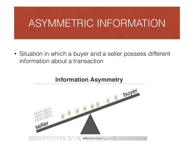
In 2001, George A. Akerlof, A. Michael Spence, and Joseph E. Stiglitz won the prize for their analyses of markets with asymmetric information. The theory showed that economic models predicated on perfect information are often misguided because, in reality, one party to a transaction often has superior information, a phenomenon known as information asymmetry.
An understanding of information asymmetry has improved our understanding of how various types of markets work and the importance of corporate transparency. Asymmetric information can also be viewed as the specialization and division of knowledge, as applied to any economic trade. For example, doctors typically know more about medical practices than their patients. After all, physicians have extensive medical school educational backgrounds that their patients generally don’t have. This principle equally applies to architects, teachers, police officers, attorneys, engineers, fitness instructors, and other trained professionals. Asymmetric information, therefore, is most often beneficial to an economy and a society in increasing efficiency.
The academy awarded the 1994 prize to John C. Harsanyi, John F. Nash Jr., and Reinhard Selten for their pioneering analysis of equilibria in the theory of non-cooperative games. The theory of non-cooperative games is a branch of the analysis of strategic interaction commonly known as “game theory.”
One of Nash’s major contributions was the Nash Equilibrium, a method for predicting the outcome of non-cooperative games based on equilibrium. Nash’s 1950 doctoral dissertation, “Non-Cooperative Games,” details his theory. The Nash Equilibrium expanded upon earlier research on two-player, zero-sum games. Selten applied Nash’s findings to dynamic strategic interactions, and Harsanyi applied them to scenarios with incomplete information to help develop the field of information economics. Their contributions are widely used in economics, such as in the analysis of oligopoly and the theory of industrial organization, and have inspired new fields of research.
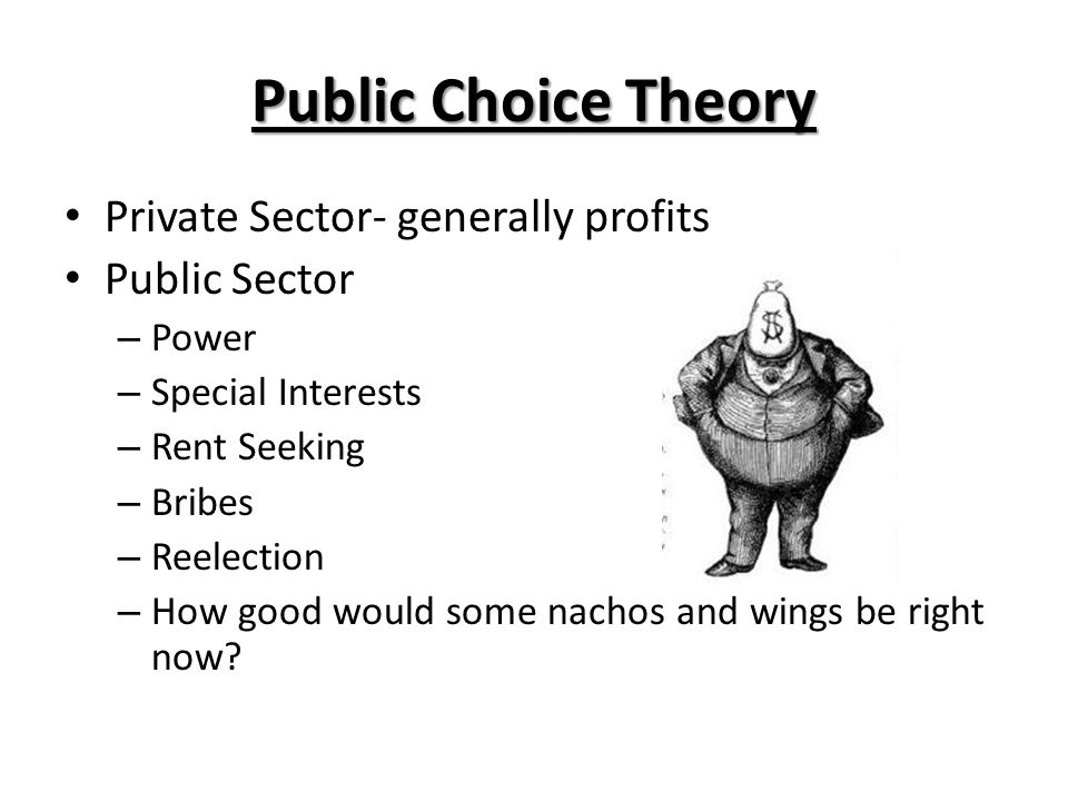
James M. Buchanan Jr. received the prize in 1986 for his development of the contractual and constitutional bases for the theory of economic and political decision-making. Using Buchanan’s insights regarding the political process, human nature, and free markets.
He showed that contrary to the conventional wisdom that public-sector actors act in the public’s best interest as “public servants”, politicians and bureaucrats tend to act in their self-interest, just like the private sector. He described his theory as “politics without romance.” We can better understand the incentives that motivate political actors and better predict the results of political decision-making. We can then design fixed rules that are more likely to lead to desirable outcomes.
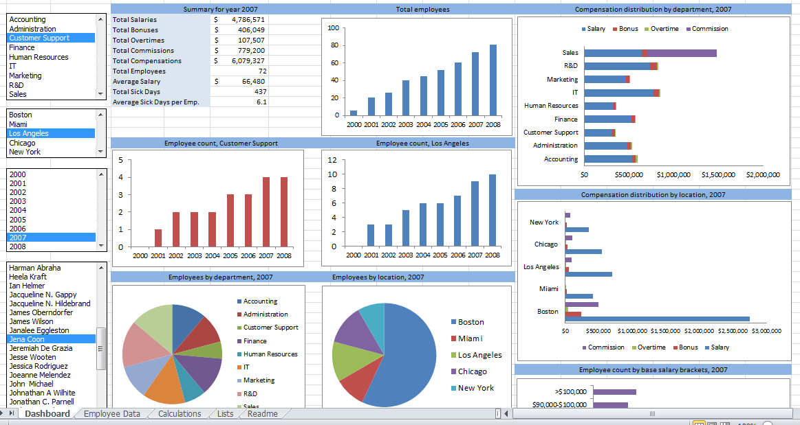
Since 1987, Microsoft Excel has been used in virtually every office by employees with various job titles. But how is Excel used in data analysis today and can it be learned? While some enjoy playing with pivotal tables and histograms, others limit themselves to simple pie charts and conditional formatting. We explain the pros and cons of using Excel for data analysis and the top Excel functions that every data analyst needs to know.
What is Excel?
Excel is spreadsheet software. Excel is a convenient go-to software that is both comprehensible and familiar, and a key part of Excel is how it can be used for ad hoc analysis. Many people are familiar with Excel and that level of comfort is where much of its power stems from.
What types of data can be entered into an Excel spreadsheet?
Everyone thinks of financial data with Excel, but it can apply to any industry data. All types of data are appropriate! The only exception would be the size of the datasets. Small to medium-sized datasets are best for Excel. If a dataset becomes too large, it’s cumbersome in Excel. Many times, data analysts will take a look at the underlying data using Excel before they use a heavier application like Python or SQL.
Pros & Cons of Excel in Data Analysis
Excel is powerful because it’s quick and easy to use, but the downside is that it isn’t scalable. As data sizes become larger, we hit limits in our notebook and time limits on our computers. Excel also lacks the ability to automate processes.
Alternatives to Excel
Google Sheets is a free alternative to Excel. The collaborative aspect of Google Sheets is great, but it also makes it harder to protect your data from other parts of the company. It is awesome software but Google Sheets isn’t quite as advanced as Excel is and I doubt they will ever catch up. Excel is continuously improving and expanding.
Analyzing Data Sets with Excel
To know how to analyze data in Excel, you can instantly create different types of charts, including line and column charts, or add miniature graphs. You can also apply a table style, create PivotTables, quickly insert totals, and apply conditional formatting. Analyzing large data sets with Excel makes work easier if you follow a few simple rules:
Select the cells that contain the data you want to analyze.
Click the Quick Analysis button image button that appears at the bottom right of your selected data (or press CRTL + Q).
Selected data with Quick Analysis Lens button visible
In the Quick Analysis gallery, select a tab you want. For example, choose Charts to see your data in a chart.
Pick an option, or just point to each one to see a preview.
You might notice that the options you can choose are not always the same. That is often because the options change based on the type of data you have selected in your workbook.
To understand the best way to analyze data in excel, you might want to know which analysis option is suitable for you. Here we offer you a basic overview of some of the best options to choose from.
Formatting: Formatting lets you highlight parts of your data by adding things like data bars and colors. This lets you quickly see high and low values, among other things.
Charts: Charts Excel recommends different charts, based on the type of data you have selected. If you do not see the chart you want, click More Charts.
Totals: Totals let you calculate the numbers in columns and rows. For example, Running Total inserts a total that grows as you add items to your data. Click the little black arrows on the right and left to see additional options.
Tables: Tables make it easy to filter and sort your data. If you do not see the table style you want, click More.
Sparklines: Sparklines are like tiny graphs that you can show alongside your data. They provide a quick way to see trends.
How to Analyze Data in Excel: Data Analysis
Data Analysis is simpler and faster with Excel analytics. Here, we offer some tips for work:
Create auto expandable ranges with Excel tables: One of the most underused features of MS Excel is Excel Tables. Excel Tables have wonderful properties that allow you to work more efficiently. Some of these features include:
Formula Auto Fill: Once you enter a formula in a table it will be automatically copied to the rest of the table.
Auto Expansion: New items typed below or at the right of the table become part of the table.
Visible headers: Regardless of your position within the table, your headers will always be visible.
Automatic Total Row: To calculate the total of a row, you just have to select the desired formula.
Use Excel Tables as part of a formula: Like in dropdown lists, if you have a formula that depends on a Table, when you add new items to the Table, the reference in the formula will be automatically updated.
Use Excel Tables as a source for a chart: Charts will be updated automatically as well if you use an Excel Table as a source. As you can see, Excel Tables allow you to create data sources that do not have to be updated when new data is included.
How to Analyze Data in Excel: Data Visualization
Quickly visualize trends with sparklines: Sparklines are a visualization feature of MS Excel that allows you to quickly visualize the overall trend of a set of values. Sparklines are mini-graphs located inside of cells. You may want to visualize the overall trend of monthly sales by a group of salesmen.
To create the sparklines, follow these steps below:
Select the range that contains the data that you will plot (This step is recommended but not required, you can select the data range later).
Go to Insert > Sparklines > Select the type of sparkline you want (Line, Column, or Win/Loss). For this specific example, I will choose Lines.
Click on the range selection button Select Range Excel Button to browse for the location of the sparklines, press Enter and click OK. Make sure you select a location that is proportional to the data source. For example, if the data source range contains 6 rows then the location of the sparkline must contain 6 rows.
To format the sparkline you may try the following:
To change the colour of markers:
Click on any cell within the sparkline to show the Sparkline Tools menu.
In the Sparkline tools menu, go to Marker Color and change the colour for the specific markers you want.
For example High points on the green, Low points on red, and the remaining in blue.
To change the width of the lines:
Click on any cell within the sparkline to show the Sparkline Tools menu.
In the Sparkline tools contextual menu, go to Sparkline Color > Weight and change the width of the line as you desire.
Save Time with Quick Analysis: One of the major improvements introduced back in Excel 2013 was the Quick Analysis feature. This feature allows you to quickly create graphs, sparklines, PivotTables, PivotCharts, and summary functions by just clicking on a button.
When you select data in Excel 2013 or later, you will see the Quick Analysis button Quick Analysis Excel Button in the bottom-right corner of the range selected. If you click on the Quick Analysis button you will see the following options:
1. Formatting
2. Charts
3. Totals
4. Tables
5. Sparklines
When you click on any of the options, Excel will show a preview of the possible results you could obtain given the data you selected.
If you click on the Quick Analysis button and go to charts, you could quickly create the graph below just by clicking a button.
If you go to Totals, you can quickly insert a row with the average for each column:
If you click on Sparklines, you can quickly insert Sparklines:
As you can see, the Quick Analysis feature really allows you to quickly perform different visualizations and analyses with almost no effort.
Data Jobs that Use Excel
Any position with the word “analyst” at the end of it requires Excel! That includes Data Analyst, Business Analyst, Business Operations Analyst, and Reporting Analyst.