Data science

Statistics and Data Visualization with Python

Statistics and data visualization play crucial roles in analyzing and interpreting data, enabling us to gain valuable insights and make informed decisions. With the increasing availability of data, it has become essential to have effective tools and techniques to process and present data visually. Python, a versatile programming language, offers powerful libraries that make statistical analysis and data visualization accessible to both beginners and experienced professionals.

Introduction

In today’s data-driven world, businesses, researchers, and individuals need to harness the power of data to derive meaningful conclusions and drive growth. Statistics provides the foundation for understanding and summarizing data, while data visualization enables us to communicate complex information visually. Python, with its extensive set of libraries, has emerged as a popular language for performing statistical analysis and creating impactful data visualizations.

Statistics and Data Visualization with Python

Importance of Statistics and Data Visualization

Enhancing data understanding and insights

Statistics allows us to explore data and uncover patterns, trends, and relationships. By applying statistical techniques, we can summarize large datasets, identify outliers, and gain a deeper understanding of the underlying distributions. This knowledge helps us make informed decisions and predictions based on evidence rather than intuition alone.

Data visualization complements statistics by representing data in a visual format. Visualizations help us perceive patterns and relationships that may not be apparent from raw data alone. Through graphs, charts, and interactive dashboards, we can communicate complex information more effectively, enabling stakeholders to grasp insights quickly and make data-driven decisions.

Supporting decision-making processes

Both statistics and data visualization are crucial for decision-making processes. Statistical analysis helps us evaluate hypotheses, test the significance of results, and quantify uncertainty. With statistical techniques, we can assess the effectiveness of interventions, identify factors influencing outcomes, and optimize strategies.

Data visualization provides an intuitive way to present data and results to decision-makers. It allows them to see trends, compare variables, and understand the impact of different scenarios. By conveying information visually, data visualization facilitates faster comprehension, leading to more informed and confident decision-making.

Python as a Powerful Tool for Statistics and Data Visualization

Python has gained popularity in the field of data science and analytics due to its simplicity, versatility, and extensive libraries. It offers a rich ecosystem of tools specifically designed for statistical analysis and data visualization. Python’s readability and user-friendly syntax make it accessible to users with varying levels of programming experience.

Key Python Libraries for Statistics and Data Visualization

To perform statistical analysis and create compelling data visualizations in Python, several key libraries are commonly used. These libraries provide a wide range of functionalities and make complex operations more accessible.

NumPy

NumPy is a fundamental library for numerical computing in Python. It provides powerful tools for working with arrays and matrices, enabling efficient and fast computation of mathematical operations. NumPy forms the foundation for many other libraries in the scientific Python ecosystem.

Pandas

Pandas is a versatile library that simplifies data manipulation and analysis. It provides data structures, such as dataframes, which allow for easy handling of structured data. Pandas offers a wide range of functionalities for filtering, aggregating, and transforming data, making it an essential tool for data preprocessing.

Matplotlib

Matplotlib is a popular data visualization library in Python. It offers a wide range of plotting functions and customization options, allowing users to create static, animated, and interactive visualizations. With Matplotlib, you can generate various types of charts, including line plots, bar plots, scatter plots, and histograms.

Seaborn

Seaborn is built on top of matplotlib and provides a high-level interface for creating visually appealing statistical graphics. It simplifies the creation of complex visualizations, such as heatmaps, violin plots, and pair plots. Seaborn also offers additional statistical functionalities, enhancing the analysis process.

Exploring Descriptive Statistics with Python

Descriptive statistics help us summarize and understand the characteristics of a dataset. With its statistical libraries, Python makes it straightforward to calculate descriptive statistics.

Mean, median, and mode

The mean represents the average value of a dataset, providing a measure of central tendency. The median represents the middle value, separating the higher and lower halves of the dataset. The mode identifies the most frequent value or values in the dataset.

Measures of dispersion

Measures of dispersion, such as the standard deviation and variance, indicate the spread or variability of data. They provide insights into the distribution of values and the degree of deviation from the mean.

Frequency distributions

Frequency distributions organize data into intervals or bins and display the number of occurrences or frequencies within each interval. Python’s libraries offer functions to calculate and visualize frequency distributions effectively.

Conducting Inferential Statistics with Python

Inferential statistics allow us to make inferences or draw conclusions about populations based on sample data. Python provides powerful tools for conducting inferential statistics.

Hypothesis testing

Hypothesis testing is a statistical method for making decisions or drawing conclusions about a population based on sample data. Python’s statistical libraries offer functions to perform hypothesis tests, such as t-tests and chi-square tests, allowing us to evaluate hypotheses and determine the statistical significance of results.

Confidence intervals

Confidence intervals provide a range of values within which we can expect the population parameter to fall with a certain level of confidence. Python’s libraries offer functions to calculate confidence intervals, helping us estimate the precision of our sample estimates.

Regression analysis

Regression analysis allows us to model and analyze the relationship between variables. Python’s libraries provide a variety of regression models, such as linear regression, logistic regression, and polynomial regression. These models help us understand how variables interact and make predictions based on observed data.

Creating Effective Data Visualizations with Python

Python’s libraries offer powerful tools for creating impactful data visualizations that enhance data communication and storytelling.

Basic plots with Matplotlib

Matplotlib provides a wide range of plotting functions to create basic visualizations. With Matplotlib, you can generate line plots, bar plots, scatter plots, pie charts, and more. It also allows customizing colors, labels, and other visual elements to create visually appealing visualizations.

Advanced visualizations with Seaborn

Seaborn extends Matplotlib’s capabilities by offering higher-level functions for complex visualizations. It simplifies the creation of statistical graphics, such as box plots, violin plots, and swarm plots. Seaborn’s default styles and color palettes make it easy to create professional-looking visualizations.

Interactive Data Visualizations with Python

In addition to static visualizations, Python provides libraries for creating interactive data visualizations that engage users and allow for exploration and analysis.

Plotly

Plotly is a powerful library for creating interactive visualizations, including charts, graphs, maps, and dashboards. It offers a wide range of customization options and interactive features, such as hover effects, zooming, and panning. With Plotly, you can create interactive plots that respond to user interactions, providing a dynamic and engaging data exploration experience.

Bokeh

Bokeh is another popular library for interactive data visualizations in Python. It focuses on creating interactive visualizations for the web, allowing users to interact with data using tools like hover tooltips, zooming, and selection. Bokeh supports a variety of plot types and offers seamless integration with web technologies, making it suitable for creating interactive dashboards and web applications.

Real-World Applications of Statistics and Data Visualization with Python

The applications of statistics and data visualization with Python are vast and span across various industries and domains.

Business Analytics

In business analytics, statistical analysis and data visualization are instrumental in understanding customer behavior, and market trends, and optimizing business processes. Python’s libraries provide the necessary tools to analyze sales data, identify customer segments, and create visualizations that support strategic decision-making. By leveraging statistical techniques and visualizations, businesses can gain insights that drive growth and competitiveness.

Healthcare analytics

In healthcare, statistics and data visualization play a crucial role in analyzing patient data, identifying patterns, and improving healthcare outcomes. Python’s libraries enable healthcare professionals to perform statistical analysis on patient data, conduct epidemiological studies, and create visualizations that aid in disease surveillance and treatment evaluation. The combination of statistical analysis and data visualization enhances medical research, policy-making, and patient care.

Social sciences

In the social sciences, statistics, and data visualization are used to analyze survey data, conduct experiments, and explore social phenomena. Python’s libraries provide researchers with the tools to analyze large datasets, test hypotheses, and visualize data in meaningful ways. By using statistical techniques and visualizations, social scientists can uncover insights into human behavior, societal trends, and policy impacts.

FAQs

1. Is Python suitable for beginners in statistics and data visualization?

Absolutely! Python has a user-friendly syntax and a vast community that provides resources and support for beginners. With its intuitive libraries, such as NumPy, Pandas, Matplotlib, and Seaborn, Python makes it easier to learn and apply statistical concepts and create compelling visualizations.

2. Can I create interactive data visualizations with Python?

Yes, Python offers libraries like Plotly and Bokeh that specialize in creating interactive data visualizations. These libraries provide features like hover effects, zooming, and panning, allowing users to explore data and gain deeper insights interactively.

3. How can statistics and data visualization benefit businesses?

Statistics and data visualization help businesses make informed decisions based on data insights. By analyzing sales data, customer behavior, and market trends, businesses can optimize their strategies, improve customer satisfaction, and identify new growth opportunities.

4. What are some real-world applications of statistics and data visualization in healthcare?

In healthcare, statistics and data visualization are used for analyzing patient data, monitoring disease outbreaks, evaluating treatment effectiveness, and improving healthcare delivery. These techniques aid in identifying patterns, optimizing healthcare processes, and enhancing patient outcomes.

5. Where can I learn more about statistics and data visualization with Python?

There are various online resources, tutorials, and courses available that can help you learn statistics and data visualization with Python. Websites like DataCamp, Coursera, and YouTube offer comprehensive courses and tutorials that cater to different skill levels. Additionally, Python’s official documentation and online communities like Stack Overflow can provide valuable guidance and support.

Download (PDF)

Download: Practical Web Scraping for Data Science: Best Practices and Examples with Python

Machine Learning with R

We are committed to providing you with the most comprehensive and cutting-edge information on machine learning with R. In this article, we will explore the vast potential of utilizing R for data analysis and delve into its applications across various industries. Our aim is to equip you with the knowledge and resources necessary to harness the power of machine learning in your own projects.

Understanding Machine Learning with R

Machine learning has revolutionized the way we analyze and interpret data, enabling us to uncover valuable insights and make informed decisions. R, a powerful programming language and environment for statistical computing, serves as an ideal tool for implementing machine learning algorithms. With its extensive collection of libraries and packages specifically designed for data analysis, R empowers data scientists and researchers to develop sophisticated models and algorithms with ease.

Machine Learning with R

Exploring the Key Benefits of R for Machine Learning

1. Versatility and Flexibility

R boasts a vast ecosystem of packages, providing a wide range of functionality for machine learning tasks. Whether you need to perform data preprocessing, feature engineering, model training, or evaluation, R offers numerous packages tailored to these specific needs. This versatility allows you to adapt and fine-tune your analysis pipeline to suit the unique requirements of your project.

2. Extensive Statistical Capabilities

Built upon a solid foundation of statistical methods, R provides a comprehensive set of tools for data analysis. From traditional statistical tests to advanced techniques like regression, clustering, and time series analysis, R empowers you to explore and model your data effectively. By leveraging these statistical capabilities, you can gain valuable insights and uncover patterns that may otherwise remain hidden.

3. Interactive Data Visualization

Visualizing data is an essential aspect of understanding and communicating your findings. R offers a wide range of powerful libraries, such as ggplot2 and plotly, that enable you to create compelling visualizations with ease. Whether you need to generate scatter plots, bar charts, or interactive dashboards, R provides the tools to transform your data into impactful visual representations.

graph LR
A[Data Analysis]
B[Machine Learning with R]
C[Insights and Decision Making]
A --> B
B --> C

Applications of Machine Learning with R

The versatility of R extends to various domains, making it a valuable asset across industries. Let’s explore some key applications where machine learning with R has proven to be highly effective:

1. Finance and Banking

In the finance industry, R facilitates tasks such as credit risk analysis, fraud detection, and algorithmic trading. By leveraging machine learning algorithms in R, financial institutions can make data-driven decisions, identify potential risks, and optimize investment strategies. With the ability to handle large datasets and perform complex analyses, R emerges as an indispensable tool for finance professionals.

2. Healthcare and Medicine

R plays a crucial role in healthcare and medicine, enabling researchers and practitioners to leverage machine learning for diagnosis, treatment planning, and drug discovery. Through the analysis of patient data, R can assist in identifying patterns and predicting outcomes, ultimately leading to more accurate diagnoses and personalized treatments. The integration of machine learning with R empowers healthcare professionals to improve patient care and optimize resource allocation.

3. Marketing and Customer Analytics

By combining R’s statistical capabilities with machine learning algorithms, businesses can gain valuable insights into customer behavior, preferences, and market trends. R facilitates tasks such as customer segmentation, churn prediction, and recommendation systems, enabling marketers to optimize their campaigns and enhance customer satisfaction. With the power of machine learning in their hands, businesses can make data-driven decisions and drive targeted marketing strategies.

Download (PDF)

Download: Beginning Data Science in R: Data Analysis, Visualization, and Modelling for the Data Scientist

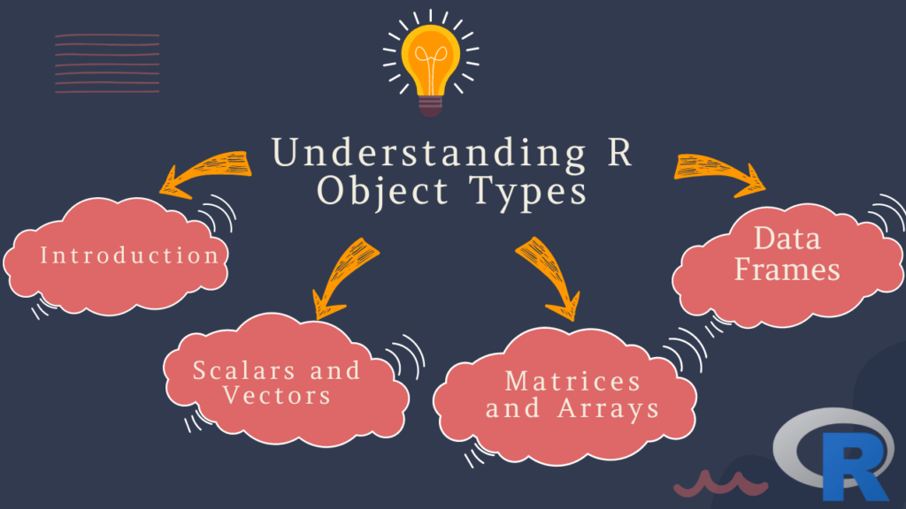
Understanding R Object Types: A Comprehensive Guide

Understanding R Object Types: If you’re new to R, one of the first things you’ll need to understand is the concept of object types. R is a dynamically-typed language, meaning that objects are not assigned a specific type at the time of declaration, but rather their type is determined at runtime. In this article, we’ll cover the different types of objects in R, how to create and manipulate them, and how to work with their associated functions.

Table of Contents

  1. Introduction
  2. Scalars and Vectors
    • Numeric Vectors
    • Integer Vectors
    • Complex Vectors
    • Logical Vectors
    • Character Vectors
    • Factor Vectors
  3. Matrices and Arrays
  4. Lists
  5. Data Frames
  6. FAQs
Understanding R Object Types

1. Introduction

R is a powerful programming language used extensively for data analysis and statistical computing. One of its key features is its ability to work with a variety of object types. In R, objects can be anything from a single number to a complex data structure containing many elements.

2. Scalars and Vectors

Scalars are single values in R, such as a number or character string. Vectors are collections of scalars of the same type, arranged in a specific order.

Numeric Vectors

Numeric vectors are the most common type of vector in R, and can contain any real number. They are created using the c() function:

> x <- c(1.5, 2.7, 3.9)
> x
[1] 1.5 2.7 3.9

Integer Vectors

Integer vectors can contain only whole numbers. They are created using the as.integer() function:

> y <- as.integer(c(1, 2, 3))
> y
[1] 1 2 3

Complex Vectors

Complex vectors are used to represent complex numbers, which have both real and imaginary component. They are created using the c() function with the complex() function:

> z <- c(1+2i, 2+3i, 3+4i)
> z
[1] 1+2i 2+3i 3+4i

Logical Vectors

Logical vectors contain either TRUE or FALSE values, and are used extensively in conditional statements. They are created using the c() function:

> a <- c(TRUE, FALSE, TRUE)
> a
[1]  TRUE FALSE  TRUE

Character Vectors

Character vectors contain text strings. They are created using the c() function with quotes:

> b <- c("apple", "banana", "cherry")
> b
[1] "apple"  "banana" "cherry"

Factor Vectors

Factor vectors are used to represent categorical data. They are created using the factor() function:

> c <- factor(c("red", "green", "blue"))
> c
[1] red   green blue 
Levels: blue green red

3. Matrices and Arrays

Matrices are two-dimensional collections of data, while arrays can have any number of dimensions. They are created using the matrix() and array() functions:

> m <- matrix(c(1, 2, 3, 4, 5, 6), nrow=2, ncol=3)
> m
     [,1] [,2] [,3]
[1,]    1    3    5
[2,]    2    4    6

Arrays are similar to matrices but can have more than two dimensions. Here is an example of a three-dimensional array:

> a <- array(c(1, 2, 3, 4, 5, 6, 7, 8), dim=c(2, 2, 2))
> a
, , 1

     [,1] [,2]
[1,]    1    3
[2,]    2    4

, , 2

     [,1] [,2]
[1,]    5    7
[2,]    6    8

4. Lists

Lists are one of the most versatile object types in R. They can contain objects of different types and sizes, and can even contain other lists. They are created using the list() function:

> l <- list(1, "apple", c(1, 2, 3))
> l
[[1]]
[1] 1

[[2]]
[1] "apple"

[[3]]
[1] 1 2 3

5. Data Frames

Data frames are used to represent tabular data, such as spreadsheets or database tables. They are similar to matrices but can contain columns of different types. They are created using the data.frame() function:

> df <- data.frame(name=c("Alice", "Bob", "Charlie"), age=c(25, 30, 35), married=c(TRUE, FALSE, TRUE))
> df
     name age married
1   Alice  25    TRUE
2     Bob  30   FALSE
3 Charlie  35    TRUE

6. FAQs

  1. What is the difference between a scalar and a vector in R?
    • A scalar is a single value, while a vector is a collection of values of the same type.
  2. How do I create a matrix in R?
    • You can create a matrix using the matrix() function.
  3. What is a data frame in R?
    • A data frame is a type of object used to represent tabular data, such as spreadsheets or database tables.
  4. What is a factor in R?
    • A factor is a type of vector used to represent categorical data.
  5. Why is it important to choose the right type of object in R?
    • The type of an object can affect how it is treated by R functions, so choosing the right type is important to ensure correct results.

Download: Beginning Data Science in R: Data Analysis, Visualization, and Modelling for the Data Scientist

Creating Violin Plots Using R

Creating Violin Plots Using R: Violin plots are a popular method for visualizing the distribution of a dataset. These plots are similar to box plots but provide a more detailed view of the distribution by showing the density of the data at different values. In this article, we will discuss how to create violin plots using R and how to interpret them.

To begin, we will need a dataset to work with. For this example, we will use the “mtcars” dataset which is built into R. This dataset contains information on various attributes of 32 cars, including their miles per gallon (mpg), number of cylinders (cyl), and horsepower (hp). We will focus on the mpg variable for our example.

Creating Violin Plots Using R

First, let’s load the dataset into R:

data(mtcars)

Now, let’s create a simple violin plot of the mpg variable:

library(ggplot2)
ggplot(mtcars, aes(x = "", y = mpg)) + 
  geom_violin()

This will produce a basic violin plot of the mpg variable. The x-axis is left blank because we are not grouping the data by any variable. The y-axis shows the values of the mpg variable, and the width of the violin at each point indicates the density of the data at that value. The thicker portions of the violin indicate where the data is more densely distributed.

We can customize the plot in several ways. For example, we can color the violins based on the number of cylinders in each car:

ggplot(mtcars, aes(x = factor(cyl), y = mpg, fill = factor(cyl))) + 
  geom_violin()

This will produce a violin plot with each violin colored based on the number of cylinders in each car. We can see that cars with 4 cylinders tend to have higher mpg values than cars with 6 or 8 cylinders.

We can also overlay a box plot on the violin plot to show additional information about the distribution:

ggplot(mtcars, aes(x = factor(cyl), y = mpg, fill = factor(cyl))) + 
  geom_violin() +
  geom_boxplot(width = 0.1, fill = "white")

This will produce a violin plot with a box plot overlaid on top of it. The box plot shows the median, quartiles, and any outliers in the data.

Learn: How to create a heat map on R programming?

Probability with R

If you’re new to probability or looking to learn how to use R for probability calculations, you’re in the right place. In this article, we’ll cover the basics of probability theory, explore some common probability distributions, and show you how to use R to calculate probabilities and generate random samples.

Understanding Probability

What is Probability?

Probability is the branch of mathematics that deals with the study of random events. In other words, it is a measure of the likelihood that a particular event will occur. The probability of an event is expressed as a number between 0 and 1, with 0 indicating that the event is impossible and 1 indicating that the event is certain.

Probability with R
Probability with R

Types of Probability

There are two main types of probability: classical probability and empirical probability.

Classical Probability

Classical probability is also known as theoretical probability. It involves calculating the probability of an event based on the assumption that all outcomes are equally likely. For example, if you toss a fair coin, the probability of getting heads or tails is 0.5 each.

Empirical Probability

Empirical probability, on the other hand, is based on observed data. It involves calculating the probability of an event based on the frequency with which it occurs in a large number of trials. For example, if you toss a coin 100 times and get 60 heads, the empirical probability of getting heads is 0.6.

Probability Distributions

A probability distribution is a function that describes the likelihood of different outcomes in a random event. There are many different types of probability distributions, but some of the most common ones include:

Bernoulli Distribution

The Bernoulli distribution is a discrete probability distribution that describes the outcomes of a single experiment that can have only two possible outcomes, such as flipping a coin. The Bernoulli distribution is characterized by a single parameter, p, which represents the probability of success.

Binomial Distribution

The binomial distribution is a discrete probability distribution that describes the outcomes of a fixed number of independent Bernoulli trials. It is characterized by two parameters: n, which represents the number of trials, and p, which represents the probability of success in each trial.

Normal Distribution

The normal distribution is a continuous probability distribution that is commonly used to model natural phenomena. It is characterized by two parameters: the mean, mu, and the standard deviation, sigma. The normal distribution is often used to model data that is approximately symmetric and bell-shaped.

Using R for Probability Calculations

R is a popular programming language that has many built-in functions for working with probability distributions and performing various statistical calculations. In order to use these functions, you will need to load the appropriate packages.

Here are some basic steps for performing probability calculations in R:

Load the required package:You can load the package using the library() function. For example, to load the package for working with normal distributions, you would type

library(stats)

Define the probability distribution:Once you have loaded the package, you can define the probability distribution that you want to work with. For example, to define a normal distribution with mean 0 and standard deviation 1, you would use the dnorm() function:

x <- seq(-3, 3, length.out = 100) y <- dnorm(x, mean = 0, sd = 1) plot(x, y, type = "l") 

This will create a plot of the normal distribution with mean 0 and standard deviation 1.

Calculate probabilities: You can use various functions to calculate probabilities based on the probability distribution that you have defined. For example, to calculate the probability that a random variable from a normal distribution with mean 0 and standard deviation 1 is less than 1, you would use the pnorm() function:

pnorm(1, mean = 0, sd = 1) 

This will return the probability that a random variable from the normal distribution is less than 1.

These are just some basic steps for performing probability calculations in R. There are many more functions and packages available for working with different probability distributions and performing more complex statistical calculations.

Download (PDF)

Download: Introduction to Basic Statistics with R

Descriptive and Inferential Statistics with R

Statistics is the science of collecting, analyzing, interpreting, and presenting data. It has become increasingly important in today’s data-driven world, and R has emerged as one of the most popular programming languages for statistical analysis. In this article, we will explore the basics of descriptive and inferential statistics with R, and how they can be used to gain insights from data.

Descriptive and Inferential Statistics with R

Introduction to Descriptive Statistics

Descriptive statistics is a branch of statistics that deals with the summary of data. It is used to describe and summarize the main features of a dataset, such as the mean, median, mode, variance, standard deviation, and range. R provides a wide range of functions to compute these summary statistics, making it an essential tool for data analysis.

Measures of Central Tendency

Central tendency measures are used to describe the central location of a dataset. The most commonly used measures of central tendency are mean, median, and mode. The mean is the arithmetic average of a dataset, while the median is the middle value of a dataset. The mode is the most frequently occurring value in a dataset.

R provides several functions to compute these measures of central tendency. For example, to calculate the mean of a dataset, we can use the mean() function. Similarly, to compute the median and mode, we can use the median() and mode() functions, respectively.

Measures of Dispersion

Measures of dispersion are used to describe the spread or variability of a dataset. The most commonly used measures of dispersion are variance, standard deviation, and range. Variance measures how much the data deviate from the mean, while standard deviation measures the same thing in a more intuitive way. Range, on the other hand, measures the difference between the maximum and minimum values in a dataset.

R provides several functions to compute these measures of dispersion. For example, to calculate the variance and standard deviation of a dataset, we can use the var() and sd() functions, respectively. To compute the range, we can simply subtract the minimum value from the maximum value.

Introduction to Inferential Statistics

Inferential statistics is a branch of statistics that deals with making predictions and generalizations about a population based on a sample. It is used to draw conclusions about a population based on a sample, and to estimate population parameters such as the mean and variance. R provides a wide range of functions to perform inferential statistics, making it an essential tool for data analysis.

Hypothesis Testing

Hypothesis testing is a statistical technique used to test a hypothesis about a population based on a sample. The basic idea behind hypothesis testing is to compare the sample statistics with the population parameters and determine whether the sample provides sufficient evidence to reject or fail to reject the null hypothesis.

R provides several functions to perform hypothesis testing. For example, to test the hypothesis that the mean of a population is equal to a specified value, we can use the t.test() function. Similarly, to test the hypothesis that the variances of two populations are equal, we can use the var.test() function.

Confidence Intervals

A confidence interval is a range of values that is likely to contain the true value of a population parameter with a certain degree of confidence. Confidence intervals are used to estimate population parameters, such as the mean and variance, based on a sample.

R provides several functions to compute confidence intervals. For example, to compute the confidence interval for the mean of a population, we can use the t.test() function with the conf.int argument set to TRUE.

Applied Spatial data analysis with R

Spatial data analysis is a rapidly growing field that has revolutionized the way we analyze, visualize, and understand data. With the advent of powerful computational tools like R, spatial data analysis has become more accessible to a wider audience. R is a popular programming language used by statisticians and data analysts for data analysis, visualization, and modeling. In this article, we will provide an overview of applied spatial data analysis with R.

Applied Spatial data analysis with R
Applied Spatial Data Analysis with R

Download:

What is Spatial Data Analysis?

Spatial data analysis involves the study of spatially referenced data, such as maps, satellite images, and aerial photographs. The goal of spatial data analysis is to understand the spatial relationships and patterns that exist within the data. Spatial data analysis is used in a wide range of fields, including ecology, epidemiology, geography, and urban planning.

Spatial data can be analyzed using various techniques, such as spatial statistics, spatial econometrics, and geostatistics. Spatial statistics is used to study the patterns and relationships that exist in spatial data. Spatial econometrics is used to analyze the relationships between economic variables and spatial data. Geostatistics is used to study the variability of spatial data over time and space.

Applied Spatial Data Analysis with R

R is a powerful programming language for data analysis and visualization. R has several libraries and packages that can be used for spatial data analysis. Some of the popular packages for spatial data analysis in R include:

  1. rgdal: This package provides tools for reading, writing, and manipulating spatial data in R. The rgdal package supports a wide range of data formats, including shapefiles, GeoTIFF, and netCDF.
  2. sp: This package provides classes and methods for handling spatial data in R. The sp package supports a wide range of spatial data types, including points, lines, and polygons.
  3. raster: This package provides tools for working with raster data in R. The raster package supports a wide range of raster data formats, including GeoTIFF, NetCDF, and HDF.
  4. maptools: This package provides tools for reading and writing spatial data in R. The maptools package supports a wide range of data formats, including shapefiles, GeoJSON, and KML.

These packages provide a comprehensive set of tools for working with spatial data in R. In addition to these packages, R also provides several visualization packages, such as ggplot2 and leaflet, that can be used for visualizing spatial data.

Download: An Introduction to Spatial Regression Analysis in R

How to perform hypothesis testing with R?

Hypothesis testing is a statistical technique used to make decisions about a population based on a sample of data. It is a crucial part of data analysis and can be used to test whether a particular hypothesis or assumption is true or not. R is a popular programming language used for data analysis and is equipped with numerous tools and functions to perform hypothesis testing. In this article, we will discuss the steps involved in performing hypothesis testing with R.

Step 1: Define the Hypothesis

The first step in hypothesis testing is to define the null hypothesis and the alternative hypothesis. The null hypothesis is the statement that we are testing, and the alternative hypothesis is the opposite of the null hypothesis. For example, let’s say we want to test whether the average height of students in a class is 5 feet. Our null hypothesis would be that the average height of students is equal to 5 feet, and the alternative hypothesis would be that the average height of students is not equal to 5 feet.

How to perform hypothesis testing with R?
How to perform hypothesis testing with R

Download:

Step 2: Collect Data

The next step is to collect data. This involves selecting a sample from the population and recording the necessary data. In our example, we would measure the height of a random sample of students in the class.

Step 3: Choose a Statistical Test

The third step is to choose an appropriate statistical test to perform hypothesis testing. The choice of test depends on the type of data and the nature of the hypothesis being tested. In R, there are several built-in functions for performing various statistical tests such as t-tests, ANOVA, chi-squared tests, etc. For our example, we will use the t-test since we are testing the difference between the means of the two groups.

Step 4: Conduct the Test

After selecting the appropriate test, we can conduct the test using the corresponding R function. For example, to conduct a two-sample t-test in R, we can use the t.test() function. We can pass the data as arguments to the function along with the null and alternative hypotheses.

Here is an example of how to conduct a two-sample t-test in R:

# Generate sample data
group1 <- rnorm(20, 68, 2) # group 1 with mean 68 and sd 2
group2 <- rnorm(20, 72, 2) # group 2 with mean 72 and sd 2

# Perform two-sample t-test
t.test(group1, group2, alternative = "two.sided", mu = 0, paired = FALSE)

In this example, we generated two random samples of size 20 with means 68 and 72, respectively. We then used the t.test() function to perform a two-sample t-test, specifying the alternative hypothesis as two-sided and the null hypothesis as 0. The output of the function will provide us with the test statistic, p-value, and confidence interval.

Step 5: Interpret the Results

The final step is to interpret the results of the hypothesis test. The output of the test will provide us with a p-value, which is the probability of obtaining the observed sample mean difference (or more extreme) if the null hypothesis is true. If the p-value is less than the significance level (usually 0.05), we can reject the null hypothesis and accept the alternative hypothesis. If the p-value is greater than the significance level, we fail to reject the null hypothesis.

In conclusion, hypothesis testing is an essential part of data analysis, and R provides numerous tools and functions to perform hypothesis testing. By following the steps outlined above, we can perform hypothesis testing in R and make informed decisions based on the results of our tests.

Learn: Confidence Intervals in R

Survival Analysis with R: How to Model Time-to-Event Data


Survival analysis is a statistical technique used to analyze time-to-event data, such as the time until death or the time until the failure of a machine. R is a popular programming language used by statisticians and data analysts for data analysis, visualization, and modeling.

In R, survival analysis can be performed using the survival package. This package provides functions for fitting different types of survival models and for conducting various types of survival analyses, such as Kaplan-Meier curves, Cox proportional hazards regression, and parametric survival models.

Survival Analysis with R How to Model Time-to-Event Data
Survival Analysis with R: How to Model Time-to-Event Data
Download:

To begin, you will need to load the survival package into R by typing:

library(survival)

The first step in survival analysis is to create a survival object. A survival object is a data structure that contains information about the time-to-event data, including the time-to-event (often called “survival time”), the event status (often called “censoring status”), and any covariates that may affect the survival time.

To create a survival object, you can use the Surv() function. For example, suppose you have a dataset called mydata that contains information on the survival time and censoring status of patients in a clinical trial. You can create a survival object as follows:

my.survival <- Surv(time = mydata$time, event = mydata$status)

In this example, time is a vector of survival times, and status is a vector of censoring statuses (0 if the event was censored, 1 if the event occurred). The Surv() function combines these vectors into a single survival object.

Once you have created a survival object, you can use it to fit survival models. The most commonly used survival model is the Cox proportional hazards regression model, which allows you to estimate the effect of covariates on the hazard rate (i.e., the instantaneous risk of experiencing the event at any given time). To fit a Cox proportional hazards model in R, you can use the coxph() function. For example:

my.coxph <- coxph(formula = Surv(time, status) ~ covariate1 + covariate2, data = mydata)

In this example, formula is a formula that specifies the survival object and the covariates to be included in the model, and data is the name of the dataset containing the variables. The output of the coxph() function is an object of class “coxph”, which can be used to obtain estimates of the hazard ratio (i.e., the relative hazard of experiencing the event associated with a one-unit increase in a covariate) and other model parameters.

In addition to Cox proportional hazards regression, there are many other types of survival models that can be fitted using the survival package, such as parametric survival models, accelerated failure time models, and frailty models. The package also provides functions for conducting various types of survival analyses, such as Kaplan-Meier curves and log-rank tests.

Overall, survival analysis is a powerful method for analyzing time-to-event data in R, and the survival package provides a wide range of functions and tools for conducting different types of survival analyses.

Learn: Principal Component Analysis with R: How to Reduce Dimensionality

Principal Component Analysis with R: How to Reduce Dimensionality

As a student of data analysis, we understand that Principal Component Analysis (PCA) is a powerful tool that helps reduce the dimensionality of large datasets while retaining the most relevant information. PCA is widely used in various fields such as finance, biology, and image processing. In this article, we will guide you through the process of performing PCA using R, a popular statistical software.

Understanding Principal Component Analysis

PCA is a statistical method used to reduce the number of variables in a dataset while retaining the most important information. It works by transforming the original variables into a new set of uncorrelated variables, called principal components. These principal components are ordered in terms of the amount of variance they explain in the original data.

Performing PCA with R

In this section, we will show you how to perform PCA using R. We will use the iris dataset, which is included in the base R installation. The iris dataset contains measurements of the sepal length, sepal width, petal length, and petal width of three different species of iris flowers.

Principal Component Analysis with R

First, we load the iris dataset into R:

data(iris)

Next, we standardize the variables to have a mean of 0 and a standard deviation of 1, which is necessary for PCA:

irisscale <- scale(iris[,1:4])

Now, we can perform PCA on the standardized iris dataset:

irispca <- prcomp(irisscale)

The prcomp() function in R performs PCA and returns a list of objects. The most important object in the list is the rotation matrix, which contains the principal components.

Visualizing the Results of PCA

To visualize the results of PCA, we can create a scree plot, which shows the amount of variance explained by each principal component. We can create a scree plot using the following code:

plot(irispca)

This will create a plot that shows the proportion of variance explained by each principal component. The x-axis represents the principal components, and the y-axis represents the proportion of variance explained.

Next, we can create a biplot, which shows the relationship between the variables and the principal components. We can create a biplot using the following code:

biplot(irispca)

This will create a plot that shows the variables as arrows and the observations as points. The length and direction of the arrows represent the contribution of each variable to the principal components.

Download: Introduction to Scientific Programming and Simulation using R

Download(PDF)