data scientist

Creating a normal distribution plot using ggplot2 in R

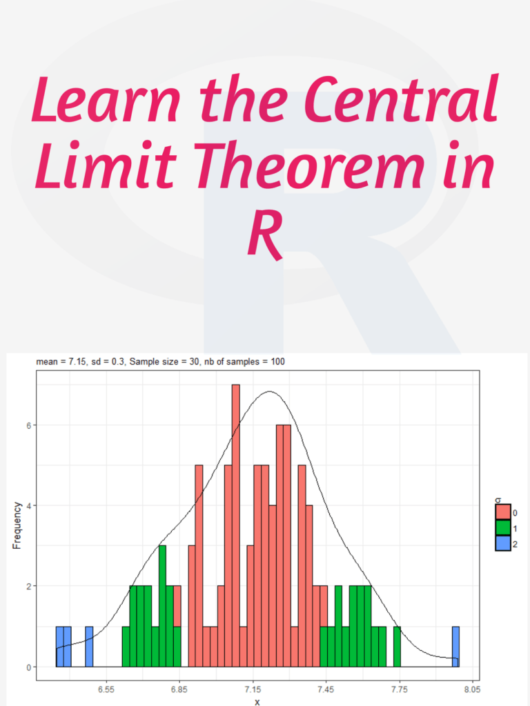
Creating a normal distribution plot using ggplot2 in R: The normal distribution is a probability distribution that is often used to model real-world phenomena, such as the distribution of test scores or the heights of a population. It is a bell-shaped curve that is symmetric around its mean value, and its standard deviation determines its spread. In this article, we will walk through the steps of creating a normal distribution plot using the ggplot2 package in R.

Creating a normal distribution plot using ggplot2 in R

Download:

Step 1: Generate a dataset

To create a normal distribution plot, we first need to generate a dataset that follows a normal distribution. We can use the rnorm function in R to generate a random sample of numbers that follow a normal distribution with a specified mean and standard deviation. For example, let’s generate a sample of 1000 numbers with a mean of 50 and a standard deviation of 10:

set.seed(123)  # for reproducibility
data <- data.frame(x = rnorm(1000, mean = 50, sd = 10))

This will create a data frame with one column, “x”, that contains our randomly generated numbers.

Step 2: Create a histogram

Next, we can create a histogram of our data using the ggplot2 package. A histogram is a graphical representation of the distribution of a dataset, and it can help us visualize the shape of our normal distribution.

library(ggplot2)
ggplot(data, aes(x = x)) +
  geom_histogram(binwidth = 1, color = "black", fill = "white") +
  labs(x = "Values", y = "Frequency", title = "Histogram of Normal Distribution")

This code will create a histogram with a binwidth of 1, a black border, and white fill. The x-axis will be labeled “Values”, the y-axis will be labeled “Frequency”, and the title of the plot will be “Histogram of Normal Distribution”.

Step 3: Add a density curve

To make our plot more informative, we can add a density curve to show the shape of the normal distribution. A density curve is a smoothed version of the histogram that shows the distribution of our data more clearly.

ggplot(data, aes(x = x)) +
  geom_histogram(binwidth = 1, color = "black", fill = "white") +
  geom_density(color = "blue", size = 1) +
  labs(x = "Values", y = "Density", title = "Histogram and Density Curve of Normal Distribution")

This code will add a blue density curve to our histogram with a size of 1. The x-axis will be labeled “Values”, the y-axis will be labeled “Density”, and the title of the plot will be “Histogram and Density Curve of Normal Distribution”.

Step 4: Customize the plot

Finally, we can customize our plot by adding axis labels, changing the colors and fonts, and adjusting the layout.

ggplot(data, aes(x = x)) +
  geom_histogram(binwidth = 1, color = "black", fill = "#69b3a2") +
  geom_density(color = "#e9c46a", size = 1) +
  labs(x = "Values", y = "Density", title = "Normal Distribution Plot") +
  theme_minimal() +
  theme(plot.title = element_text(size = 18, face = "bold"),
        axis.title = element_text(size = 14, face = "bold"),
        axis.text = element_text(size = 12),
        legend.position = "none")

This code will change the fill color of the histogram to “#69b3a2” and the color of the density curve to “#e9c46

Tips to Learn R using chatGPT

R is a popular programming language for data analysis and visualization. It has a rich set of packages and functions that make it easy to manipulate, explore and present data in various formats. However, learning R can be challenging for beginners who may not have a strong background in statistics or programming. One way to overcome this challenge is to use chatGPT, a chatbot that can generate code snippets and explanations based on natural language queries. ChatGPT is powered by GPT-4, a state-of-the-art natural language processing model that can produce coherent and relevant texts on any topic. ChatGPT can help you learn R by providing you with examples, tips, and feedback as you interact with it.

Tips to Learn R using chatGPT

In this post, we will show you how to use chatGPT to learn R in three steps:

  1. Ask chatGPT to generate a code snippet based on your query. For example, you can ask “How do I create a scatter plot in R?” or “How do I filter a data frame by a condition in R?” ChatGPT will respond with a code snippet that performs the task you requested, along with some comments or explanations. You can copy and paste the code into your R console or script and run it to see the result.
  2. Ask chatGPT to explain the code snippet or any part of it that you don’t understand. For example, you can ask “What does the ggplot function do?” or “What does the aes argument mean?” ChatGPT will respond with a clear and concise explanation of the function or argument, along with some examples or links to more resources. You can use this information to learn more about the syntax and logic of R.
  3. Ask chatGPT to modify the code snippet or suggest improvements. For example, you can ask “How do I add a title to the plot?” or “How do I make the points bigger?” ChatGPT will respond with a modified code snippet that incorporates your request, along with some comments or explanations. You can compare the original and modified code snippets and see how they affect the output.

By using chatGPT to learn R, you can benefit from the following advantages:

  • You can learn at your own pace and level of difficulty. You can ask chatGPT any question related to R, from basic to advanced, and get an appropriate answer. You can also adjust the complexity and length of the code snippets by using keywords like “simple”, “short”, “complex” or “long”.
  • You can learn by doing and experimenting. You can run the code snippets generated by chatGPT and see the results immediately. You can also modify the code snippets and see how they change the output. This way, you can learn from trial and error and discover new features and possibilities of R.
  • You can learn by having fun and being creative. You can ask chatGPT to generate code snippets for any data analysis or visualization task that interests you. You can also challenge chatGPT to generate code snippets for unusual or difficult tasks and see how it responds. This way, you can enjoy the process of learning R and express your creativity.

Learn More: R For Everyone: Advanced Analytics And Graphics

Download:

Introduction to Geospatial Visualization with the tmap package

Introduction to Geospatial Visualization with the tmap package: Geospatial visualization is a powerful tool for exploring and communicating patterns and trends in spatial data. The tmap package in R provides an easy-to-use framework for creating high-quality static and interactive geospatial visualizations. In this introduction, we’ll cover some basic concepts and examples to get you started with using tmap for your own data visualizations.

Introduction to Geospatial Visualization with the tmap package

Download:

Basic tmap syntax

The basic syntax of tmap is simple and intuitive. Here’s an example of how to create a map of the United States with some sample data:

library(tmap)
data("World")
states <- World[World$region == "USA", ]
tm_shape(states) +
  tm_polygons("HPI", palette = "Blues")

In this code, we’re loading the tmap library, then loading the World dataset that comes with the package. We’re selecting just the data for the United States, and then creating a tmap object with tm_shape(). Finally, we’re adding a layer to the map with tm_polygons(), which displays the “HPI” variable (which stands for “Human Poverty Index”) using a blue color palette.

Mapping point data

tm_points() can be used to create point-based maps. Here’s an example:

library(sp)
data(meuse)
coordinates(meuse) <- ~x+y
tm_shape(meuse) +
  tm_dots("cadmium", palette = "Blues")

This code is using the meuse dataset, which is included with the sp package. We’re setting the x and y coordinates of the data using the coordinates() function, and then creating a tmap object with tm_shape(). Finally, we’re adding a layer to the map with tm_dots(), which displays the “cadmium” variable using a blue color palette.

Mapping raster data

tm_raster() can be used to create raster-based maps. Here’s an example:

library(raster)
data(volcano)
r <- raster(volcano)
tm_shape(r) +
  tm_raster(palette = "-Blues")

This code is using the volcano dataset, which is included with the raster package. We’re creating a raster object with the raster() function, and then creating a tmap object with tm_shape(). Finally, we’re adding a layer to the map with tm_raster(), which displays the raster data using a blue color palette.

Interactive maps

tmap also supports creating interactive maps using the tmap_leaflet() function. Here’s an example:

library(leaflet)
tm_shape(states) +
  tm_polygons("HPI", palette = "Blues") +
  tmap_leaflet()

This code is creating the same map as before, but adding tmap_leaflet() at the end to create an interactive map using the leaflet library.

In this introduction, we covered some basic concepts and examples for creating geospatial visualizations using the tmap package in R. With just a few lines of code, you can create high-quality static and interactive maps of your spatial data. For more information on using tmp, see the package documentation and tutorials.


Python DataVisualization Cookbook

Python DataVisualization Cookbook: Python is a popular programming language data scientists, engineers, and developers use to analyze, manipulate and visualize data. Data visualization is an essential part of data analysis that helps in understanding complex data sets and presenting them meaningfully. The Python Data Visualization Cookbook is an excellent resource for those looking to learn about data visualization with Python. The Python Data Visualization Cookbook is a comprehensive guide that covers various techniques for visualizing data in Python. The cookbook is authored by Igor Milovanović, Aleksandar Erkalović, and Dimitry Foures-Angelov. The book is divided into three parts, each focusing on a particular aspect of data visualization.

Python DataVisualization Cookbook

Part 1: Getting Started with Python Data Visualization

The first part of the book covers the basics of data visualization and introduces the libraries used in Python for data visualization, including Matplotlib, Seaborn, and Plotly. The authors explain how to create basic plots such as scatter plots, line charts, and bar charts using Matplotlib. They also demonstrate how to use Seaborn, a library built on top of Matplotlib, to create more complex visualizations such as heatmaps, violin plots, and box plots. The authors also introduce Plotly, a web-based tool for creating interactive plots.

Part 2: Advanced Data Visualization Techniques

The second part of the book covers advanced data visualization techniques such as 3D plots, geospatial data visualization, and network visualization. The authors introduce the Mayavi library, used for 3D visualization in Python. They also cover the basics of geospatial data visualization using the Basemap library and demonstrate how to create interactive maps using Folium. The authors also introduce NetworkX, a library used for network visualization, and demonstrate how to create network visualizations.

Part 3: Best Practices for Data Visualization

The final part of the book covers best practices for data visualization, including designing effective visualizations, choosing appropriate color schemes, and presenting data in a meaningful way. The authors also cover data visualization tools used in the industry, including Tableau and Power BI.

Overall, the Python Data Visualization Cookbook is an excellent resource for anyone looking to learn about data visualization with Python. The book is well-structured, and the authors provide clear explanations of each topic covered. The cookbook is also full of practical examples, making it easy for readers to apply the techniques learned in the book to their own data sets.

Read more: Best Packages For Data Visualization In Python

Download(PDF)

Learn the Central Limit Theorem in R

Learn the Central Limit Theorem in R: The Central Limit Theorem (CLT) is a fundamental concept in statistics that states that if you have a large sample size from any population with a finite mean and variance, then the sampling distribution of the mean will be approximately normal regardless of the shape of the original population distribution. In this tutorial, I will walk you through how to simulate the CLT using R step by step.

Learn the Central Limit Theorem in R

Download:

Step 1: Load Required Libraries We will be using the libraries “ggplot2” and “gridExtra” for this tutorial. So, we need to install and load them using the following code:

install.packages("ggplot2")
install.packages("gridExtra")

library(ggplot2)
library(gridExtra)

Step 2: Generate Data Let’s generate some data for this example. We will use the exponential distribution as our population distribution. The exponential distribution is a continuous probability distribution that describes the time between events in a Poisson process. It has a single parameter, which is the rate parameter.

set.seed(123) # for reproducibility
population <- rexp(1000, rate = 1)

Here, we generated 1000 observations from an exponential distribution with a rate parameter of 1.

Step 3: Simulate Sampling Distribution of Means To simulate the CLT, we will take random samples of size n from the population and calculate the mean. We will repeat this process 1000 times and store the means in a vector.

n <- 10 # sample size
num.simulations <- 1000 # number of simulations

sample.means <- replicate(num.simulations, mean(sample(population, n)))

Here, we took random samples of size 10 from the population and calculated the mean. We repeated this process 1000 times and stored the means in the vector “sample.means”.

Step 4: Visualize Sampling Distribution of Means Now, we can visualize the sampling distribution of means using a histogram.

# histogram of sample means
ggplot(data.frame(sample.means), aes(x = sample.means)) + 
  geom_histogram(aes(y = ..density..), color = "black", fill = "white", binwidth = 0.2) +
  stat_function(fun = dnorm, args = list(mean = mean(population), sd = sd(population)/sqrt(n)), color = "red", size = 1) +
  ggtitle(paste("Sampling Distribution of Means (n = ", n, ")", sep = "")) +
  xlab("Sample Means") +
  ylab("Density")

In this code, we created a histogram of the sample means and added a red line for the theoretical normal distribution with the same mean and standard deviation as the sampling distribution of means. We also added a title and axis labels to the plot.

Step 5: Repeat with Different Sample Sizes Finally, we can repeat this process for different sample sizes and visualize the results using a grid of plots.

# function to simulate CLT and create plot
plot_CLT <- function(n) {
  sample.means <- replicate(num.simulations, mean(sample(population, n)))
  
  plot <- ggplot(data.frame(sample.means), aes(x = sample.means)) + 
    geom_histogram(aes(y = ..density..), color = "black", fill = "white", binwidth = 0.2) +
    stat_function(fun = dnorm, args = list(mean = mean(population), sd = sd(population)/sqrt(n)), color = "red", size = 1) +
    ggtitle(p

Five tips to improve your R code

R is a powerful programming language used for data analysis and statistical computing. However, writing efficient and effective R code can be challenging, especially for those who are new to the language. In this article, we will discuss five tips to improve your R code and make it more readable, efficient, and reliable.

Five tips to improve your R code

1. Use vectorization

Vectorization is the process of performing operations on entire vectors instead of individual elements. This technique can significantly improve the performance of your code by reducing the number of loops required. For example, instead of using a for loop to add two vectors element-wise, you can use the “+” operator to add the vectors directly.

Here’s an example:

# Using a for loop
x <- 1:1000
y <- 1:1000
z <- numeric(length(x))

for (i in 1:length(x)) {
  z[i] <- x[i] + y[i]
}

# Using vectorization
x <- 1:1000
y <- 1:1000
z <- x + y

2. Avoid global variables

Using global variables can make your code more difficult to debug and maintain, especially when dealing with large programs. It’s best to use local variables instead, which are created and used within a function. This approach can also help avoid naming conflicts between different parts of your code.

Here’s an example:

# Using global variables
x <- 10

my_function <- function() {
  y <- x + 5
  return(y)
}

# Using local variables
my_function <- function(x) {
  y <- x + 5
  return(y)
}

result <- my_function(10)

3. Use appropriate data structures

Choosing the appropriate data structure can make a significant difference in the performance of your code. For example, using a matrix instead of a data frame can be faster for numerical operations, while using a list can be more flexible for storing different types of objects.

Here’s an example:

# Using a matrix
x <- matrix(1:1000000, nrow = 1000)
row_sums <- apply(x, 1, sum)

# Using a data frame
x <- data.frame(matrix(1:1000000, nrow = 1000))
row_sums <- apply(x, 1, sum)

# Using a list
my_list <- list(a = 1, b = "hello", c = TRUE)

4. Write readable code

Writing readable code can make it easier for others to understand your code and for you to maintain it in the future. Some best practices for writing readable code include using descriptive variable names, writing comments to explain complex code, and formatting your code consistently.

Here’s an example:

# Writing readable code
x <- c(1, 2, 3, 4, 5) # Create a vector of numbers
y <- sum(x) # Calculate the sum of the vector

5. Use functions from packages

R has a vast library of packages that provide pre-built functions for a wide range of tasks. Using functions from these packages can save you time and improve the reliability of your code, as these functions have often been thoroughly tested and optimized.

Here’s an example:

# Using a function from a package
library(dplyr)

x <- data.frame(a = c(1, 2, 3), b = c(4, 5, 6))
y <- select(x, a) # Select the 'a' column of the data frame

These five tips can help you improve your R code and make it more efficient, readable, and reliable.

How to make a boxplot in R?

A box plot is a graphical representation of a dataset that displays the distribution of data through five summary statistics: the minimum value, the first quartile (25th percentile), the median (50th percentile), the third quartile (75th percentile), and the maximum value. The box in the plot represents the middle 50% of the data (between the first and third quartiles), while the whiskers extend from the box to show the range of the data, excluding any outliers. Outliers are represented by dots or asterisks outside the whiskers. Box plots are useful for quickly visualizing the spread, skewness, and outliers of a dataset. They are commonly used in statistical analysis, especially for comparing distributions between different groups or variables.

How to make a boxplot in R?

Download:

To make a boxplot in R, you can use the boxplot() function, which is a built-in function in R. Here’s an example code:

# Create a vector of data
data <- c(10, 20, 15, 30, 25, 35, 40, 50)

# Create a boxplot of the data
boxplot(data)

In the above example, we first create a vector of data called data. Then we use the boxplot() function to create a boxplot of the data.

You can customize the boxplot by adding different parameters to the boxplot() function. Here are some examples:

  • Adding a title to the plot:
boxplot(data, main="Boxplot of Data")
  • Changing the x-axis label:
boxplot(data, xlab="Data")
  • Changing the color of the box and whiskers:
boxplot(data, col="blue")
  • Creating a horizontal boxplot:
boxplot(data, horizontal=TRUE)

These are just a few examples of how you can customize the boxplot in R. You can find more information about the boxplot() function and its parameters in the R documentation.

Read more: How to Create a Population Pyramid in R?

How to Create a Population Pyramid in R?

An age-sex pyramid is also known as a population pyramid. Using it, we can visualize the distribution of a population by age group and gender. In general, it resembles a pyramid. Females are represented on the right of the population pyramid, while males are typically depicted on the left. Based on the number or percentage of men and women in a particular population, this data visualization method can be used to visualize that population’s age. Creating a population pyramid in R is a common data analysis and visualization task. Here are the steps to create a population pyramid in R:

How to Create a Population Pyramid in R

Download:

Step 1: Install and load necessary packages Before starting to create a population pyramid, we need to install and load the ggplot2 and dplyr packages. These packages are used for data visualization and data manipulation, respectively.

install.packages("ggplot2")
install.packages("dplyr")

library(ggplot2)
library(dplyr)

Step 2: Load the Data To create a population pyramid, we need data on the age and sex distribution of the population. We can use the built-in “midwest” dataset from ggplot2 package as an example.

data(midwest)

Step 3: Data Wrangling Next, we need to prepare the data for the population pyramid visualization. We will use the dplyr package to manipulate the data.

midwest <- midwest %>%
  select(county, state, Poptotal, popdensity, percwhite, percblack, percamericanindian, percasian, perchispanic, percother, medianage, medianhousevalue, medianincome, region, division) %>%
  filter(!is.na(Poptotal), !is.na(medianage)) %>%
  mutate_at(vars(percwhite:percother), ~replace_na(., 0))

Step 4: Create the Population Pyramid Now, we can create the population pyramid using the ggplot2 package.

ggplot(midwest, aes(x = medianage, y = Poptotal, fill = factor(ifelse(medianage < 37.5, "Male", "Female")))) +
  geom_bar(stat = "identity", position = "identity") +
  scale_fill_manual(values = c("#619CFF", "#FF6161")) +
  labs(title = "Population Pyramid", x = "Median Age", y = "Population", fill = "") +
  coord_flip()

This will create a population pyramid in R, showing the age and sex distribution of the population.

The above example is just a sample, and you can use your own data to create the population pyramid in R.

Create A Dashboard In R

There are several ways to create a dashboard in R, but one of the most popular and powerful options is to use the Shiny package. Shiny allows you to build interactive web applications directly from R code, including data visualization and analysis. Here are the general steps to creating a dashboard in R using Shiny:

Create A Dashboard In R
  1. Install and load the Shiny package:
install.packages("shiny")
library(shiny)
  1. Load your data: You can use any data source that you like, but it’s important to make sure that the data is in a format that can be used by Shiny.
  2. Create a user interface (UI): This is where you define what the user will see and interact with in your dashboard. You can use Shiny’s built-in UI elements (such as sliders, drop-down menus, and text boxes) or create your own custom UI elements using HTML, CSS, and JavaScript.
  3. Create a server function: This is where you define the logic and calculations that will power your dashboard. You can use any R code you like, including data manipulation and analysis functions.
  4. Combine the UI and server: Use the shinyApp() function to combine the UI and server functions into a complete Shiny application.
  5. Deploy your dashboard: You can deploy your Shiny dashboard to a variety of platforms, including shinyapps.io and your own web server.

Here’s a basic example of a Shiny dashboard that displays a histogram of a dataset:

# Load the Shiny package
library(shiny)

# Load the dataset
data(mtcars)

# Define the UI
ui <- fluidPage(
  titlePanel("MTCars Histogram"),
  sidebarLayout(
    sidebarPanel(
      sliderInput("bins", "Number of bins:", min = 1, max = 50, value = 30)
    ),
    mainPanel(
      plotOutput("histogram")
    )
  )
)

# Define the server
server <- function(input, output) {
  output$histogram <- renderPlot({
    bins <- seq(min(mtcars$mpg), max(mtcars$mpg), length.out = input$bins + 1)
    hist(mtcars$mpg, breaks = bins, col = "blue", main = "MTCars Histogram")
  })
}

# Combine the UI and server
shinyApp(ui = ui, server = server)

This code creates a Shiny app with a slider that allows the user to control the number of bins in a histogram of the mpg column of the mtcars dataset. When the user moves the slider, the histogram is updated in real-time. You can customize this example and add more elements to create a full dashboard with multiple charts, tables, and other interactive features.

Download:

Confidence Intervals in R

A confidence interval is a range of values that provides a plausible range of values for an unknown population parameter, based on a sample from that population. The confidence interval is expressed as a percentage, such as 95% or 99%, which represents the level of confidence you have that the true population parameter falls within the interval. For example, if you calculate a 95% confidence interval for the average height of students in the school, you can say with 95% confidence that the true average height falls within that range of values. Calculating confidence intervals using R is relatively simple. Here’s a general process you can follow:

Confidence Intervals in R
  1. Load your data into R. You can do this by typing the name of your data file, followed by the read.table() function, like this: mydata <- read.table("myfile.txt", header=TRUE). This assumes that your data is in a tab-delimited text file with headers.
  2. Calculate the sample mean and standard deviation. You can use the mean() and sd() functions in R to do this, like this: mymean <- mean(mydata$myvariable) and mysd <- sd(mydata$myvariable). Replace “myvariable” with the name of the variable in your data that you want to calculate the confidence interval for.
  3. Determine the sample size. You can use the nrow() function in R to get the number of rows (i.e., observations) in your data, like this: mysize <- nrow(mydata).
  4. Choose a confidence level. You’ll need to decide on a confidence level for your confidence interval. For example, you might choose 95%, which is a common level of confidence.
  5. Calculate the confidence interval. You can use the t.test() function in R to calculate the confidence interval, like this: myci <- t.test(mydata$myvariable, conf.level=0.95)$conf.int. This will give you a 95% confidence interval for the mean of your variable.
  6. Print or save the confidence interval. You can use the print() function to print the confidence interval to the console, like this: print(myci). Or you can save it to a variable and use it later in your code, like this: myci <- t.test(mydata$myvariable, conf.level=0.95)$conf.int.

Keep in mind that the exact method of calculating the confidence interval may vary depending on the type of data you’re working with and the statistical test you’re using. But the general process outlined above should give you a good starting point for calculating confidence intervals in R.

Related post: ANOVA in R

Download(PDF)