Introduction To R For Excel

R is a popular open-source programming language that is widely used for statistical computing, data analysis, and data visualization. It offers a wide range of tools and libraries for working with data and has become increasingly popular among data scientists and statisticians. If you are an Excel user who is interested in learning R, you might be wondering how to get started. In this article, we will provide an introduction to R for Excel users, including the benefits of using R, the differences between R and Excel, and tips for transitioning to R.

Introduction To R For Excel

Benefits of using R

R offers several advantages over Excel, including:

  1. Large data handling: R is designed to handle large datasets with ease. It is capable of handling datasets that are too large to fit in Excel, and can handle more complex data structures.
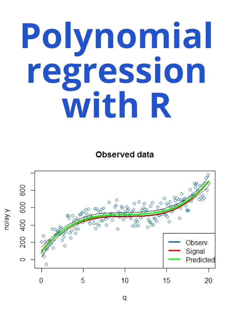
  2. Powerful statistics: R has a vast range of statistical analysis capabilities built-in. R provides a powerful set of statistical and graphical techniques, including linear and nonlinear modelling, time-series analysis, classification, clustering, and more.
  3. Open-source community: R is an open-source language, which means it is continuously developed by an active community of users. This community provides a wealth of resources and support, including libraries, packages, and forums.
  4. Reproducible research: R makes it easy to create reproducible research by documenting every step of your analysis. This ensures that your results are transparent and easily replicable.

Differences between R and Excel

While Excel is a powerful tool for working with data, it has its limitations. Excel is designed for small to medium-sized datasets and is not well-suited to handling complex data structures. Here are some key differences between R and Excel:

  1. Data Structures: In Excel, data is usually stored in tables with columns and rows. R has many more data structures, such as vectors, matrices, arrays, and data frames. Each data structure can handle different types of data and operations.
  2. Functions: In Excel, functions are pre-built formulas that perform specific tasks on data. In R, functions are built into the language and can be easily extended using packages. R provides a wide range of built-in functions and packages for statistical analysis and data manipulation.
  3. Programming: R is a programming language, while Excel is a spreadsheet program. This means that R requires you to write code to perform tasks, while Excel requires you to manually enter data and use pre-built functions.

Tips for transitioning to R

If you are an Excel user who is interested in learning R, here are some tips to help you get started:

  1. Learn the basics: Start by learning the basics of R, including data structures, functions, and programming concepts. There are many online resources available, including tutorials and videos.
  2. Start with small datasets: Start by working with small datasets to get comfortable with R. As you gain more experience, you can move on to larger and more complex datasets.
  3. Use RStudio: RStudio is a popular integrated development environment (IDE) for R. It provides an easy-to-use interface for writing and running code, as well as tools for data visualization and exploration.
  4. Use packages: R has a vast range of packages that can be used to extend its functionality. Start by learning the most commonly used packages for data manipulation and statistical analysis, such as dplyr and ggplot2.
  5. Practice: Practice is key to becoming proficient in R. Try working on small projects, participating in online communities, and contributing to open-source projects to improve your skills.

Download:

Polynomial regression with R

Polynomial regression is a type of regression analysis in which the relationship between the independent variable x and the dependent variable y is modeled as an nth-degree polynomial. In R, you can perform polynomial regression using the lm() function, which fits a linear model.

Polynomial regression with R

Here’s an example of how to perform polynomial regression in R:

Suppose we have the following data:

x <- c(1, 2, 3, 4, 5)
y <- c(2, 6, 9, 10, 12)

We can fit a second-degree polynomial regression model using the lm() function as follows:

model <- lm(y ~ poly(x, 2, raw=TRUE))

In this case, poly(x, 2, raw=TRUE) creates a matrix of the predictors, where the columns are x raised to the power of 0, 1, and 2 (i.e., the intercept, x, and x^2). The raw=TRUE argument specifies that the predictors should not be standardized.

We can then use the summary() function to obtain the model summary:

summary(model)

This will output a summary of the model, including the coefficients, standard errors, t-values, and p-values for each predictor.

We can also use the predict() function to make predictions based on the model:

new_x <- seq(1, 5, length.out=100)
new_y <- predict(model, newdata=data.frame(x=new_x))

This will generate 100 new values of x and use the model to predict the corresponding values of y.

Finally, we can use the ggplot2 package to visualize the data and the fitted model:

library(ggplot2)
df <- data.frame(x, y, new_x, new_y)
ggplot(df, aes(x, y)) + 
  geom_point() + 
  geom_line(aes(x=new_x, y=new_y), color="blue")

This will create a scatter plot of the data points, overlaid with a blue line representing the fitted model.

Python for probability statistics and machine learning

Python is a popular programming language that has gained significant traction in the fields of probability, statistics, and machine learning. With its user-friendly syntax and extensive libraries, Python has become the go-to language for data analysis and modeling. In this article, we will explore the various Python libraries that make it an ideal choice for probability, statistics, and machine learning.

Python for probability statistics and machine learning

Python for probability statistics and machine learning                      Download:

NumPy

NumPy is a library for Python that provides support for large, multi-dimensional arrays and matrices, as well as a variety of mathematical functions. It is a fundamental library for scientific computing in Python and is widely used in the fields of probability and statistics. NumPy is particularly useful for generating random numbers and for working with probability distributions.

Pandas

Pandas is a library for Python that provides support for data manipulation and analysis. It provides a variety of tools for working with structured data, including dataframes and series, which make it easy to work with datasets of different sizes and shapes. Pandas is particularly useful for data preprocessing and cleaning, which is an essential step in any data analysis or modeling project.

Matplotlib

Matplotlib is a library for Python that provides support for data visualization. It provides a variety of tools for creating plots, charts, and graphs, which make it easy to visualize data and explore patterns and relationships. Matplotlib is particularly useful for exploring data and communicating results to others.

Scikit-learn

Scikit-learn is a library for Python that provides support for machine learning. It provides a variety of tools for building predictive models, including classification, regression, and clustering algorithms. Scikit-learn is particularly useful for building predictive models and for evaluating the performance of those models.

Statsmodels

Statsmodels is a library for Python that provides support for statistical modeling. It provides a variety of tools for fitting statistical models, including linear regression, time series analysis, and multivariate analysis. Statsmodels is particularly useful for building statistical models and for testing hypotheses.

PyMC3

PyMC3 is a library for Python that provides support for Bayesian modeling. It provides various tools for building Bayesian models, including Markov Chain Monte Carlo (MCMC) algorithms for sampling from posterior distributions. PyMC3 is particularly useful for building Bayesian models and for quantifying uncertainty.

Download(PDF)

ggplot2 for data visualization

Data visualization is an essential part of data analysis. It helps us to understand data by providing visual representations of complex information. ggplot2 is a popular data visualization package in R, which is widely used by data scientists, statisticians, and researchers to create elegant and customizable graphs. In this article, we will discuss ggplot2 and its capabilities in data visualization.

What is ggplot2?

ggplot2 is an R package that is based on the principles of the Grammar of Graphics, a book written by Leland Wilkinson. The package is designed to create and customize graphs by breaking down the visual components of a graph into a set of grammar rules. The package includes a wide range of statistical graphics, including scatterplots, line charts, bar charts, histograms, and many more.

ggplot2 for data visualization

Advantages of ggplot2:

The following are some of the advantages of using ggplot2 for data visualization:

  1. Customization: ggplot2 provides a high level of customization, which allows users to modify the appearance of their graphs to meet their specific needs.
  2. Flexibility: ggplot2 is flexible and can be used to create a wide range of visualizations, including scatterplots, histograms, boxplots, and many more.
  3. Ease of use: ggplot2 is easy to use, with a simple syntax that allows users to create graphs quickly.
  4. Reproducibility: ggplot2 creates graphics that are highly reproducible, making it easier to share and replicate results.

Basic components of ggplot2:

ggplot2 graphs are built up from a set of basic components, including data, aesthetic mappings, geometric objects, scales, and facets.

  1. Data: ggplot2 requires data to be in the form of a data frame or a tibble. The data frame contains the variables to be plotted on the x and y-axes.
  2. Aesthetic mappings: Aesthetic mappings define how variables are mapped to visual properties of a graph, such as color, shape, and size.
  3. Geometric objects: Geometric objects are used to represent data points on the plot. Examples of geometric objects include points, lines, bars, and histograms.
  4. Scales: Scales are used to map data values to visual properties such as color or size.
  5. Facets: Facets are used to split a plot into multiple panels based on a categorical variable.

Examples of ggplot2 graphs:

  1. Scatterplot:

A scatterplot is a graph that displays the relationship between two continuous variables. In ggplot2, a scatterplot can be created using the geom_point() function.

ggplot(data = iris, aes(x = Sepal.Length, y = Sepal.Width)) +
  geom_point()

This code creates a scatterplot of Sepal Length against Sepal Width in the iris dataset.

  1. Bar chart:

A bar chart is a graph that displays the frequency or proportion of a categorical variable. In ggplot2, a bar chart can be created using the geom_bar() function.

ggplot(data = diamonds, aes(x = cut)) +
  geom_bar()

This code creates a bar chart of the cut of diamonds in the diamonds dataset.

  1. Line chart:

A line chart is a graph that displays the change in a continuous variable over time or another continuous variable. In ggplot2, a line chart can be created using the geom_line() function.

eggplot(data = economics, aes(x = date, y = unemploy)) +
  geom_line()

This code creates a line chart of unemployment over time in the economics dataset.

Download(PDF)

An Introduction to Statistics with Python

An Introduction to Statistics with Python: Statistics is a branch of mathematics that deals with the collection, analysis, interpretation, presentation, and organization of data. It plays a crucial role in various fields such as science, engineering, business, medicine, and social sciences. In recent years, Python has become a popular tool for statistical analysis due to its simplicity, readability, and extensive library support. This article aims to introduce you to statistics using Python.

An Introduction to Statistics with Python

Basic Concepts

Before diving into Python, let’s review some basic statistical concepts:

  1. Population: A population is a collection of all the individuals or objects under study.
  2. Sample: A sample is a subset of a population.
  3. Descriptive statistics: Descriptive statistics are used to describe and summarize data.
  4. Inferential statistics: Inferential statistics are used to make inferences about a population based on a sample.
  5. Central tendency: Central tendency refers to the measure of the middle or central value of a dataset. It can be measured using mean, median, and mode.
  6. Variability: Variability refers to the degree of spread or dispersion in a dataset. It can be measured using variance and standard deviation.

Python Libraries

Python has several libraries that are commonly used for statistical analysis. Some of the most popular ones are:

  1. NumPy: NumPy is a library for scientific computing in Python. It provides a high-performance multidimensional array object and tools for working with these arrays.
  2. Pandas: Panda is a library for data manipulation and analysis. It provides data structures for efficiently storing and manipulating large datasets.
  3. Matplotlib: Matplotlib is a library for creating visualizations in Python. It provides a range of plotting functionality, from simple line plots to complex 3D plots.
  4. SciPy: SciPy is a library for scientific computing in Python. It provides functions for optimization, integration, interpolation, eigenvalue problems, and many more.

Working with Data

To work with data in Python, we first need to import the required libraries. We can import NumPy and Pandas as follows:

import numpy as np
import pandas as pd

We can read data from a file using Pandas. For example, to read a CSV file, we can use the read_csv() function:

data = pd.read_csv('data.csv')

We can then perform various operations on the data. For example, we can calculate the mean of a dataset using NumPy:

mean = np.mean(data)

We can also calculate the variance and standard deviation using NumPy:

variance = np.var(data)
standard_deviation = np.std(data)

We can create visualizations using Matplotlib. For example, we can create a histogram of a dataset using the hist() function:

import matplotlib.pyplot as plt

plt.hist(data)
plt.show()

Download(PDF)

Python Crash Course

1. Introduction Python is a popular high-level programming language, developed by Guido van Rossum in the late 1980s. It’s widely used in various fields, such as web development, data science, machine learning, and artificial intelligence.

Python Crash Course
Python Crash Course

2. Installing Python You can download Python from the official website (https://www.python.org/downloads/). Choose the appropriate version for your operating system, and follow the installation instructions.

3. Getting started Once you have installed Python, you can open the command prompt or terminal and type python to enter the Python interpreter. You can use the interpreter to write Python code and see the results immediately.

Here’s an example:

>>> print("Hello, world!")
Hello, world!

4. Variables and data types In Python, you can use variables to store data. To create a variable, you simply assign a value to a name:

x = 5

Python has several built-in data types, including integers, floats, booleans, strings, and lists.

5. Operators Python has various operators, including arithmetic operators (+, -, *, /), comparison operators (==, !=, <, >, <=, >=), and logical operators (and, or, not).

6. Control flow You can use control flow statements, such as if/else statements, for loops, and while loops, to control the flow of your program.

Here’s an example:

x = 5 if x > 0:     print("x is positive") elif x < 0:     print("x is negative") else:     print("x is zero") 

7. Functions You can define your own functions in Python. A function is a block of code that performs a specific task. You can call a function multiple times in your code.

Here’s an example:

def square(x):
    return x * x

print(square(5))  # Output: 25

8. Modules Python has a large standard library and a vast ecosystem of third-party packages. You can import modules to use their functionality in your code.

Here’s an example:

import math

print(math.sqrt(25))  # Output: 5.0

9. File I/O You can read from and write to files in Python using the built-in file objects.

Here’s an example:

with open("example.txt", "w") as file:
    file.write("Hello, world!")

with open("example.txt", "r") as file:
    print(file.read())  # Output: Hello, world!

10. Conclusion That’s it for this crash course on Python! This should give you a good starting point to start writing Python code. There’s a lot more to learn, but this should give you a solid foundation to build on.

Download(PDF)

How to create a heat map on R programming?

How to create a heat map on R programming? Heat maps are a graphical representation of data that uses color coding to show the values of a matrix. They are useful for visualizing large amounts of data and identifying patterns and trends. This article will show you how to create a heat map in R programming. To create a heat map in R, we will use the heatmap() function, which is part of the base R package. We will also use the scale() function to normalize the data so that the colors represent the relative values of the matrix.

How to create a heat map on R programming

Here are the steps to create a heat map in R:

Step 1: Prepare your data

The data for your heat map should be in a matrix format, with rows and columns representing variables and the values representing the observations. Here is an example of a matrix:

data <- matrix(c(10, 20, 30, 40, 50, 60, 70, 80, 90), nrow = 3, ncol = 3)

Step 2: Normalize the data

We will use the scale() function to normalize the data so that the colors represent the relative values of the matrix. This is done by subtracting the mean and dividing by the standard deviation of each row or column:

scaled_data <- scale(data, center = TRUE, scale = TRUE) 

Step 3: Create the heat map

To create the heat map, we will use the heatmap() function. Here is the code:

heatmap(scaled_data, col = rev(heat.colors(10)), margins = c(5, 10)) 

The scaled_data argument is the matrix of normalized data. The col argument specifies the color palette to use. In this case, we are using the heat.colors() function to generate a palette of 10 colors, which we reverse with the rev() function so that higher values are darker. The margins argument specifies the size of the margins around the heat map.

Step 4: Add labels to the heat map

To add labels to the heat map, we can use the xlab, ylab, and main arguments. Here is an example:

heatmap(scaled_data, col = rev(heat.colors(10)), margins = c(5, 10),
        xlab = "Columns", ylab = "Rows", main = "Heat Map Example")

The xlab argument specifies the label for the x-axis, the ylab argument specifies the label for the y-axis, and the main argument specifies the main title of the heat map.

Step 5: Customize the heat map

There are many ways to customize the heat map in R. For example, you can change the font size and color of the labels, adjust the size of the heat map, and add a color scale legend. Here is an example of how to change the font size and color of the labels:

heatmap(scaled_data, col = rev(heat.colors(10)), margins = c(5, 10),         xlab = "Columns", ylab = "Rows", main = "Heat Map Example",         cex.axis = 1.5, col.axis = "white") 

The cex.axis argument specifies the font size of the axis labels, and the col.axis argument specifies the color of the axis labels.

R For Everyone: Advanced Analytics And Graphics

R for everyone: Advanced analytics and graphics: R provides a powerful set of tools for advanced analytics and graphics. Its data manipulation, machine learning, visualization, statistical analysis, and reproducibility capabilities make it a popular choice for data scientists and analysts. With its open-source nature, it also allows for collaborative work and contribution from the community, further increasing its value as a data analysis tool. In this article, we’ll discuss the features of R that make it suitable for advanced analytics and graphics.

R for everyone Advanced analytics and graphics
R for Everyone Advanced analytics and graphics
  1. Data Manipulation

R provides powerful tools for data manipulation, such as the dplyr package, which enables users to filter, arrange, and summarize data. It also provides functions for merging and joining datasets, which is essential for combining data from multiple sources.

  1. Machine Learning

R has a wide range of packages for machine learning, such as caret, mlr, and h2o. These packages provide functions for tasks like feature selection, model tuning, and ensemble learning. R also supports popular machine learning algorithms, including decision trees, random forests, and support vector machines.

  1. Visualization

R is known for its powerful and flexible graphics capabilities. The ggplot2 package provides an intuitive syntax for creating complex visualizations, including scatterplots, bar charts, and heatmaps. R also provides packages for interactive visualizations, such as shiny, which enables users to create web applications with dynamic plots and tables.

  1. Statistical Analysis

R provides a wide range of statistical functions for data analysis, including descriptive statistics, hypothesis testing, and regression analysis. The stats package provides functions for common statistical tests, such as t-tests and ANOVA. R also provides packages for specialized statistical analyses, such as survival analysis and time series analysis.

  1. Reproducibility

One of the key advantages of R is its support for reproducible research. R Markdown enables users to combine code, text, and visualizations into a single document, making it easy to share and reproduce analyses. R also provides version control tools, such as Git, for tracking changes to code and data.

Download(PDF)


R Decision Tree Modeling

R Decision Tree Modeling: A decision tree is a type of predictive modeling tool used in data mining, statistics, and machine learning. It is a tree-like model of decisions and their possible consequences, including chance event outcomes, resource costs, and utility. In R, there are several packages that can be used to create decision trees. The most commonly used packages are rpart and party. The rpart package is used to create regression and classification trees, while the party package is used to create conditional inference trees.

R Decision Tree Modeling

Here is an example of how to create a decision tree using the rpart package in R:

# Load the rpart package
library(rpart)

# Load the iris dataset
data(iris)

# Create a decision tree using the rpart function
iris.tree <- rpart(Species ~ ., data = iris)

# Plot the decision tree
plot(iris.tree)

In this example, we first load the rpart package and then load the iris dataset. We then use the rpart function to create a decision tree with the Species column as the target variable and all other columns as predictors. Finally, we use the plot function to visualize the decision tree.

Here is an example of how to create a decision tree using the party package in R:

# Load the party package
library(party)

# Load the iris dataset
data(iris)

# Create a decision tree using the ctree function
iris.tree <- ctree(Species ~ ., data = iris)

# Plot the decision tree
plot(iris.tree)

In this example, we first load the party package and then load the iris dataset. We then use the ctree function to create a decision tree with the Species column as the target variable and all other columns as predictors. Finally, we use the plot function to visualize the decision tree.

Both the rpart and party packages offer several options for customizing the decision tree, such as controlling the depth of the tree, the complexity parameter, and the splitting criterion. You can refer to the documentation of each package for more information on how to customize your decision tree.

Download(PDF)

Analyze candlestick chart with R

Analyze candlestick chart with R: A candlestick chart is a type of financial chart used to represent the price movement of an asset, such as a stock, currency, or commodity, over a specific period of time. It is called a “candlestick” chart because each data point is represented by a rectangular box with a vertical line protruding from the top and bottom, resembling a candle with a wick. To analyze a candlestick chart in R, you can use the quantmod package which provides functions for downloading financial data and plotting candlestick charts. Here’s an example of how to analyze a candlestick chart in R:

Analyze candlestick chart with R
 
  1. Install and load the quantmod package:
install.packages("quantmod")
library(quantmod)
  1. Download financial data for a stock using the getSymbols() function. In this example, we’ll download data for Apple (AAPL) from Yahoo Finance:
getSymbols("AAPL", from = "2020-01-01", to = "2022-02-27")

This downloads daily data for AAPL from January 1, 2020 to February 27, 2022.

  1. Plot a candlestick chart using the chartSeries() function from quantmod:
chartSeries(AAPL, theme = "white", TA = NULL)

This will plot a candlestick chart for AAPL with a white background and no technical indicators.

  1. Analyze the chart. Candlestick charts can provide a wealth of information about price movements and trends. Here are some things to look for:
  • Long green candles (or “bullish” candles) indicate that buyers were in control and pushed the price up.
  • Long red candles (or “bearish” candles) indicate that sellers were in control and pushed the price down.
  • Small candles with long upper and lower wicks indicate indecision or uncertainty in the market.
  • Patterns such as “doji” candles (where the opening and closing prices are very close together) can indicate a potential trend reversal.

You can also use technical indicators and overlays to further analyze the chart, such as moving averages, Bollinger Bands, or MACD. The quantmod package provides functions for adding these indicators to your chart.

Here’s an example of how to add a simple moving average to your chart:

addSMA(20)

This will add a 20-day simple moving average to your chart. You can adjust the period of the moving average by changing the number in the function call.

Overall, analyzing candlestick charts requires some knowledge and interpretation of the technical analysis. It’s important to remember that past performance is not necessarily indicative of future results, and that chart patterns and indicators should be used in conjunction with other information to make trading decisions.

Download: